Primary lockup
The primary logo brings the symbol and name together for the most visible brand applications.
An introduction to the way your brand looks, feels, and comes together.
Prepared by Graphstorm | Branding & Logo Design
A dynamic magenta forest emblem with expressive custom lettering positions BOS Kombucha as energetic, creative, and memorable.
01The stylized tree motif reinforces the product's natural and vibrant forest theme.
02Bold magenta and deep brown contrast create shelf impact and accentuate the product's unconventional flavor profile and positioning as different from competing kombucha brands.
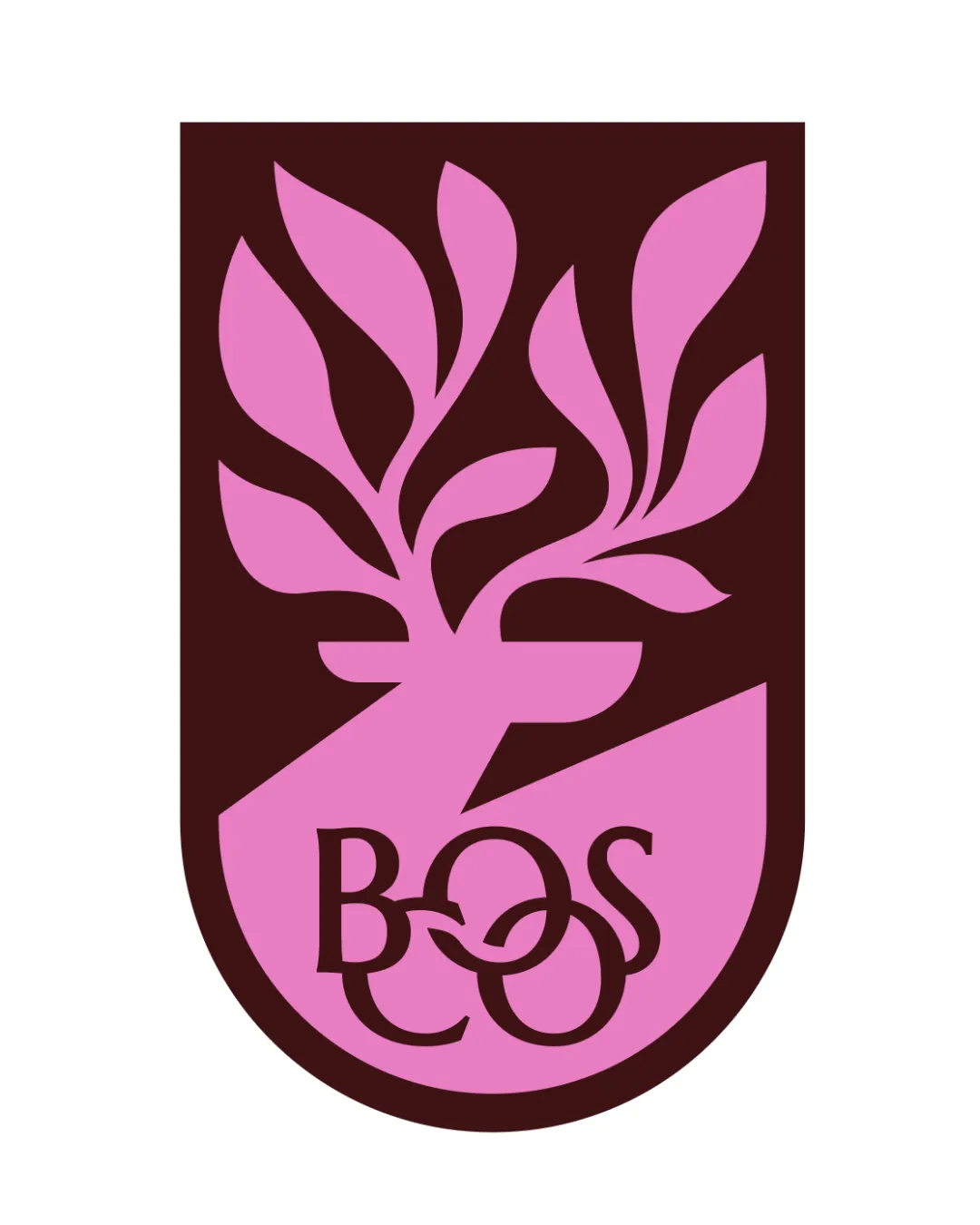
Original and cohesive, but custom letter overlap risks legibility and scalability for a busy retail setting.
The primary logo brings the symbol and name together for the most visible brand applications.

A magenta and brown shield featuring a dynamic, stylized tree with branching leaves and intricate custom BOS lettering integrated at the base.

The wordmark puts the brand name first, with a clear signature for wide and text-led placements.
Bold magenta creating the brand's signature energetic and playful impact.
Deep, earthy brown recalling rich forest soil, grounding the palette and ensuring legible contrast.
Soft, airy neutral with a slight blush, complementing magenta without competing for attention.
Softer, inviting light for subtle accent backgrounds and contrast layering.
See your headline, subheading, and body copy together.
Open a note to inspect its typography rules.
See every text style together in one post.
Open a note on the left to inspect its typography rules.
Some text extends beyond this preview. Your designer can refine the typography rules.
 BOSCO
BOSCO

Discover the latest products, services, stories, and updates from BOSCO.
BOSCO
Thoughtful work for people who expect more.

 Identity prepared by