Lā Lan BEAUTY
Polished, elegant logo exudes premium quality and aligns well with the beauty industry. Distinctive enough to stand out among competitors, with only small adjustments to perfect…
Discover real logo reviews and color palettes for your next project.
Selected by the mylogo.review team.
Polished, elegant logo exudes premium quality and aligns well with the beauty industry. Distinctive enough to stand out among competitors, with only small adjustments to perfect…
A fun, appealing, and cohesive brand mark that stands out and suits the likely market; enhanced immediate readability would perfect it.
Creative and memorable; ready for use with adjustments to symbol clarity and balance.
Solid, distinctive design with minor technical improvements suggested before final implementation.
Strong, contemporary, and professional logo; recommend for digital music brand with minimal tweaks.
Strong visual and conceptual fit. Minor refinement will yield a highly professional, industry-appropriate logo.
A distinctive, well-executed logo with strong industry relevance and only minor risk in detailed overlap at small sizes.
A distinctive, regionally resonant wordmark with only minor scalability risks.
A distinctive, modern consulting logo with strong concept and clarity—minor spatial refinement will enhance polish.
A visually striking geometric wordmark with strong style, but practical performance is limited by legibility issues.
Legible and approachable for a children's clothing brand, but integration of the tagline with the main wordmark should be refined for improved visual harmony.
Distinctive and professional with strong creative appeal; main polish needed in vertical balance between symbol and text.
A warm, compelling wordmark with a subtle, meaningful human motif that visually communicates care and companionship, but would benefit from geometric refinement and small-scale…
The logo is competent and trustworthy for broad business, but too generic for strong IT hardware positioning.
A creative and bold monogram with strong concept and excellent legibility, slightly weakened by stroke and curve imbalance.
A strong, clear transportation logo with harmonious symbolism and typography—distinctive execution of a familiar idea, but minor style refinement and distinctiveness validation…
Well-composed and purposeful combination, with moderate distinctiveness and lockup efficiency; main concern is scalability of finer elements.
A functional, professional business logo with crisp letterforms and modern color use, but moderate originality and cohesion—fine-tuning spacing and exploring more distinct…
A balanced abstract mark with high visual symmetry, suitable for versatile use but may need reinforcement of central details for tiny applications.
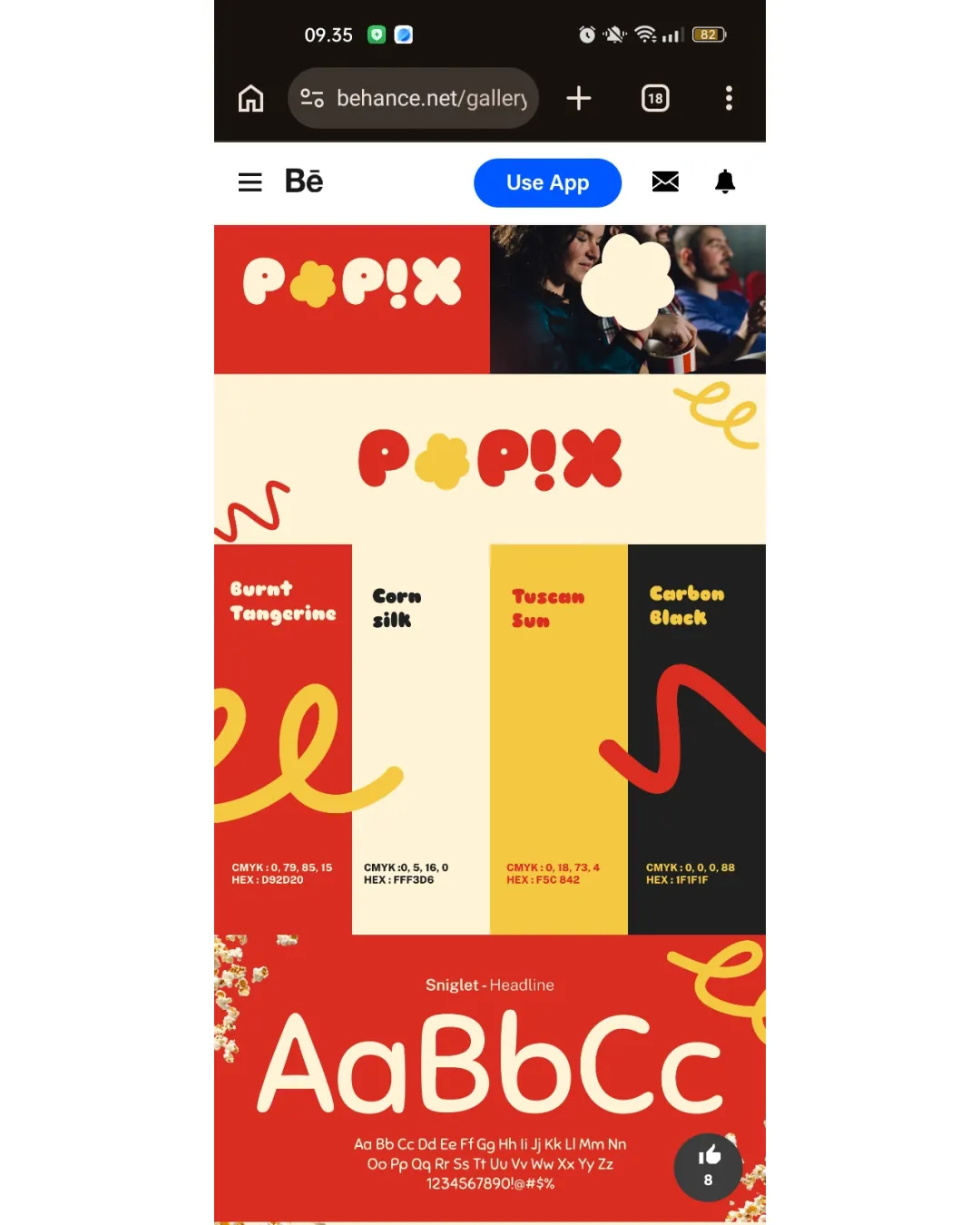
A bold, playful logo suited for a popcorn brand, with high legibility and color appeal; key improvement is kerning for balanced rhythm.
A striking, inventive logo that joyfully merges a personal initial with a mascot cartoon face, fitting a playful, creative brand identity.
Strong, distinctive wordmark with effective balance and legibility; unique character modification elevates memorability while retaining clarity.
A visually compelling, highly legible logo with a memorable geometric mark; polish shape proportions for best results.
The academic context is clear due to the graduation cap, but heavy stylization of the monogram hinders legibility and visual balance, limiting immediate effectiveness for an…
A dynamic, original wordmark that quickly signals boldness and energy, but its extreme stylization and wide spread mean legibility and spatial efficiency should be checked before…
The logo communicates stability and expertise with a strong geometric mark and clear hierarchy, but minor text alignment and legibility refinements would enhance scalability and…
A visually harmonious and original abstract symbol suitable for wellness or nature-themed brands, with minor risks at small sizes and slight refinement opportunity for balance.
A friendly, effective coffee shop logo with minor refinements optional and small size testing advisable.
Distinctive and locally meaningful emblem with excellent legibility and style, but detailed hand-drawn artwork may need adaptation for scalability.
A striking, readable, and expressive wordmark that effectively suggests energy and personality, but would benefit from some typographic balance adjustments.
A functional and clear wordmark with creative touches, but improvements to balance and palette cohesion would enhance polish.
The logo is visually distinctive and appealing, with strong symbolism, balance, and color; verify scalability and versatility in single-color applications.
Distinctive and professional logo, with readability and originality strengths; moderate cohesion and balance issues could be refined for an even stronger impact.
Solid, legible and modern logo, but lacks a distinctive playful or friendly accent needed for the 5-30 years target group.
More credits needed
Add credits to continue without losing your work.
Then $7/month. Cancel anytime.