Primary lockup
The primary logo brings the symbol and name together for the most visible brand applications.
An introduction to the way your brand looks, feels, and comes together.
Prepared by Kalle Vanderplas
nature brand
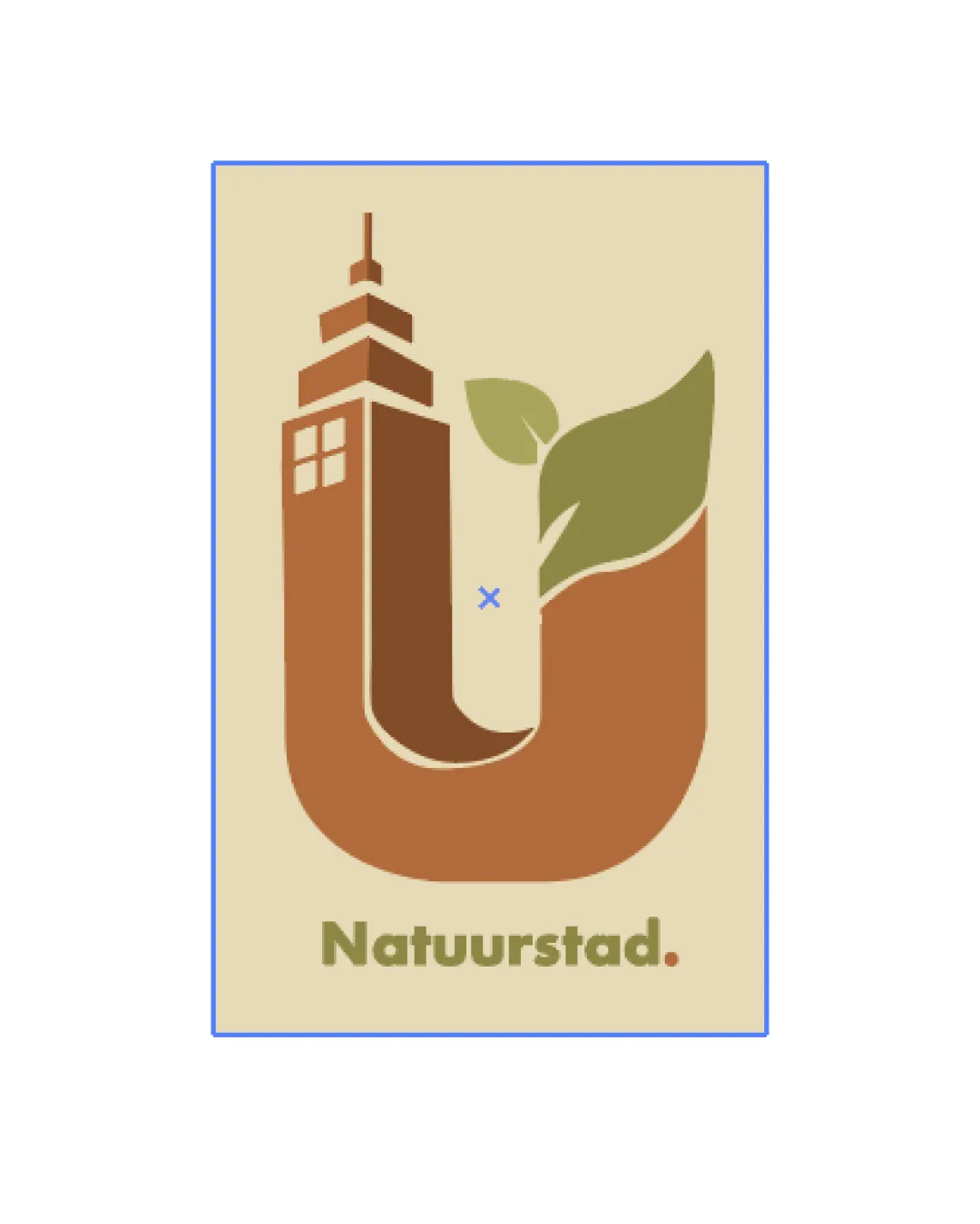
Distinctive, strongly relevant urban-nature monogram; minor visual balance correction and scalability tweaks would resolve the main weaknesses.
The primary logo brings the symbol and name together for the most visible brand applications.
The standalone symbol gives the brand a compact signature for avatars and smaller spaces.

The wordmark puts the brand name first, with a clear signature for wide and text-led placements.
Mossy mid-green symbolizing renewal and balance.
Warm, earthy orange-brown for energy and grounded recognition.
Deep, muted green for icons and controls that evokes enduring natural strength.
Clean, inviting light neutral for backgrounds.
Softer light neutral introducing warmth to secondary backgrounds.
Deep, highly readable neutral for text and dark backgrounds.
 Natuurstad. urban-nature monogram logo
Discover the latest products, services, stories, and updates from Natuurstad. urban-nature monogram logo.
Natuurstad. urban-nature monogram logo
Thoughtful work for people who expect more.
These files are available only to clients with a private access link.