Concept A4.4/5
An introduction to the way your brand looks, feels, and comes together.
Prepared by Muhamad Fahri Akbhar
A distinctive, playful identity with good legibility and originality, but the large, heavy symbol should be rebalanced to strengthen brand clarity.
Most distinctive and versatile; combines abstract mark and approachable text while remaining scalable and readable.

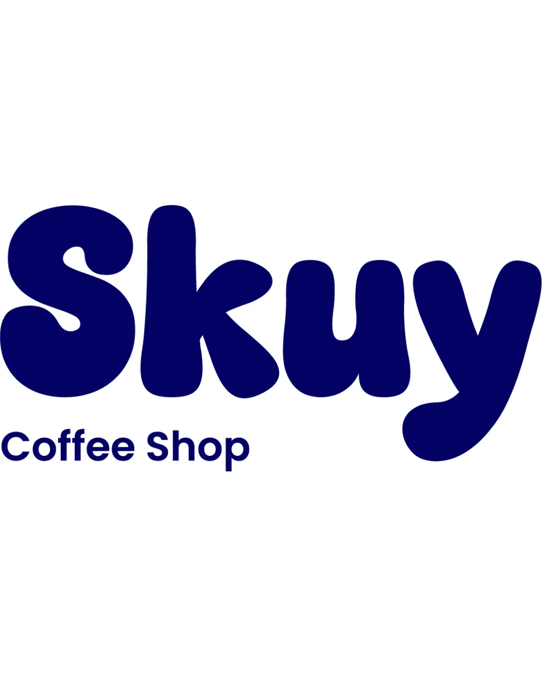
The primary logo brings the symbol and name together for the most visible brand applications.
Rich, classic navy blue for strong brand presence and logo recognition.
Inviting burnt orange caramel for warmth and active accents.
Cozy, soft mustard accent that adds youthful energy and complements both navy and caramel.
Clean, off-white cream for backgrounds, carrying a welcoming, light coffeehouse feel.
Softer, creamy neutral for gentle background contrast and cozy atmosphere.
Rich, very dark brown-black for highly readable text and deep accents.
 Skuy Coffee Shop logo
Discover the latest products, services, stories, and updates from Skuy Coffee Shop logo.
Skuy Coffee Shop logo
Thoughtful work for people who expect more.