
Primary lockup
The primary logo brings the symbol and name together for the most visible brand applications.

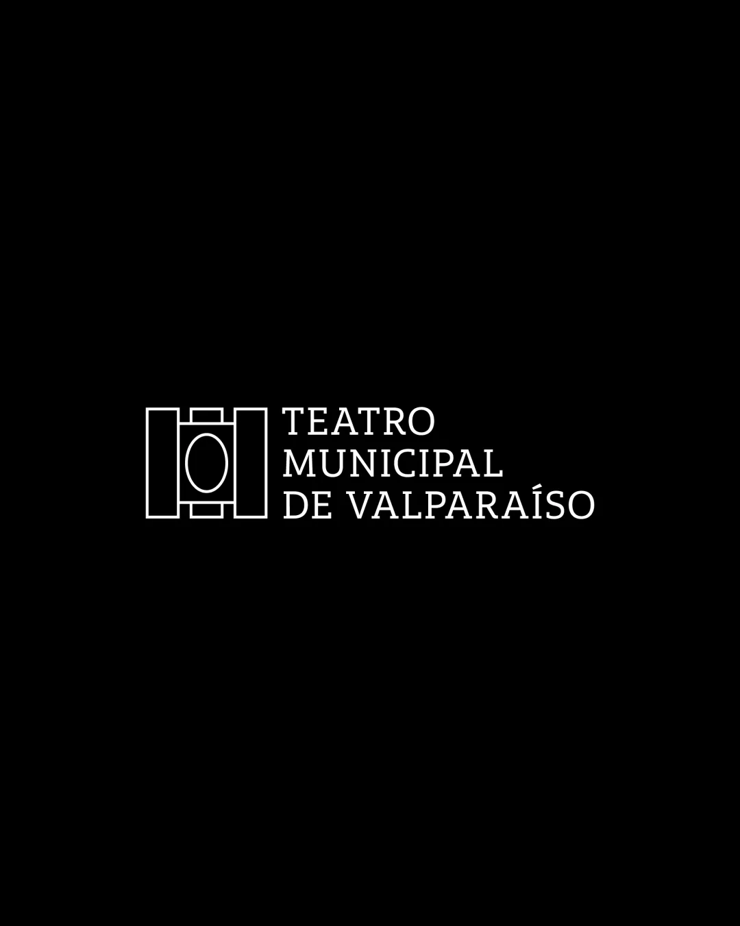
A distinctive and appropriate logo, requiring minor refinements for better scaling and compositional balance.
The primary logo brings the symbol and name together for the most visible brand applications.

The standalone symbol gives the brand a compact signature for avatars and smaller spaces.

The wordmark puts the brand name first, with a clear signature for wide and text-led placements.
Electric purple with high energy for strong brand presence.
A practical color in the brand system.
Gentle, cool lilac for supportive UI elements and icons.
A practical color in the brand system.
Softer, slightly purple-tinted white for gentle background contrast.
Very dark blue-violet for legible body text and dark backgrounds.
See your headline, subheading, and body copy together.
Open a note to inspect its typography rules.
See every text style together in one post.
Open a note on the left to inspect its typography rules.
Some text extends beyond this preview. Your designer can refine the typography rules.
 Teatro Municipal De Valparaíso
Discover the latest products, services, stories, and updates from Teatro Municipal De Valparaíso.
Teatro Municipal De Valparaíso
Thoughtful work for people who expect more.
These files are available only to clients with a private access link.