 View review
Logo score
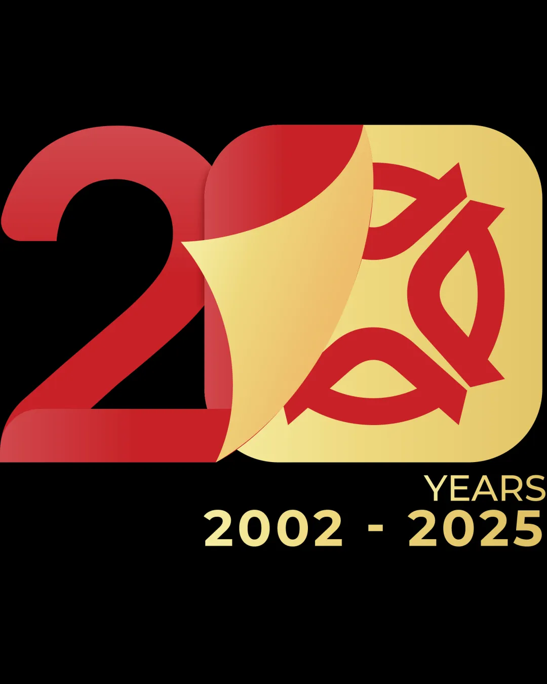
Logo review of20 Years 2002 2025
Review the detailed scores below to see what is working and what should be refined first.
Legibility
Originality
Balance
Scale
Detailed review
Logo performance breakdown
Legibility
![]() Text is clear and legible.
Text is clear and legible.
Originality
![]() Unique representation of '20' with peeled corner effect.
Unique representation of '20' with peeled corner effect.
![]() Circular pattern is somewhat generic.
Circular pattern is somewhat generic.
Color harmony
![]() Good use of complementary colors with red and gold.
Good use of complementary colors with red and gold.
Balance alignment
![]() Design is mostly balanced.
Design is mostly balanced.
![]() The peeled corner effect may create a slight visual imbalance.
The peeled corner effect may create a slight visual imbalance.

Scalability
![]() Simple design allows for versatile use.
Simple design allows for versatile use.
![]() The gradient and detailed pattern may lose detail when scaled down.
The gradient and detailed pattern may lose detail when scaled down.
200x250 px
100×125 px
50×62 px
Try your own review
Review my logo
Wondering how your logo performs?
Get a clear logo score, key risks, and priority fix ideas before your client or audience sees it.
Keep exploring


