View review
Logo review ofQudrat
Review the detailed scores below to see what is working and what should be refined first.
Logo performance breakdown
Legibility
The word 'QUDRAT' is clear, easy to read, and uses a clean sans-serif font.
Letter spacing ensures clarity even at reduced sizes.
Originality
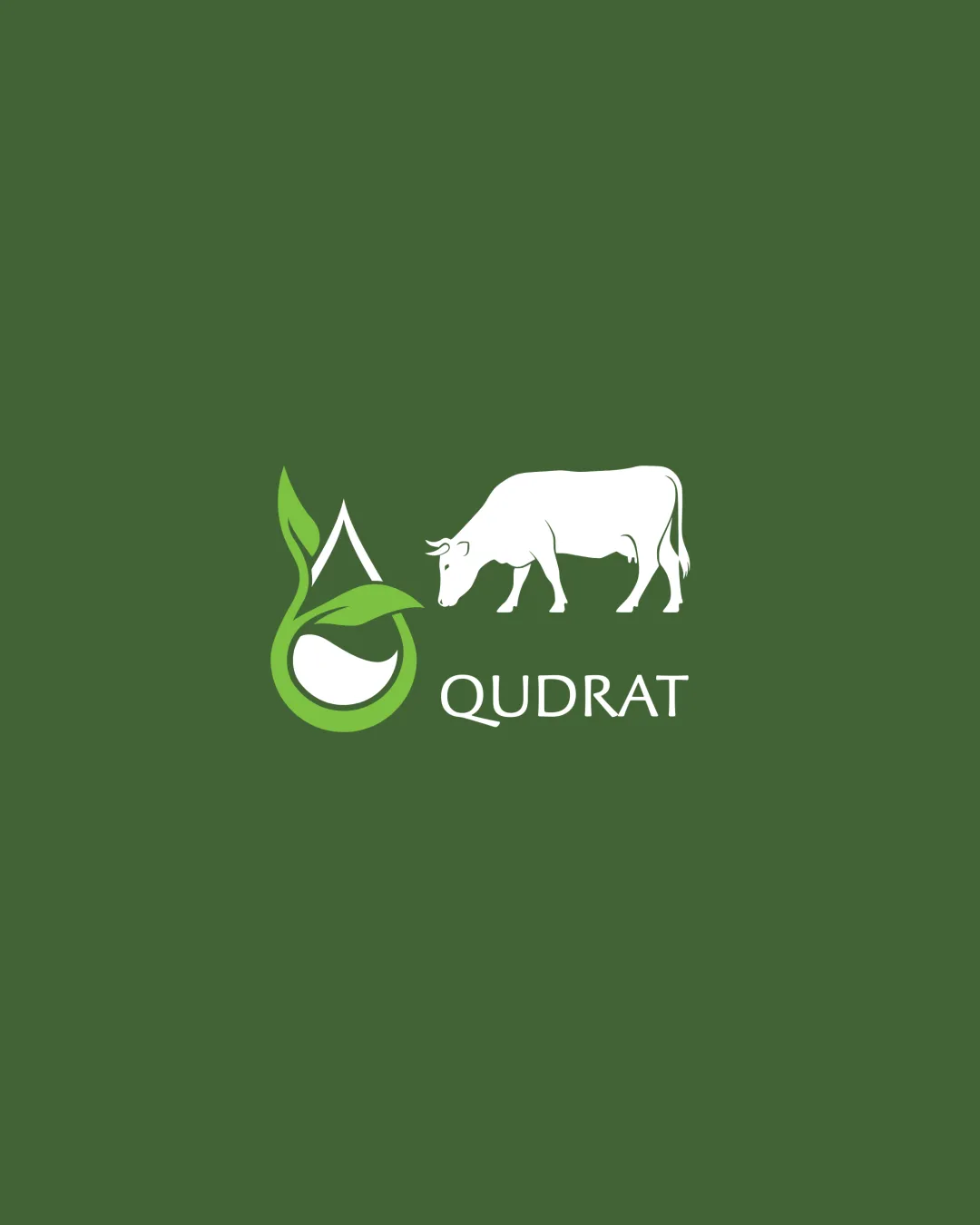
Nature-inspired droplet and leaf integration brings some personality.
Combining a cow, leaf, droplet, and wordmark is literal and lacks creative synthesis; both elements are common in agriculture logos.
No unique or clever integration between the elements—each sits independently.
No use of negative space for additional meaning.
Color harmony
Limited to two main colors and white, promoting clarity and relevance.
Green conveys nature and sustainability, while white provides needed contrast.
Deep Olive Green
#486634
Moderate Green
#68A23C
White
#FFFFFF
Balance alignment
The elements are arranged in a loose horizontal alignment, offering a sense of flow.
The cow and the leaf/water droplet symbol compete for attention, causing visual imbalance.
The cow appears disconnected from the main symbol and text, creating an awkward hierarchy.
Alignment between symbol, cow, and wordmark feels incomplete—visual weight leans too much to the left.
Scalability
Clean lines and not too much detail ensure the logo is readable at medium sizes.
Should work well on packaging and digital applications.
Thin details like the cow's tail, legs, and smaller leaves may become unrecognizable or cluttered at very small sizes such as business cards or embroidery.
Multiple elements (symbol + cow + wordmark) can lose clarity in small-scale applications like favicons.
200x250 px
100×125 px
50×62 px
Misinterpretations
No inappropriate or misleading imagery detected.
Visual meaning is straightforward.
Symbol & text fit
Both the symbol and type use rounded, soft features.
The cow silhouette’s detailed and realistic style conflicts with the minimal, abstract shape of the leaf/droplet.
Sizing imbalance—the cow is visually heavier than the wordmark and logomark, distracting from brand readability.
Wondering how your logo performs?
Get a clear logo score, key risks, and priority fix ideas before your client or audience sees it.