 View review
Logo score
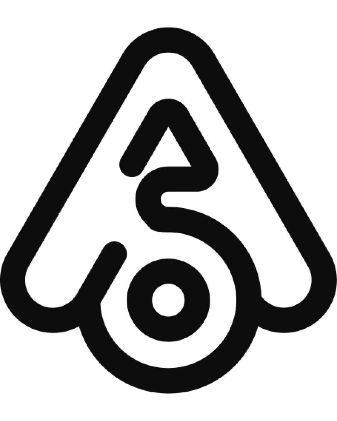
Logo review ofA, 6, O
Review the detailed scores below to see what is working and what should be refined first.
Legibility
Originality
Misread
Balance
Scale
Detailed review
Logo performance breakdown
Legibility
![]() Distinct shapes with clear, bold outlines enhance short-range legibility.
Distinct shapes with clear, bold outlines enhance short-range legibility.![]() Strong contrast between black symbol and white background.
Strong contrast between black symbol and white background.
![]() Integration of 'A', '6', and 'O' reduces immediate readability.
Integration of 'A', '6', and 'O' reduces immediate readability.![]() May cause confusion as viewers need time to recognize all intended letterforms.
May cause confusion as viewers need time to recognize all intended letterforms.
Originality
![]() Creative fusion of 'A', '6', and an abstract symbol demonstrates thoughtful construction.
Creative fusion of 'A', '6', and an abstract symbol demonstrates thoughtful construction.![]() Unique minimalist execution that avoids generic icons or overused shapes.
Unique minimalist execution that avoids generic icons or overused shapes.
![]() Ambiguity in the multi-letter fusion could cause the logo to feel derivative if not paired with strong brand context.
Ambiguity in the multi-letter fusion could cause the logo to feel derivative if not paired with strong brand context.
Color harmony
![]() Monochrome palette maximizes adaptability and visual clarity.
Monochrome palette maximizes adaptability and visual clarity.![]() No unnecessary color distractions.
No unnecessary color distractions.
Black
#000000
White
#FFFFFF
Balance alignment
![]() Strong geometric construction and symmetry support visual stability.
Strong geometric construction and symmetry support visual stability.![]() Shape sits well within a contained triangular boundary, giving a unified look.
Shape sits well within a contained triangular boundary, giving a unified look.
![]() The left-weighted line (forming part of the '6') might create minor heaviness on one side, slightly affecting the overall visual balance.
The left-weighted line (forming part of the '6') might create minor heaviness on one side, slightly affecting the overall visual balance.

Scalability
![]() Bold lines ensure good visibility from small to large sizes.
Bold lines ensure good visibility from small to large sizes.![]() Logo retains its form on monochrome backgrounds and works well as a favicon or app icon.
Logo retains its form on monochrome backgrounds and works well as a favicon or app icon.
![]() Small, thin negative spaces within the symbol may fill in or become unclear when scaled down too far (e.g., tiny embroidery or stamps).
Small, thin negative spaces within the symbol may fill in or become unclear when scaled down too far (e.g., tiny embroidery or stamps).
200x250 px
100×125 px
50×62 px
Misinterpretations
![]() No inappropriate or accidental imagery detected.
No inappropriate or accidental imagery detected.![]() Abstract construction avoids negative symbolism.
Abstract construction avoids negative symbolism.
Try your own review
Review my logo
Wondering how your logo performs?
Get a clear logo score, key risks, and priority fix ideas before your client or audience sees it.
Keep exploring


