Wondering how your logo performs? 🧐
Get professional logo reviews in seconds and catch design issues in time.
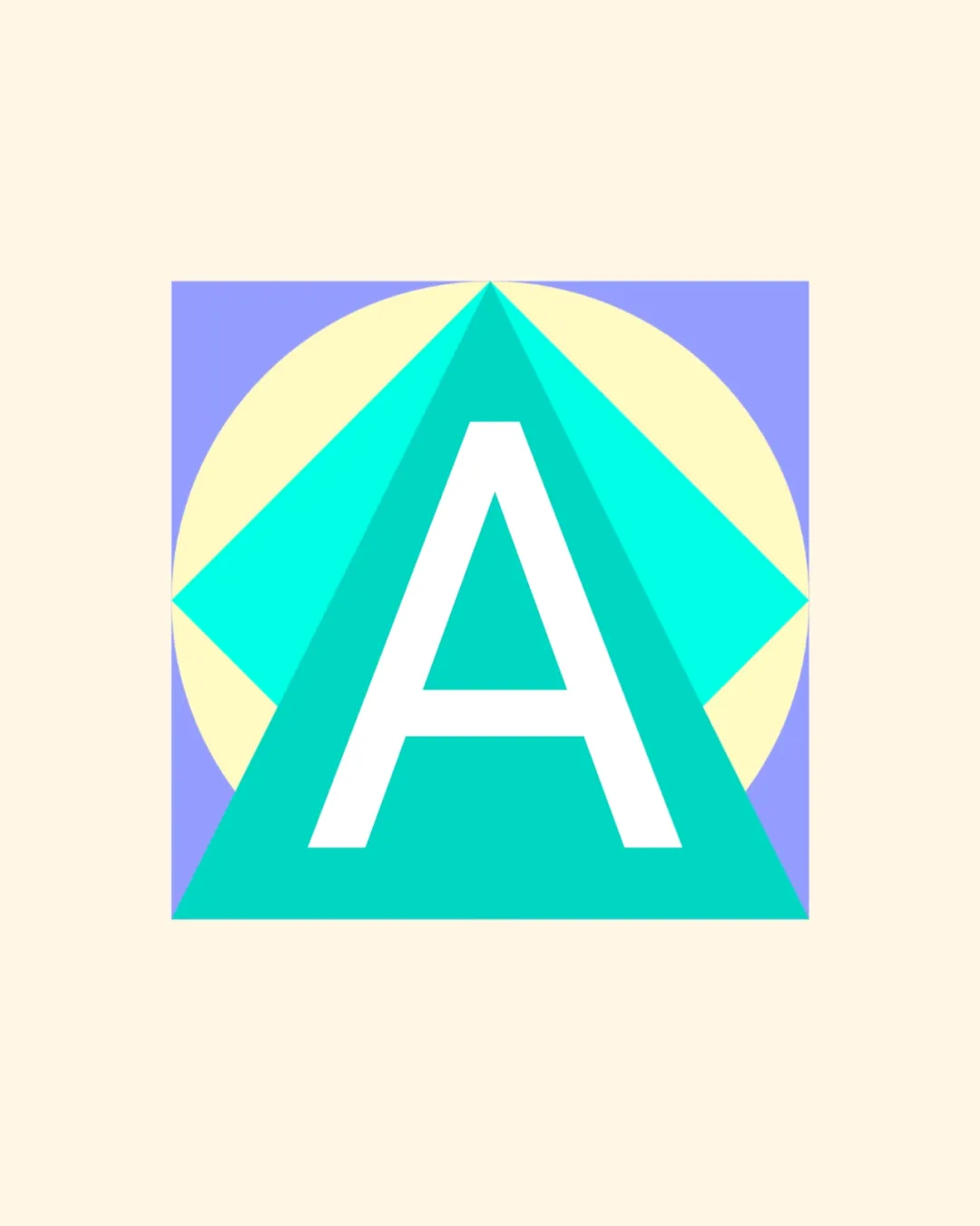
Try it Now!Logo review of A
 Logo analysis by AI
Logo type:
Style:
Detected symbol:
Detected text:
Business industry:
Review requested by JAZ
**If AI can recognize or misinterpret it, so can people.
Structured logo review
Legibility
![]() The 'A' is bold, centered, and easily readable.
The 'A' is bold, centered, and easily readable.![]() Strong contrast between the white letter and colorful background.
Strong contrast between the white letter and colorful background.
Scalability versatility
![]() Simple geometric forms maintain clarity at various sizes.
Simple geometric forms maintain clarity at various sizes.![]() Will work on digital displays, app icons, and print.
Will work on digital displays, app icons, and print.
![]() Fine color differences between geometric shapes may blend at small scales.
Fine color differences between geometric shapes may blend at small scales.![]() Thin outline of 'A' could lose impact on embroidery or very small print.
Thin outline of 'A' could lose impact on embroidery or very small print.![]() Complex mix of colors may be difficult to reproduce in black and white or single-color versions.
Complex mix of colors may be difficult to reproduce in black and white or single-color versions.
200x250 px
100×125 px
50×62 px
Balance alignment
![]() The central alignment of 'A' inside the geometric shapes gives good symmetry.
The central alignment of 'A' inside the geometric shapes gives good symmetry.![]() Elements are visually balanced.
Elements are visually balanced.
![]() Busy intersection of triangle, semicircle, and square adds slight complexity to core balance, causing minor visual distraction.
Busy intersection of triangle, semicircle, and square adds slight complexity to core balance, causing minor visual distraction.

Originality
![]() Geometric integration with the letter 'A' creates a memorable silhouette.
Geometric integration with the letter 'A' creates a memorable silhouette.![]() Color palette is somewhat unconventional.
Color palette is somewhat unconventional.
![]() Triangle-over-letter/A concepts are common in tech and architecture.
Triangle-over-letter/A concepts are common in tech and architecture.![]() No clear negative space play or unexpected twist.
No clear negative space play or unexpected twist.
Aesthetic look
![]() Pleasing color harmony and symmetry catch attention.
Pleasing color harmony and symmetry catch attention.![]() Modern and fresh geometric look.
Modern and fresh geometric look.
![]() Color combinations can feel slightly pastel and washed out on some backgrounds.
Color combinations can feel slightly pastel and washed out on some backgrounds.![]() Geometric approach feels a bit generic and lacks emotional presence.
Geometric approach feels a bit generic and lacks emotional presence.
Dual meaning and misinterpretations
![]() No inappropriate symbols or misleading secondary imagery detected.
No inappropriate symbols or misleading secondary imagery detected.
Color harmony
![]() Soft pastel colors work well together and create a friendly vibe.
Soft pastel colors work well together and create a friendly vibe.![]() Contrast is sufficient for most use cases.
Contrast is sufficient for most use cases.
![]() Multiple intersecting colors may not translate well in all mediums.
Multiple intersecting colors may not translate well in all mediums.![]() Too many colors can complicate reproduction or embroidery.
Too many colors can complicate reproduction or embroidery.
Turquoise
#19E3C2
Light Cyan
#A9E3E0
Light Yellow
#EDECBA
Light Periwinkle
#9797EB
Beige
#F8F1DE


