 View review
Logo score
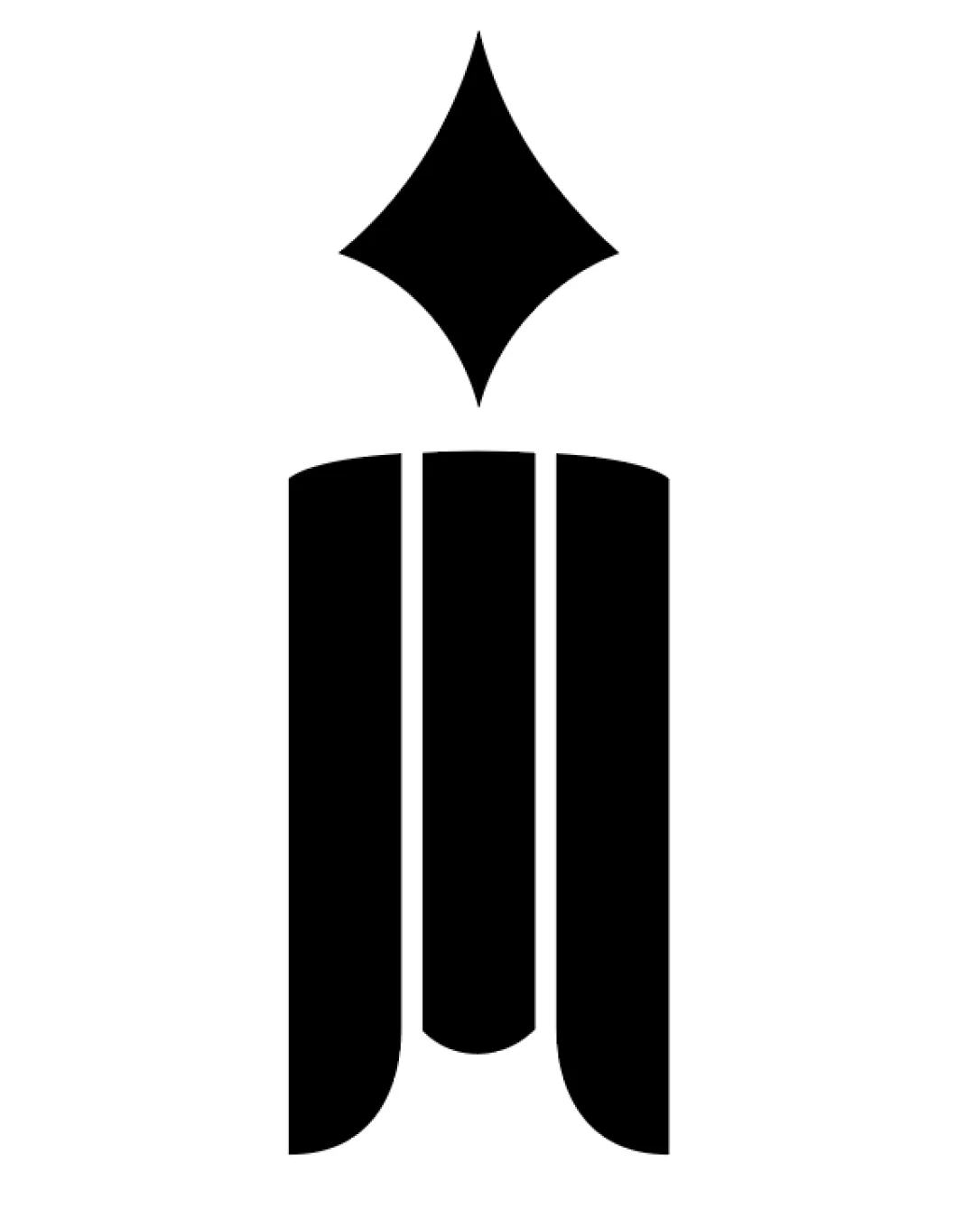
Logo review ofAbstract Pen Nib Over Three Column Like Shapes For..
Review the detailed scores below to see what is working and what should be refined first.
Originality
Misread
Balance
Scale
Detailed review
Logo performance breakdown
Originality
![]() Creative use of a pen nib and abstract columns forms a subtle 'M' and references books or publishing
Creative use of a pen nib and abstract columns forms a subtle 'M' and references books or publishing![]() Balanced execution of common symbols with a unified approach
Balanced execution of common symbols with a unified approach
![]() Pen nib motif is widely used and slightly generic, though contextually appropriate
Pen nib motif is widely used and slightly generic, though contextually appropriate
Color harmony
![]() High-contrast black and white color scheme is bold, timeless, and professional
High-contrast black and white color scheme is bold, timeless, and professional
Black
#000000
White
#FFFFFF
Balance alignment
![]() Excellent symmetry and spatial distribution
Excellent symmetry and spatial distribution![]() Geometric balance between top nib and three columns
Geometric balance between top nib and three columns

Scalability
![]() Simple, bold geometric forms maintain clarity at multiple sizes
Simple, bold geometric forms maintain clarity at multiple sizes![]() No excessive detail, making it suitable for business cards, headers, website favicons, and signage
No excessive detail, making it suitable for business cards, headers, website favicons, and signage
200x250 px
100×125 px
50×62 px
Misinterpretations
![]() No inappropriate or confusing secondary imagery detected
No inappropriate or confusing secondary imagery detected
Try your own review
Review my logo
Wondering how your logo performs?
Get a clear logo score, key risks, and priority fix ideas before your client or audience sees it.
Keep exploring