 View review
Logo score
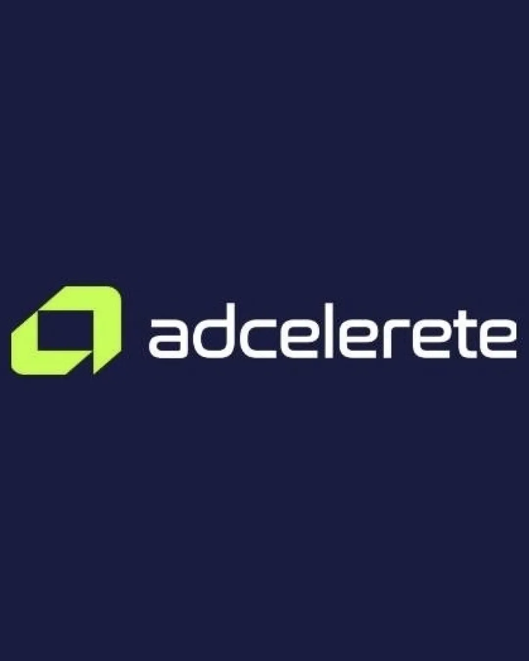
Logo review ofAdcelerete
Review the detailed scores below to see what is working and what should be refined first.
Legibility
Originality
Misread
Balance
Scale
Detailed review
Logo performance breakdown
Legibility
![]() All characters are distinct and easy to read at medium and large sizes.
All characters are distinct and easy to read at medium and large sizes.![]() Sleek, futuristic sans-serif type supports a tech-oriented look.
Sleek, futuristic sans-serif type supports a tech-oriented look.
![]() The double 'e' and 't' are too close, which could harm legibility in small sizes.
The double 'e' and 't' are too close, which could harm legibility in small sizes.![]() Spacing between letters could be slightly increased for clarity.
Spacing between letters could be slightly increased for clarity.![]() The brand name contains a misspelling ('adcelerete' instead of 'accelerate'), which could affect professionalism and recognition.
The brand name contains a misspelling ('adcelerete' instead of 'accelerate'), which could affect professionalism and recognition.
Originality
![]() Stylized initial as symbol is somewhat distinct.
Stylized initial as symbol is somewhat distinct.![]() Uses geometric reduction rather than a literal or clip-art symbol.
Uses geometric reduction rather than a literal or clip-art symbol.
![]() Boxy geometric 'a' is fairly common in tech branding and lacks strong uniqueness.
Boxy geometric 'a' is fairly common in tech branding and lacks strong uniqueness.![]() No clever/hidden aspect beyond geometric reduction.
No clever/hidden aspect beyond geometric reduction.
Color harmony
![]() Good contrast between lime green and navy blue provides visibility and energy.
Good contrast between lime green and navy blue provides visibility and energy.![]() Modern color selection fits technology space.
Modern color selection fits technology space.
![]() Lime green may not reproduce well on all backgrounds, especially white.
Lime green may not reproduce well on all backgrounds, especially white.![]() Limited color variation; could lack emotional depth or warmth.
Limited color variation; could lack emotional depth or warmth.![]() The intense green can easily become overwhelming or dated if not paired carefully.
The intense green can easily become overwhelming or dated if not paired carefully.
LimeGreen
#D6FF40
DarkNavy
#15193C
Color may be holding this logo back. Explore stronger palette options with Colorfly.design before updating the logo.
Explore palettesBalance alignment
![]() The spacing between the icon and wordmark is well-judged.
The spacing between the icon and wordmark is well-judged.![]() Visual weight is fairly balanced between symbol and wordmark.
Visual weight is fairly balanced between symbol and wordmark.
![]() Slight optical imbalance: symbol's angular base draws the eye down and away from the wordmark.
Slight optical imbalance: symbol's angular base draws the eye down and away from the wordmark.![]() Top-heavy symbol compared to the low x-height of the wordmark.
Top-heavy symbol compared to the low x-height of the wordmark.

Scalability
![]() Icon is simple and should scale down reasonably well for app icons or social avatars.
Icon is simple and should scale down reasonably well for app icons or social avatars.![]() Works for digital uses, websites, and large display formats.
Works for digital uses, websites, and large display formats.
![]() Thin letterforms of the wordmark might lose clarity on small merchandise or embroidery.
Thin letterforms of the wordmark might lose clarity on small merchandise or embroidery.![]() Light green symbol may be hard to reproduce on some light backgrounds or print formats.
Light green symbol may be hard to reproduce on some light backgrounds or print formats.![]() Overall contrast between icon and background could be problematic in black-and-white prints.
Overall contrast between icon and background could be problematic in black-and-white prints.
200x250 px
100×125 px
50×62 px
Misinterpretations
![]() No inappropriate shapes, gestures, or forms detected in the symbol.
No inappropriate shapes, gestures, or forms detected in the symbol.
Symbol & text fit
![]() Angular style of icon complements the geometric wordmark.
Angular style of icon complements the geometric wordmark.
![]() Both elements use sharp, clean lines and match visually.
Both elements use sharp, clean lines and match visually.
![]() Slight difference in thickness: icon is bolder than the wordmark at small sizes.
Slight difference in thickness: icon is bolder than the wordmark at small sizes.
![]() Color difference can make the icon pop too much compared to the understated text.
Color difference can make the icon pop too much compared to the understated text.
Try your own review
Review my logo
Wondering how your logo performs?
Get a clear logo score, key risks, and priority fix ideas before your client or audience sees it.
Keep exploring


