 View review
Logo score
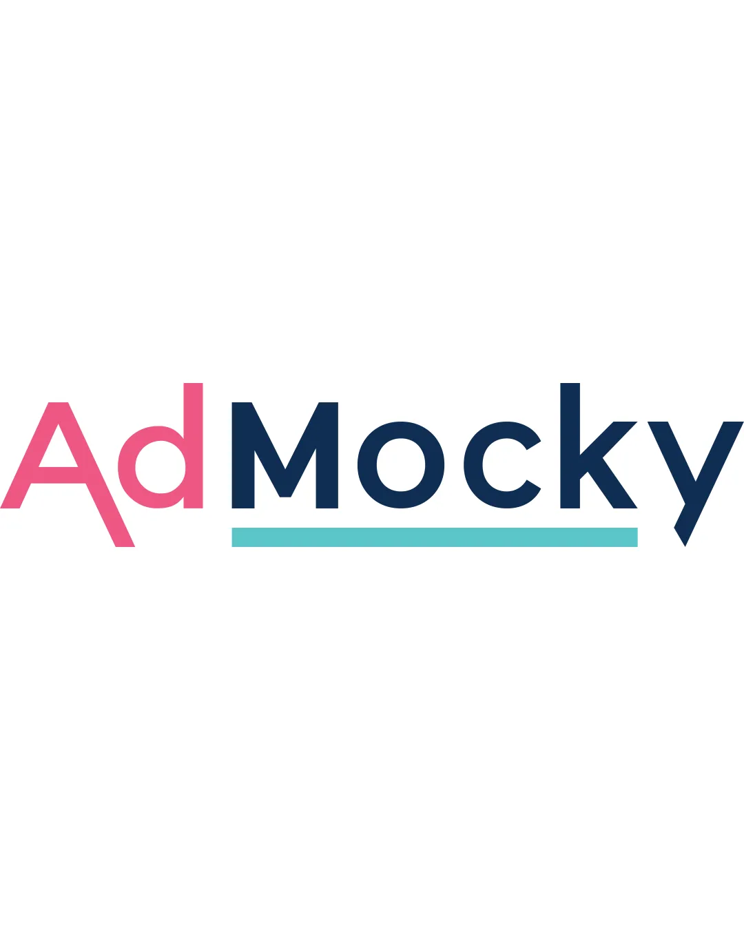
Logo review ofAdmocky
Review the detailed scores below to see what is working and what should be refined first.
Legibility
Originality
Balance
Scale
Detailed review
Logo performance breakdown
Legibility
![]() Text is clear and easy to read.
Text is clear and easy to read.
Originality
![]() Distinctive color choice for different words.
Distinctive color choice for different words.
![]() Relies on a simple text treatment, which is common.
Relies on a simple text treatment, which is common.
Color harmony
![]() Colors are harmonious and well-matched.
Colors are harmonious and well-matched.
![]() The pink and teal might clash for some audiences.
The pink and teal might clash for some audiences.
Your palette is close. Explore sharper color combinations with Colorfly.design before updating the logo.
Explore palettesBalance alignment
![]() Overall good balance and alignment in the logo.
Overall good balance and alignment in the logo.
![]() The underline color draws more attention to 'Mocky', potentially imbalancing focus.
The underline color draws more attention to 'Mocky', potentially imbalancing focus.

Scalability
![]() Simple design ensures scalability across different sizes.
Simple design ensures scalability across different sizes.
200x250 px
100×125 px
50×62 px
Try your own review
Review my logo
Wondering how your logo performs?
Get a clear logo score, key risks, and priority fix ideas before your client or audience sees it.
Keep exploring


