 View review
Logo score
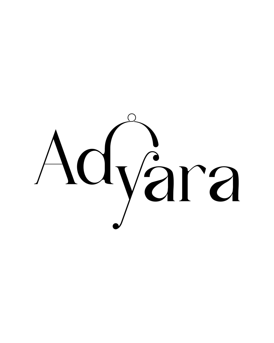
Logo review ofAdyara
Review the detailed scores below to see what is working and what should be refined first.
Legibility
Originality
Misread
Balance
Scale
Detailed review
Logo performance breakdown
Legibility
![]() Distinct contrast in letterforms gives visual emphasis
Distinct contrast in letterforms gives visual emphasis![]() Primary text 'Adyara' is mostly recognizable when viewed at medium to large sizes
Primary text 'Adyara' is mostly recognizable when viewed at medium to large sizes
![]() The highly stylized 'y' may cause confusion, especially with the looped top and exaggerated descender
The highly stylized 'y' may cause confusion, especially with the looped top and exaggerated descender![]() Decorative elements in 'y' may reduce quick legibility at small sizes or from a distance
Decorative elements in 'y' may reduce quick legibility at small sizes or from a distance![]() Thin lines in decorative features might break up in print or low resolutions
Thin lines in decorative features might break up in print or low resolutions
Originality
![]() Creative transformation of the 'y' into an ornamented, jewelry-like form adds memorability
Creative transformation of the 'y' into an ornamented, jewelry-like form adds memorability![]() The unique letterform gives the wordmark character relevant to fashion or luxury
The unique letterform gives the wordmark character relevant to fashion or luxury
![]() While inventive, the form borders on being overly complex, and risks confusion if not explained contextually
While inventive, the form borders on being overly complex, and risks confusion if not explained contextually
Color harmony
![]() Monochrome palette ensures perfect harmony and timelessness
Monochrome palette ensures perfect harmony and timelessness![]() No color clutter or inharmonious combinations
No color clutter or inharmonious combinations
Black
#000000
White
#FFFFFF
Balance alignment
![]() Typographic weight is fairly distributed from left to right
Typographic weight is fairly distributed from left to right![]() High-contrast serifs give elegance and moderate cohesion
High-contrast serifs give elegance and moderate cohesion
![]() The arch and dot above the 'y' throws off visual centering, pulling focus upward awkwardly
The arch and dot above the 'y' throws off visual centering, pulling focus upward awkwardly![]() The long descender of 'y' and abrupt loop at the top disrupt horizontal baseline consistency
The long descender of 'y' and abrupt loop at the top disrupt horizontal baseline consistency

Scalability
![]() Minimalist color palette aids versatile reproduction in monochrome printing
Minimalist color palette aids versatile reproduction in monochrome printing![]() No gradients or color complexity to affect scaling
No gradients or color complexity to affect scaling
![]() Thin accents and details on the 'y' loop may be lost on business cards, embroidery, or digital favicons
Thin accents and details on the 'y' loop may be lost on business cards, embroidery, or digital favicons![]() The decorative style does not adapt well at very small scale—details look cluttered or disappear entirely
The decorative style does not adapt well at very small scale—details look cluttered or disappear entirely
200x250 px
100×125 px
50×62 px
Misinterpretations
![]() No inappropriate or accidental imagery detected in the contours
No inappropriate or accidental imagery detected in the contours![]() Decorative loop and ball look intentional and benign
Decorative loop and ball look intentional and benign
Try your own review
Review my logo
Wondering how your logo performs?
Get a clear logo score, key risks, and priority fix ideas before your client or audience sees it.
Keep exploring


