 View review
Logo score
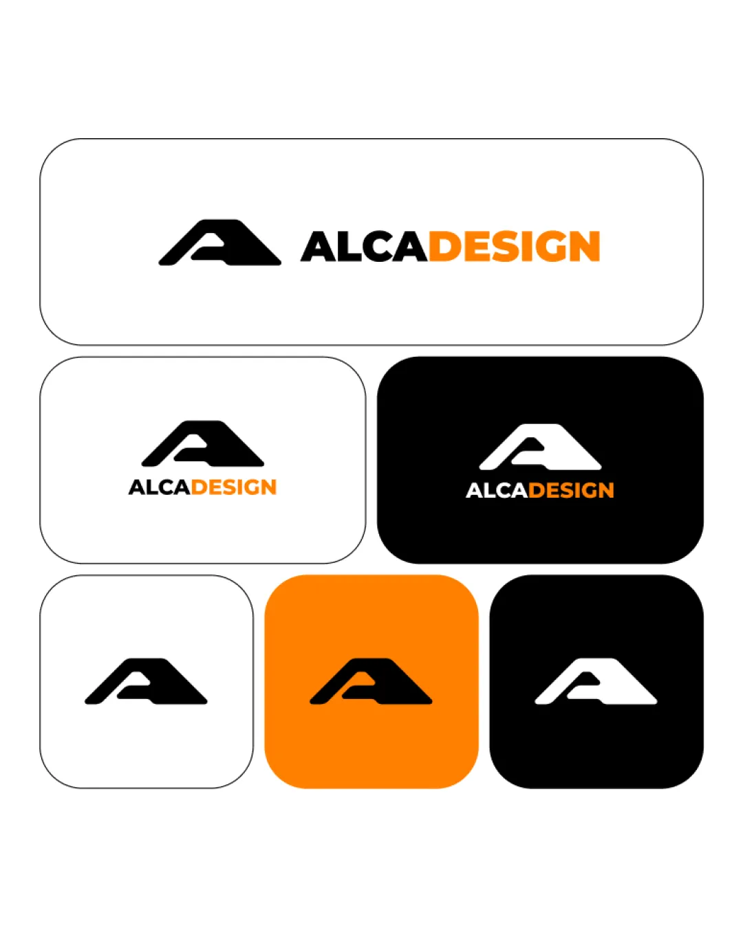
Logo review ofAlcadesign
Highly functional, on-brief, and visually distinctive. Ready for versatile brand use with minimal tweak suggestion.
Legibility
Originality
Misread
Balance
Scale
Action plan
What to fix first
The most important fixes to handle before polishing the full presentation.
1
Consider very slight refinement of letter thickness for maximum crispness at tiny sizes.
Medium priorityEnsures perfect sharpness in all use cases.
Impact: Enhances Micro-scale Versatility On Small Digital Assets. · Effort: Low
Detailed review
Logo performance breakdown
Legibility
 Text is bold, clear, and high-contrast in all versions
Originality
Clever integration of A and gesture-like form Abstract but recognizably unique
 Some similarity to common minimal letterforms
Color harmony
Orange accent adds energy without overwhelming Palette is limited and balanced
Black
#000000
White
#FFFFFF
Orange
#FF9200
Balance alignment
Strong centering and equal visual weight between symbol and text

Scalability
Simple shape and bold strokes scale well Works in both color and monochrome
Slightly thick lettermark may feel heavy at smallest scale
200x250 px
100×125 px
50×62 px
Misinterpretations
No unintended or inappropriate shapes detected
Logo structure & brief match
Mark and wordmark style, weight, and color play complement each other well
Icon Concept (A + Hand/pen/mouse): Symbol clearly blends 'A' with a gesture, fitting the designer/tool theme well.
Design Professionalism: Presentation and form match a creative services industry and target audience.
Try your own review
Review my logo
Wondering how your logo performs?
Get a clear logo score, key risks, and priority fix ideas before your client or audience sees it.
Keep exploring