Wondering how your logo performs? 🧐
Get professional logo reviews in seconds and catch design issues in time.
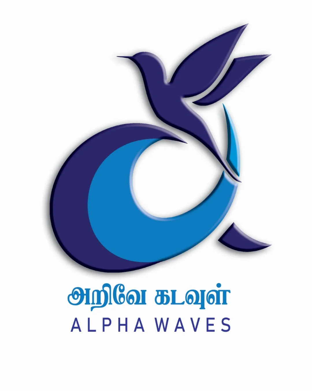
Try it Now!Logo review of அறிவே கடல்கள், ALPHA WAVES
 Logo analysis by AI
Logo type:
Style:
Detected symbol:
Detected text:
Business industry:
Review requested by Seshan
**If AI can recognize or misinterpret it, so can people.
Structured logo review
Legibility
![]() Latin font is simple, sans-serif, and easy to read
Latin font is simple, sans-serif, and easy to read![]() Tamil script is distinct and spaced out, maintaining clarity
Tamil script is distinct and spaced out, maintaining clarity
![]() The Tamil text, while clear, may lose readability at very small scales due to fine strokes
The Tamil text, while clear, may lose readability at very small scales due to fine strokes![]() Secondary color for text could be more contrasting from the symbol for differentiation
Secondary color for text could be more contrasting from the symbol for differentiation
Scalability versatility
![]() Clean shapes and minimal gradient usage support scalability
Clean shapes and minimal gradient usage support scalability![]() Simple enough for large-scale applications like signage and banners
Simple enough for large-scale applications like signage and banners
![]() Gradient detail and fine lines in the bird's shape may lose clarity at favicon or embroidery scale
Gradient detail and fine lines in the bird's shape may lose clarity at favicon or embroidery scale![]() Text under the symbol becomes hard to read at reduced sizes
Text under the symbol becomes hard to read at reduced sizes
200x250 px
100×125 px
50×62 px
Balance alignment
![]() Symbol and text are generally well-centered and visually aligned
Symbol and text are generally well-centered and visually aligned![]() Bird's placement blends cohesively with the wave/‘A’ element
Bird's placement blends cohesively with the wave/‘A’ element
![]() Minor imbalance as the bird’s head and beak extend far from the main mass, making top-right heavy
Minor imbalance as the bird’s head and beak extend far from the main mass, making top-right heavy

Originality
![]() Unique integration of bird and wave to imply the 'A' letter
Unique integration of bird and wave to imply the 'A' letter![]() Combination of symbol and wave feels intentional
Combination of symbol and wave feels intentional
![]() Flight/bird and wave concepts are somewhat common; not pushing boundaries beyond expected motifs in education/logos representing growth or flow
Flight/bird and wave concepts are somewhat common; not pushing boundaries beyond expected motifs in education/logos representing growth or flow
Logomark wordmark fit
![]() Typeface choice harmonizes with the symbol’s curves
Typeface choice harmonizes with the symbol’s curves![]() Colors between mark and wordmark are consistent
Colors between mark and wordmark are consistent
![]() Tamil and English text combination creates a visually dense block that could be more refined
Tamil and English text combination creates a visually dense block that could be more refined
Aesthetic look
![]() Modern and visually pleasing color palette
Modern and visually pleasing color palette![]() Soft gradients add depth without clutter
Soft gradients add depth without clutter
![]() Gradient shading is at risk of looking dated or inconsistent on different media
Gradient shading is at risk of looking dated or inconsistent on different media
Dual meaning and misinterpretations
![]() No inappropriate or unintended imagery detected
No inappropriate or unintended imagery detected![]() Symbolism is positive and clear
Symbolism is positive and clear
Color harmony
![]() Consistent blue tones create unity
Consistent blue tones create unity![]() High contrast between symbol, background, and text
High contrast between symbol, background, and text
Persian Indigo
#232060
Blue
#288DD9
White
#ffffff


