Wondering how your logo performs? 🧐
Get professional logo reviews in seconds and catch design issues in time.
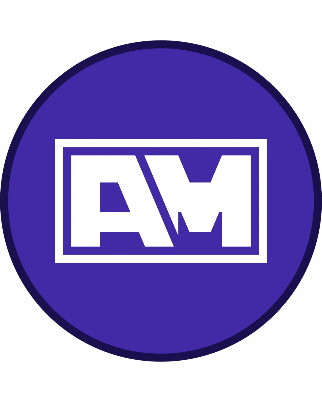
Try it Now!Logo review of AM
 Logo analysis by AI
Logo type:
Style:
Detected symbol:
Detected text:
Business industry:
Review requested by Alvaro
**If AI can recognize or misinterpret it, so can people.
Structured logo review
Legibility
![]() Letterforms are highly legible and bold, standing out clearly against the background.
Letterforms are highly legible and bold, standing out clearly against the background.![]() Good color contrast between text and background enhances visibility.
Good color contrast between text and background enhances visibility.
![]() The angled cut between 'A' and 'M' slightly disrupts smooth letter recognition, especially at first glance.
The angled cut between 'A' and 'M' slightly disrupts smooth letter recognition, especially at first glance.
Scalability versatility
![]() Strong, bold lines make the logo easily scalable for print and digital applications like social media icons, signage, and packaging.
Strong, bold lines make the logo easily scalable for print and digital applications like social media icons, signage, and packaging.![]() Simple geometric structure maintains legibility at small sizes, such as favicons or embroidery patches.
Simple geometric structure maintains legibility at small sizes, such as favicons or embroidery patches.
![]() Fine details at the intersection of the 'A' and 'M' could blur at very small sizes, particularly in embroidery or small-scale printing.
Fine details at the intersection of the 'A' and 'M' could blur at very small sizes, particularly in embroidery or small-scale printing.
200x250 px
100×125 px
50×62 px
Balance alignment
![]() The placement of the monogram within a perfectly centered double-bordered rectangle creates strong visual balance.
The placement of the monogram within a perfectly centered double-bordered rectangle creates strong visual balance.![]() Symmetry between the 'A' and 'M' feels stable and well-grounded.
Symmetry between the 'A' and 'M' feels stable and well-grounded.
![]() The angled diagonal element causes slight visual weight imbalance between the left and right halves of the monogram.
The angled diagonal element causes slight visual weight imbalance between the left and right halves of the monogram.

Originality
![]() Bold geometric styling for the monogram lends a modern edge.
Bold geometric styling for the monogram lends a modern edge.![]() The angled element adds some distinction.
The angled element adds some distinction.
![]() Rectangular containment and basic monogram structure are fairly conventional within the industry.
Rectangular containment and basic monogram structure are fairly conventional within the industry.![]() No use of negative space or clever visual twist to set the logo apart from typical monogram designs.
No use of negative space or clever visual twist to set the logo apart from typical monogram designs.
Aesthetic look
![]() Clean lines and modern styling convey professionalism.
Clean lines and modern styling convey professionalism.![]() Consistent color palette keeps the design visually appealing and cohesive.
Consistent color palette keeps the design visually appealing and cohesive.
![]() Heavy use of geometric shapes with minimal embellishment makes the logo aesthetically plain and not particularly memorable.
Heavy use of geometric shapes with minimal embellishment makes the logo aesthetically plain and not particularly memorable.
Dual meaning and misinterpretations
![]() No inappropriate or ambiguous shapes detected; the design is straightforward and clear.
No inappropriate or ambiguous shapes detected; the design is straightforward and clear.
Color harmony
![]() Limited use of only two main colors results in harmony and strong contrast.
Limited use of only two main colors results in harmony and strong contrast.![]() Colors reinforce modern, professional look.
Colors reinforce modern, professional look.
Governor Bay
#4B2BAE
White
#FFFFFF
Valhalla
#2E1E68


