Wondering how your logo performs? 🧐
Get professional logo reviews in seconds and catch design issues in time.
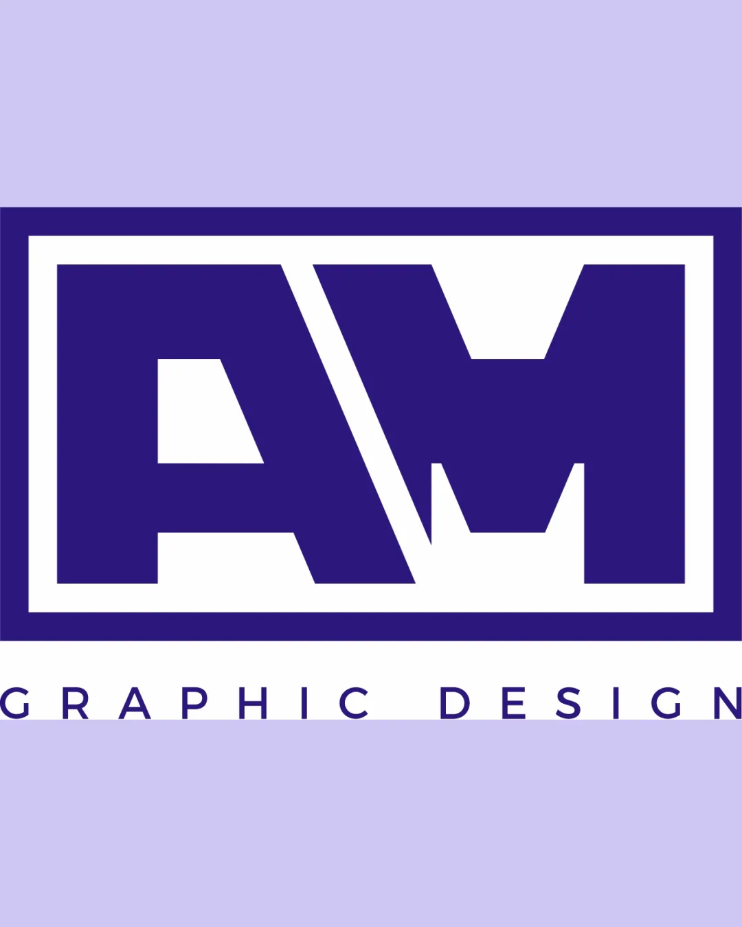
Try it Now!Logo review of AM, GRAPHIC DESIGN
 Logo analysis by AI
Logo type:
Style:
Detected symbol:
Detected text:
Business industry:
Review requested by Alvaro
**If AI can recognize or misinterpret it, so can people.
Structured logo review
Legibility
![]() Large, bold monogram is easily readable at larger sizes.
Large, bold monogram is easily readable at larger sizes.![]() Supporting text 'GRAPHIC DESIGN' is clear in a clean, sans-serif font.
Supporting text 'GRAPHIC DESIGN' is clear in a clean, sans-serif font.
![]() Diagonal slash separating A and M can make instant recognition slightly challenging at small sizes.
Diagonal slash separating A and M can make instant recognition slightly challenging at small sizes.![]() Monogram may appear crowded at significantly reduced scales.
Monogram may appear crowded at significantly reduced scales.
Scalability versatility
![]() Thick lines ensure strong presence on large formats like billboards and banners.
Thick lines ensure strong presence on large formats like billboards and banners.![]() Rectangular shape fits well on business cards and letterheads.
Rectangular shape fits well on business cards and letterheads.
![]() High level of detail and tight spacing in the monogram harms clarity at smaller sizes (e.g., social media profile icons, app favicons, merchandise embroidery).
High level of detail and tight spacing in the monogram harms clarity at smaller sizes (e.g., social media profile icons, app favicons, merchandise embroidery).![]() Thin margin between inner and outer borders may disappear or blur on small-scale outputs.
Thin margin between inner and outer borders may disappear or blur on small-scale outputs.
200x250 px
100×125 px
50×62 px
Balance alignment
![]() Rectangular framing provides structural stability.
Rectangular framing provides structural stability.![]() Bottom text is centered and visually aligned.
Bottom text is centered and visually aligned.
![]() The asymmetric angle between the A and M feels visually heavy on the right.
The asymmetric angle between the A and M feels visually heavy on the right.![]() Monogram dominates and makes the supporting text feel secondary and disconnected, especially due to the large gap.
Monogram dominates and makes the supporting text feel secondary and disconnected, especially due to the large gap.

Originality
![]() Diagonal cut and merging of A/M adds minor unique flair.
Diagonal cut and merging of A/M adds minor unique flair.![]() Bold, boxy style provides some distinctiveness.
Bold, boxy style provides some distinctiveness.
![]() Boxed monogram layouts are quite common in design-related industries.
Boxed monogram layouts are quite common in design-related industries.![]() Letterforms themselves are fairly standard except for the joining diagonal.
Letterforms themselves are fairly standard except for the joining diagonal.
Logomark wordmark fit
![]() Matching color palette and geometric font for subtext.
Matching color palette and geometric font for subtext.
![]() Wordmark is visually and spatially separated from the dominant monogram by a large gap, creating a sense of disconnect.
Wordmark is visually and spatially separated from the dominant monogram by a large gap, creating a sense of disconnect.![]() Typeface style of 'GRAPHIC DESIGN' is contemporary but visually lighter than the heavy monogram, causing a mismatch in visual weight.
Typeface style of 'GRAPHIC DESIGN' is contemporary but visually lighter than the heavy monogram, causing a mismatch in visual weight.
Aesthetic look
![]() Modern and commanding presence attracts initial attention.
Modern and commanding presence attracts initial attention.![]() Consistent color usage throughout.
Consistent color usage throughout.
![]() Visual heaviness and sharp inner angles can make it appear rigid.
Visual heaviness and sharp inner angles can make it appear rigid.![]() The thick strokes and sharp geometry may seem harsh or unrefined for some target audiences.
The thick strokes and sharp geometry may seem harsh or unrefined for some target audiences.
Dual meaning and misinterpretations
![]() No inappropriate or offensive shapes detected.
No inappropriate or offensive shapes detected.![]() Monogram is straightforward in its representation.
Monogram is straightforward in its representation.
Color harmony
![]() Limited palette ensures brand consistency and visual clarity.
Limited palette ensures brand consistency and visual clarity.![]() Good contrast between text and background elements.
Good contrast between text and background elements.
![]() No additional accent color limits flexibility for alternate backgrounds.
No additional accent color limits flexibility for alternate backgrounds.![]() Lavender background may reduce impact when used on all media.
Lavender background may reduce impact when used on all media.
Jacarta
#2E1881
White
#FFFFFF
Lavender
#D1C6F2


