Wondering how your logo performs? 🧐
Get professional logo reviews in seconds and catch design issues in time.
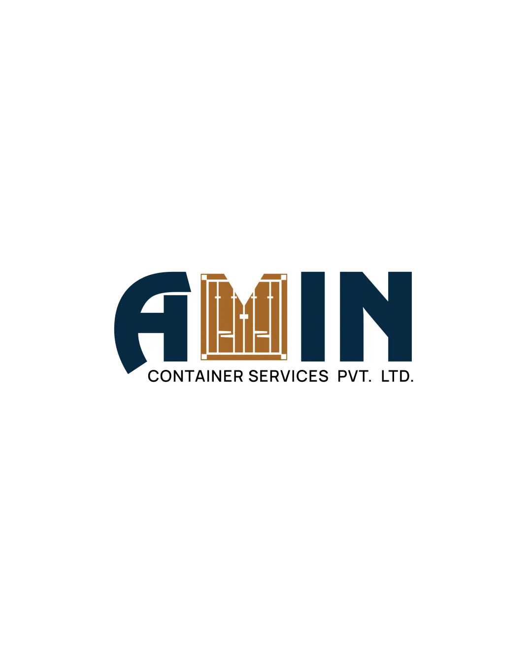
Try it Now!Logo review of AMIN CONTAINER SERVICES PVT. LTD.
 Logo analysis by AI
Logo type:
Style:
Detected symbol:
Detected text:
Business industry:
Review requested by Darshna
**If AI can recognize or misinterpret it, so can people.
Structured logo review
Legibility
![]() The word 'AMIN' is highly readable despite the custom styling.
The word 'AMIN' is highly readable despite the custom styling.![]() The subtext 'CONTAINER SERVICES PVT. LTD.' is clear and simple.
The subtext 'CONTAINER SERVICES PVT. LTD.' is clear and simple.
![]() The stylized 'M' may cause a slight pause for first-time viewers due to its integration with the container door symbol.
The stylized 'M' may cause a slight pause for first-time viewers due to its integration with the container door symbol.
Scalability versatility
![]() Bold letterforms support clarity at reduced sizes.
Bold letterforms support clarity at reduced sizes.![]() Simple color palette would reproduce well in print and embroidery.
Simple color palette would reproduce well in print and embroidery.
![]() The fine lines in the container door motif may get lost at small sizes such as favicons or small promotional items.
The fine lines in the container door motif may get lost at small sizes such as favicons or small promotional items.![]() Logo may lose its symbol detail on extremely small applications.
Logo may lose its symbol detail on extremely small applications.
200x250 px
100×125 px
50×62 px
Balance alignment
![]() Logomark is visually centered within the wordmark.
Logomark is visually centered within the wordmark.![]() Consistent baseline and letter height create a solid horizontal alignment.
Consistent baseline and letter height create a solid horizontal alignment.
![]() The 'M' appears visually heavier with the container lines, creating slight weight imbalance between letters.
The 'M' appears visually heavier with the container lines, creating slight weight imbalance between letters.

Originality
![]() Clever integration of container door into the 'M' is customized to the industry.
Clever integration of container door into the 'M' is customized to the industry.![]() Does not use common generic shipping or warehouse icons.
Does not use common generic shipping or warehouse icons.
![]() Letter integration is creative, but stylized container doors in letterforms are seen occasionally in the logistics sector.
Letter integration is creative, but stylized container doors in letterforms are seen occasionally in the logistics sector.
Logomark wordmark fit
![]() Container door seamlessly fits as the middle letter, bridging symbol with wordmark.
Container door seamlessly fits as the middle letter, bridging symbol with wordmark.![]() Visual style and weight are coherent between elements.
Visual style and weight are coherent between elements.
![]() Slight over-emphasis on the 'M' compared to other letters, possible dominance affecting balance.
Slight over-emphasis on the 'M' compared to other letters, possible dominance affecting balance.
Aesthetic look
![]() Strong, impactful presence with clean geometry and well-chosen colors.
Strong, impactful presence with clean geometry and well-chosen colors.![]() Modern type reflects professionalism.
Modern type reflects professionalism.
![]() Container graphic could be simplified to reduce possible busyness.
Container graphic could be simplified to reduce possible busyness.
Dual meaning and misinterpretations
![]() No inappropriate or misleading dual meanings detected.
No inappropriate or misleading dual meanings detected.![]() Symbol clearly refers to shipping container doors.
Symbol clearly refers to shipping container doors.
Color harmony
![]() Effective use of two strong, contrasting colors (teak and dark blue).
Effective use of two strong, contrasting colors (teak and dark blue).![]() Steady contrast between background and logo for clarity.
Steady contrast between background and logo for clarity.
Teak
#B7996E
Dark Blue
#13293D
White
#FFFFFF


