Wondering how your logo performs? 🧐
Get professional logo reviews in seconds and catch design issues in time.
Try it Now!Logo review of An Viên Farm
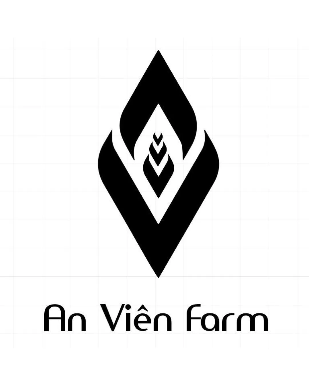
 Logo analysis by AI
Logo type:
Style:
Detected symbol:
Negative space:
Detected text:
Business industry:
Review requested by BinhQuan412
**If AI can recognize or misinterpret it, so can people.
Structured logo review
Legibility
Text is easy to read and clear with distinctive letterforms.
Good contrast between text color and background.
The unconventional font could cause slight confusion for quick glances, particularly with the 'a', 'n', and 'f'.
Scalability versatility
Bold, simple shapes allow for decent scalability in most sizes.
Works well in monochrome for embroidery, stamps, and simple signage.
The intricate nested shapes might blur or merge when scaled down to favicon size or small labels.
Thin outlines within the wheat element may lose clarity in small-format uses.

200x250 px

100×125 px

50×62 px
Balance alignment
Logo mark and wordmark are centrally aligned.
Symmetry within the logo mark creates a sense of balance.


Originality
Uses abstract and agricultural cues in a unique, stylized format.
Employs negative space creatively within a geometric symbol.
Diamond frames are common in logos, though the wheat integration adds distinction.
Logomark wordmark fit
Both logomark and wordmark share similar visual weight and geometric style.
Overall, the text complements the strong, sharp lines of the symbol.
The custom font has an unusual style that is slightly less organic compared to the agricultural symbol.
Aesthetic look
Clean, bold, and contemporary aesthetic without unnecessary decoration.
Minimal color use helps retain a timeless look.
Some might find the nested diamond shapes overly sharp for an agriculture brand, potentially making the mark look less organic and a bit corporate.
Dual meaning and misinterpretations
No inappropriate or controversial shapes detected.
Symbol is abstract, but supports the intended farm/crop theme.
Color harmony
Black and white palette ensures maximum flexibility and brand recognition.
No color clashes; simple and strong visual impact.
Black
#000000
White
#FFFFFF

