View review
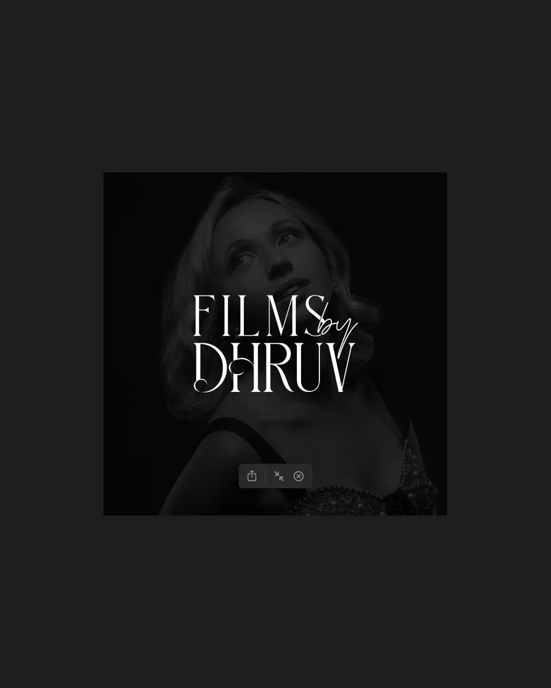
Logo review ofFilms By Dhruv
Review the detailed scores below to see what is working and what should be refined first.
Logo performance breakdown
Legibility
Primary text 'FILMS' and 'DHRUV' is in uppercase, serif font, contributing to readability.
Contrast between white text and dark background helps with visibility.
The handwritten 'by' is very thin and small, causing it to be less legible, especially at smaller sizes.
Overlap of the handwritten word with the main text creates visual clutter.

Originality
Mix of elegant serif and handwritten script adds a signature, personalized touch.
Use of classic serif and handwritten mix is relatively common in film and photography industries.
No distinct or unique logomark or custom element to create a memorable brand identity.
Color harmony
Monochromatic palette offers timeless elegance.
Excellent contrast ensures visual impact.
White
#FFFFFF
Shark
#181818
Black
#000000
Balance alignment
Serif typography for the main text provides symmetry and visual hierarchy.
The 'by' appears almost squeezed between 'FILMS' and 'DHRUV', disrupting vertical balance.
No strong alignment lines; placement feels slightly arbitrary and unanchored.
Scalability
High-contrast color scheme is suitable for film intros and digital applications.
Thin strokes in the handwritten 'by' will not scale well on business cards, merchandise, or favicons.
Complexity of overlaid elements may get lost or become unreadable at small sizes.
Does not translate well onto embroidery, where thin elements disappear.
200x250 px
100×125 px
50×62 px
Misinterpretations
No inappropriate or ambiguous symbols detected.
Wondering how your logo performs?
Get a clear logo score, key risks, and priority fix ideas before your client or audience sees it.