Wondering how your logo performs? 🧐
Get professional logo reviews in seconds and catch design issues in time.
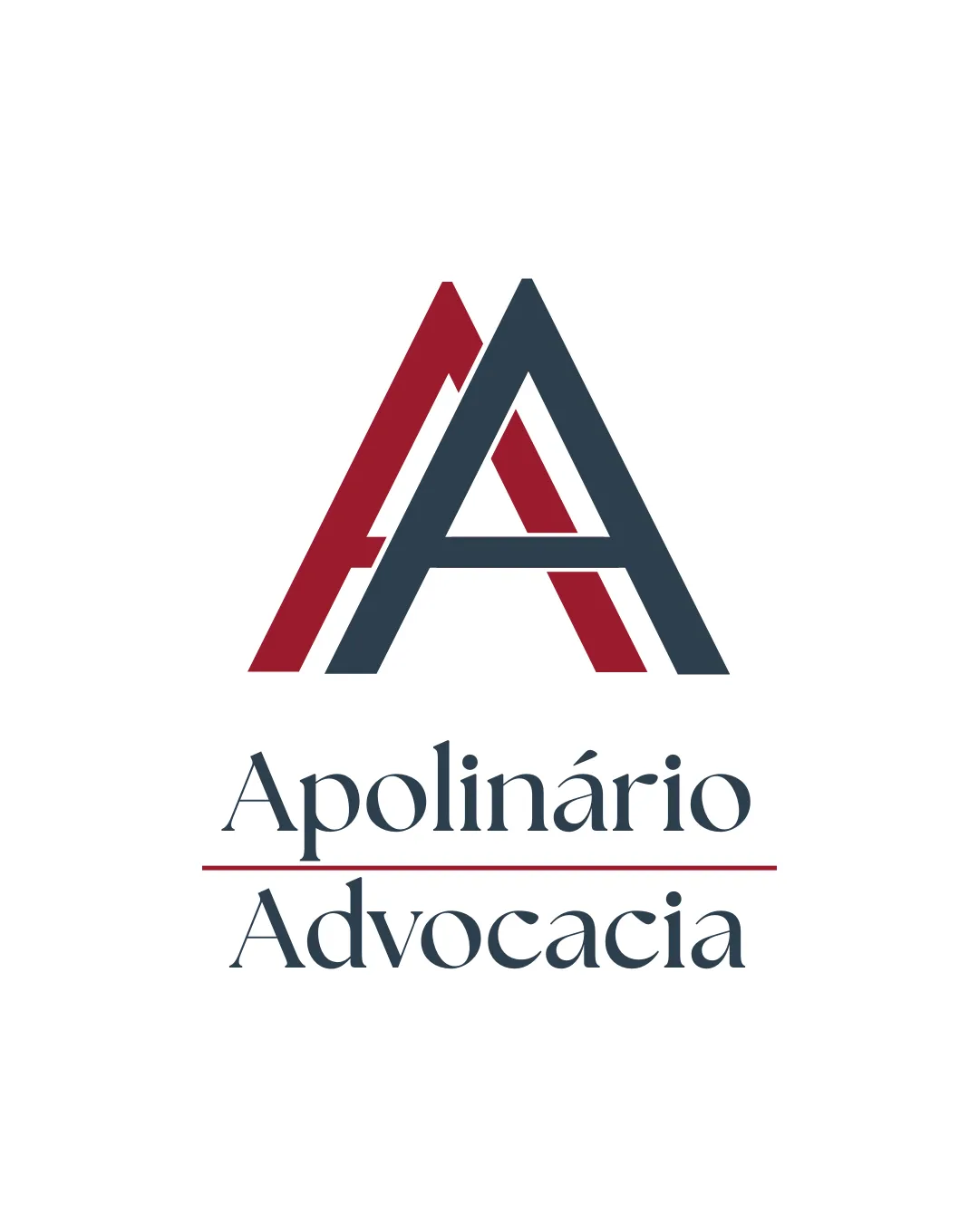
Try it Now!Logo review of Apolinário Advocacia
 Logo analysis by AI
Logo type:
Style:
Detected symbol:
Negative space:
Detected text:
Business industry:
Review requested by Legalzinho
**If AI can recognize or misinterpret it, so can people.
Structured logo review
Legibility
![]() Text is set in a classic serif typeface, providing strong readability.
Text is set in a classic serif typeface, providing strong readability.![]() High contrast between text color and background.
High contrast between text color and background.![]() Diacritics on the word 'Apolinário' are clear.
Diacritics on the word 'Apolinário' are clear.
Scalability versatility
![]() Monogram is simple and should scale well for most applications including letterheads and business cards.
Monogram is simple and should scale well for most applications including letterheads and business cards.![]() Logo will work on digital media and legal documents.
Logo will work on digital media and legal documents.
![]() Thin lines on the monogram may lose clarity at extremely small sizes, such as favicons or embroidery.
Thin lines on the monogram may lose clarity at extremely small sizes, such as favicons or embroidery.![]() Multiple elements require careful adjustments in smaller applications.
Multiple elements require careful adjustments in smaller applications.
200x250 px
100×125 px
50×62 px
Balance alignment
![]() Monogram is centered over the wordmark, creating a unified vertical alignment.
Monogram is centered over the wordmark, creating a unified vertical alignment.![]() Spacing between symbol, text, and line is mostly proportional.
Spacing between symbol, text, and line is mostly proportional.
![]() Red horizontal line slightly interrupts the flow between the text elements.
Red horizontal line slightly interrupts the flow between the text elements.![]() Monogram could feel slightly heavier than the wordmark at first glance.
Monogram could feel slightly heavier than the wordmark at first glance.

Originality
![]() Double 'A' monogram is appropriate for the brand and somewhat customized.
Double 'A' monogram is appropriate for the brand and somewhat customized.![]() Negative space helps define the letterforms distinctly.
Negative space helps define the letterforms distinctly.
![]() Double-letter monogram is a common approach in the legal sector and not highly unique.
Double-letter monogram is a common approach in the legal sector and not highly unique.![]() No additional creative twists or industry-specific symbolism.
No additional creative twists or industry-specific symbolism.
Logomark wordmark fit
![]() Color palette and line thickness are mostly consistent between monogram and typeface.
Color palette and line thickness are mostly consistent between monogram and typeface.![]() Both elements create a professional impression.
Both elements create a professional impression.
![]() The substantial monogram slightly overpowers the elegant wordmark, impacting harmony.
The substantial monogram slightly overpowers the elegant wordmark, impacting harmony.
Aesthetic look
![]() Clean and professional appearance with a minimal, refined palette.
Clean and professional appearance with a minimal, refined palette.![]() Typography adds a traditional touch, suitable for the industry.
Typography adds a traditional touch, suitable for the industry.
![]() Red line is a little abrupt visually and does not add much value to the composition.
Red line is a little abrupt visually and does not add much value to the composition.
Dual meaning and misinterpretations
![]() No inappropriate or misleading shapes detected.
No inappropriate or misleading shapes detected.![]() Visual language is clear and suitable for the industry.
Visual language is clear and suitable for the industry.
Color harmony
![]() Limited to two strong, contrasting colors with excellent harmony.
Limited to two strong, contrasting colors with excellent harmony.![]() Colors evoke professionalism and authority.
Colors evoke professionalism and authority.
Cabernet
#B02B3D
Charcoal
#2E3944
White
#FFFFFF


