 View review
Logo score
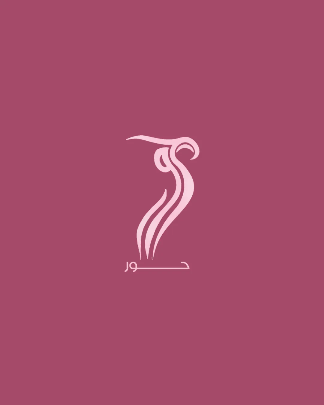
Logo review ofArabic Script Below The Symbol
Review the detailed scores below to see what is working and what should be refined first.
Legibility
Originality
Misread
Balance
Scale
Detailed review
Logo performance breakdown
Legibility
![]() Text is present and readable for those familiar with Arabic script.
Text is present and readable for those familiar with Arabic script.![]() Good color contrast between text and background.
Good color contrast between text and background.
![]() Non-Arabic speakers will not recognize the name, which limits universality.
Non-Arabic speakers will not recognize the name, which limits universality.![]() Text size is relatively small compared to the symbol and could be hard to read at small scales.
Text size is relatively small compared to the symbol and could be hard to read at small scales.
Originality
![]() Abstract feminine figure shows a distinctive style.
Abstract feminine figure shows a distinctive style.![]() Symbolic and elegant form is not commonly used.
Symbolic and elegant form is not commonly used.
![]() Abstract femininity as a motif is somewhat common within the beauty/wellness industry, but this execution stands out with its unique curves and artistry.
Abstract femininity as a motif is somewhat common within the beauty/wellness industry, but this execution stands out with its unique curves and artistry.
Color harmony
![]() Excellent color harmony with two complementary shades of pink.
Excellent color harmony with two complementary shades of pink.![]() Contrast is well maintained.
Contrast is well maintained.![]() Appropriate for the intended industry and target audience.
Appropriate for the intended industry and target audience.
Rose Taupe
#B35C78
Chantilly
#E0A7B2
Balance alignment
![]() Central alignment provides some visual stability.
Central alignment provides some visual stability.![]() Symbol sits directly above the wordmark.
Symbol sits directly above the wordmark.
![]() Symbol is visually much larger and heavier than the wordmark, making the composition feel top-heavy.
Symbol is visually much larger and heavier than the wordmark, making the composition feel top-heavy.![]() The flowing design of the symbol and the rigidity of the text create a disjointed transition.
The flowing design of the symbol and the rigidity of the text create a disjointed transition.

Scalability
![]() Simple color palette supports basic reproduction.
Simple color palette supports basic reproduction.![]() Minimal gradients aid clarity.
Minimal gradients aid clarity.
![]() Fine, thin lines in the symbol may vanish at small sizes, such as business cards or embroidery.
Fine, thin lines in the symbol may vanish at small sizes, such as business cards or embroidery.![]() Small text below may become illegible in small-scale applications.
Small text below may become illegible in small-scale applications.![]() Works best on monochrome backgrounds, may lose impact on diverse backdrops.
Works best on monochrome backgrounds, may lose impact on diverse backdrops.
200x250 px
100×125 px
50×62 px
Misinterpretations
![]() Abstract representation is tasteful and carefully executed; no explicit or inappropriate symbols detected.
Abstract representation is tasteful and carefully executed; no explicit or inappropriate symbols detected.
Symbol & text fit
![]() Both elements use similar pink tones, supporting some visual cohesion.
Both elements use similar pink tones, supporting some visual cohesion.
![]() Stylistic mismatch between the flowing, organic curves of the symbol and the geometric minimalism of the wordmark.
Stylistic mismatch between the flowing, organic curves of the symbol and the geometric minimalism of the wordmark.
![]() Sizing and positioning create a sense of imbalance, with the symbol overpowering the text.
Sizing and positioning create a sense of imbalance, with the symbol overpowering the text.
Try your own review
Review my logo
Wondering how your logo performs?
Get a clear logo score, key risks, and priority fix ideas before your client or audience sees it.
Keep exploring


