Wondering how your logo performs? 🧐
Get professional logo reviews in seconds and catch design issues in time.
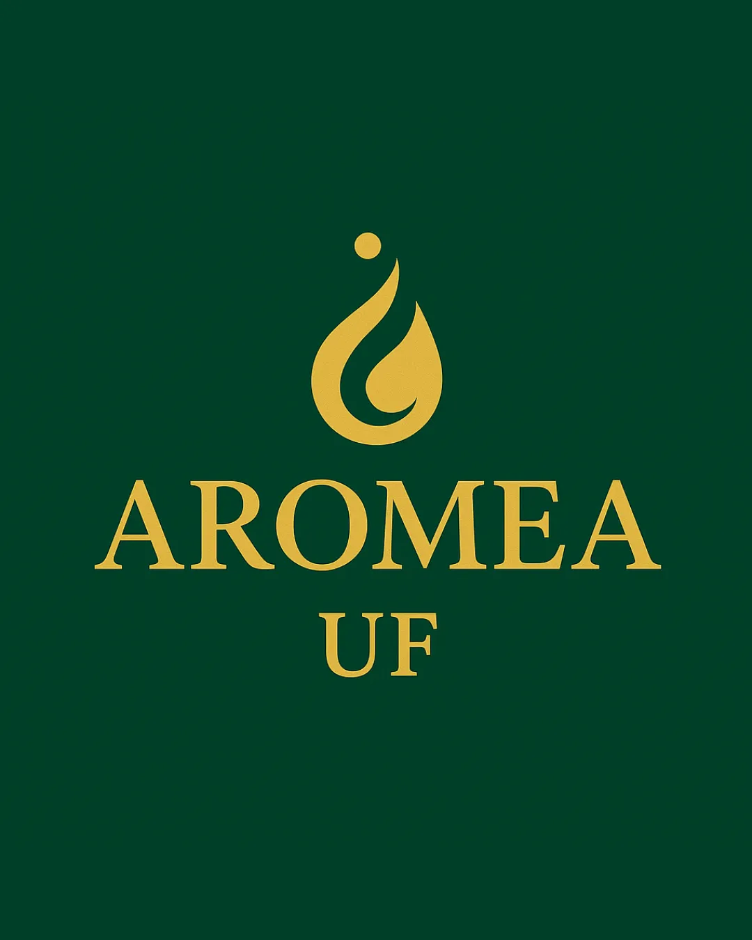
Try it Now!Logo review of AROMEA UF
 Logo analysis by AI
Logo type:
Style:
Detected symbol:
Negative space:
Detected text:
Business industry:
Review requested by EldinAlmhult
**If AI can recognize or misinterpret it, so can people.
Structured logo review
Legibility
![]() Text is sharp and highly readable with classic serif styling
Text is sharp and highly readable with classic serif styling![]() Excellent contrast against a dark background ensures clarity
Excellent contrast against a dark background ensures clarity
Scalability versatility
![]() Simple, bold forms allow for reduction without major loss of clarity
Simple, bold forms allow for reduction without major loss of clarity![]() Symbol is geometrically solid for embroidery and small sizes
Symbol is geometrically solid for embroidery and small sizes
![]() Fine inner curve in the symbol may blur on very small applications like favicons
Fine inner curve in the symbol may blur on very small applications like favicons![]() Two-line text configuration may be challenging for extremely horizontal or vertical formats
Two-line text configuration may be challenging for extremely horizontal or vertical formats
200x250 px
100×125 px
50×62 px
Balance alignment
![]() Symbol is centered and visually balanced above text
Symbol is centered and visually balanced above text![]() Text alignment is precise with equal emphasis on AROMEA and UF
Text alignment is precise with equal emphasis on AROMEA and UF

Originality
![]() Drop shape and swirl suggest aroma or essence in a refined way
Drop shape and swirl suggest aroma or essence in a refined way![]() Elegance added with classical serif font and restrained symbol
Elegance added with classical serif font and restrained symbol
![]() Drop/swirl motif is relatively common in wellness/aroma industries, so little risk-taking
Drop/swirl motif is relatively common in wellness/aroma industries, so little risk-taking
Logomark wordmark fit
![]() Visual weight and style of symbol match the elegance of the wordmark
Visual weight and style of symbol match the elegance of the wordmark![]() The gold color is consistent across both elements
The gold color is consistent across both elements
Aesthetic look
![]() Sleek, uncluttered, and visually harmonious
Sleek, uncluttered, and visually harmonious![]() Luxury is reinforced by gold on green
Luxury is reinforced by gold on green
Dual meaning and misinterpretations
![]() No inappropriate or ambiguous forms detected
No inappropriate or ambiguous forms detected
Color harmony
![]() Restrained two-color palette exudes sophistication and calm
Restrained two-color palette exudes sophistication and calm![]() Excellent gold-green pairing for luxury segment
Excellent gold-green pairing for luxury segment
Evergreen
#20513B
Goldenrod
#D4BA62


