 View review
Logo score
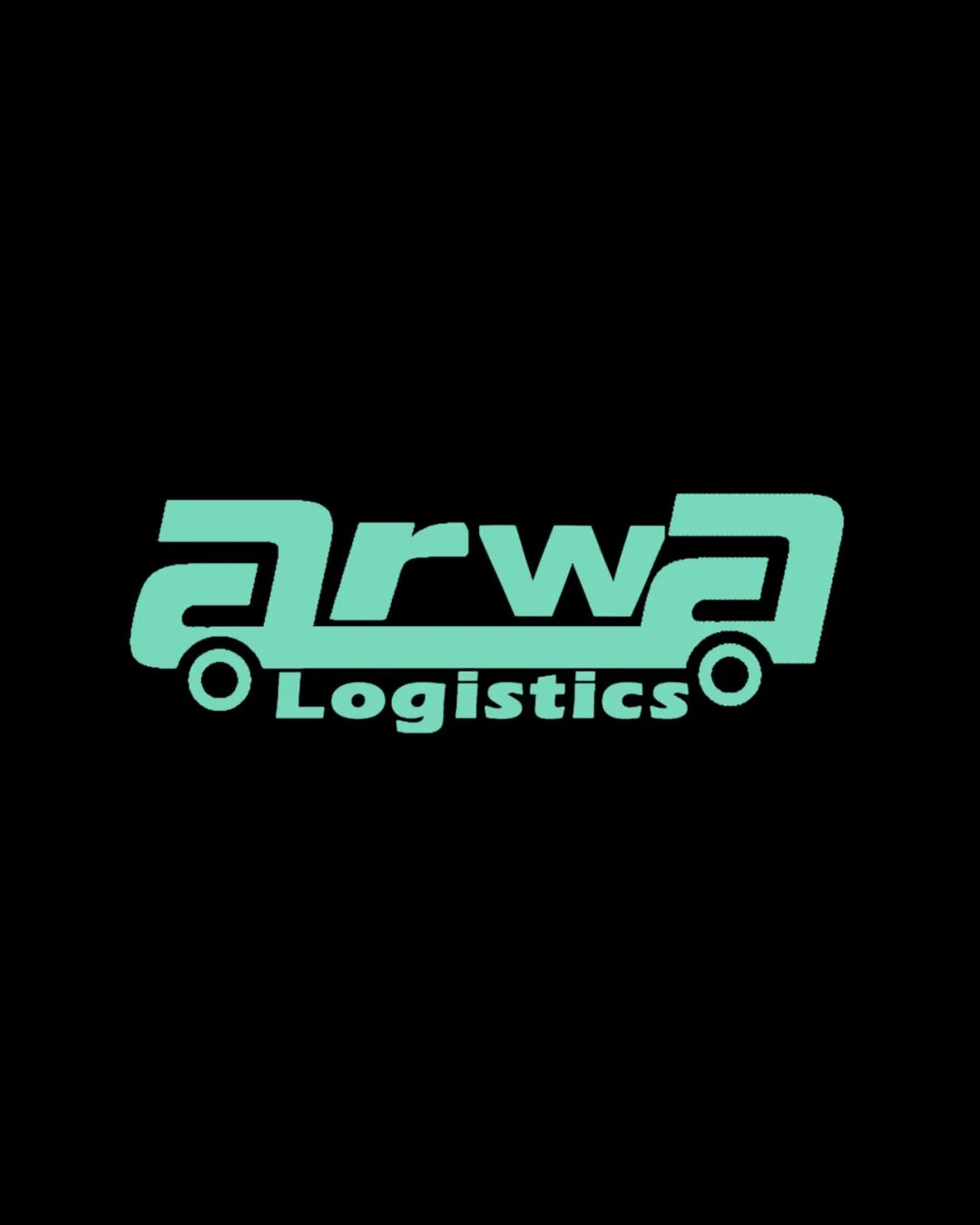
Logo review ofArwa Logistics
Review the detailed scores below to see what is working and what should be refined first.
Legibility
Originality
Misread
Balance
Scale
Detailed review
Logo performance breakdown
Legibility
![]() Brand name and descriptor are clearly readable.
Brand name and descriptor are clearly readable.![]() Typographic style is bold, aiding legibility.
Typographic style is bold, aiding legibility.
![]() The integration of 'arwa' into the vehicle form slightly compromises the natural reading flow, particularly with the extended terminals.
The integration of 'arwa' into the vehicle form slightly compromises the natural reading flow, particularly with the extended terminals.![]() The overlapping elements and integrated circles can distract from quick word recognition.
The overlapping elements and integrated circles can distract from quick word recognition.
Originality
![]() Clever integration of word and industry-relevant vehicle silhouette is unique.
Clever integration of word and industry-relevant vehicle silhouette is unique.![]() The use of letterforms as vehicle body is creative and less commonly seen in the industry.
The use of letterforms as vehicle body is creative and less commonly seen in the industry.
![]() While visually unique, vehicle-shaped wordmarks are not entirely novel within logistics—moderately original due to concept execution rather than raw idea.
While visually unique, vehicle-shaped wordmarks are not entirely novel within logistics—moderately original due to concept execution rather than raw idea.
Color harmony
![]() Simple two-color scheme ensures clarity and high-contrast visibility.
Simple two-color scheme ensures clarity and high-contrast visibility.![]() Harmonious pairing of turquoise and black.
Harmonious pairing of turquoise and black.
Turquoise
#6be3d6
Black
#000000
Balance alignment
![]() Baseline of primary word is aligned to wheels, creating unified artistry.
Baseline of primary word is aligned to wheels, creating unified artistry.![]() Good visual weight across the composition.
Good visual weight across the composition.
![]() 'Logistics' placement under the baseline feels slightly off-balance versus the heavy, extended top line of 'arwa'.
'Logistics' placement under the baseline feels slightly off-balance versus the heavy, extended top line of 'arwa'.![]() The left and right extended terminals are not symmetrically balanced, making the wordmark heavier on the right side.
The left and right extended terminals are not symmetrically balanced, making the wordmark heavier on the right side.

Scalability
![]() Simple color palette aids scaling.
Simple color palette aids scaling.![]() Will be legible on larger formats like truck signage and billboards.
Will be legible on larger formats like truck signage and billboards.
![]() Fine details on small scales (such as business cards or favicons) may blend together, especially the wheels and extended lines.
Fine details on small scales (such as business cards or favicons) may blend together, especially the wheels and extended lines.![]() The detailed integration would be hard to reproduce cleanly in embroidery or on very small promotional objects.
The detailed integration would be hard to reproduce cleanly in embroidery or on very small promotional objects.
200x250 px
100×125 px
50×62 px
Misinterpretations
![]() No inappropriate or ambiguous imagery detected, automotive form is clear.
No inappropriate or ambiguous imagery detected, automotive form is clear.
Symbol & text fit
![]() Stylization matches the industry context, and the integration feels intentional.
Stylization matches the industry context, and the integration feels intentional.
![]() Consistent color and stroke weight between wordmark and illustrative elements.
Consistent color and stroke weight between wordmark and illustrative elements.
![]() The secondary line 'Logistics' feels slightly less integrated stylistically and spatially, compared to the primary wordmark.
The secondary line 'Logistics' feels slightly less integrated stylistically and spatially, compared to the primary wordmark.
Try your own review
Review my logo
Wondering how your logo performs?
Get a clear logo score, key risks, and priority fix ideas before your client or audience sees it.
Keep exploring


