 View review
Logo score
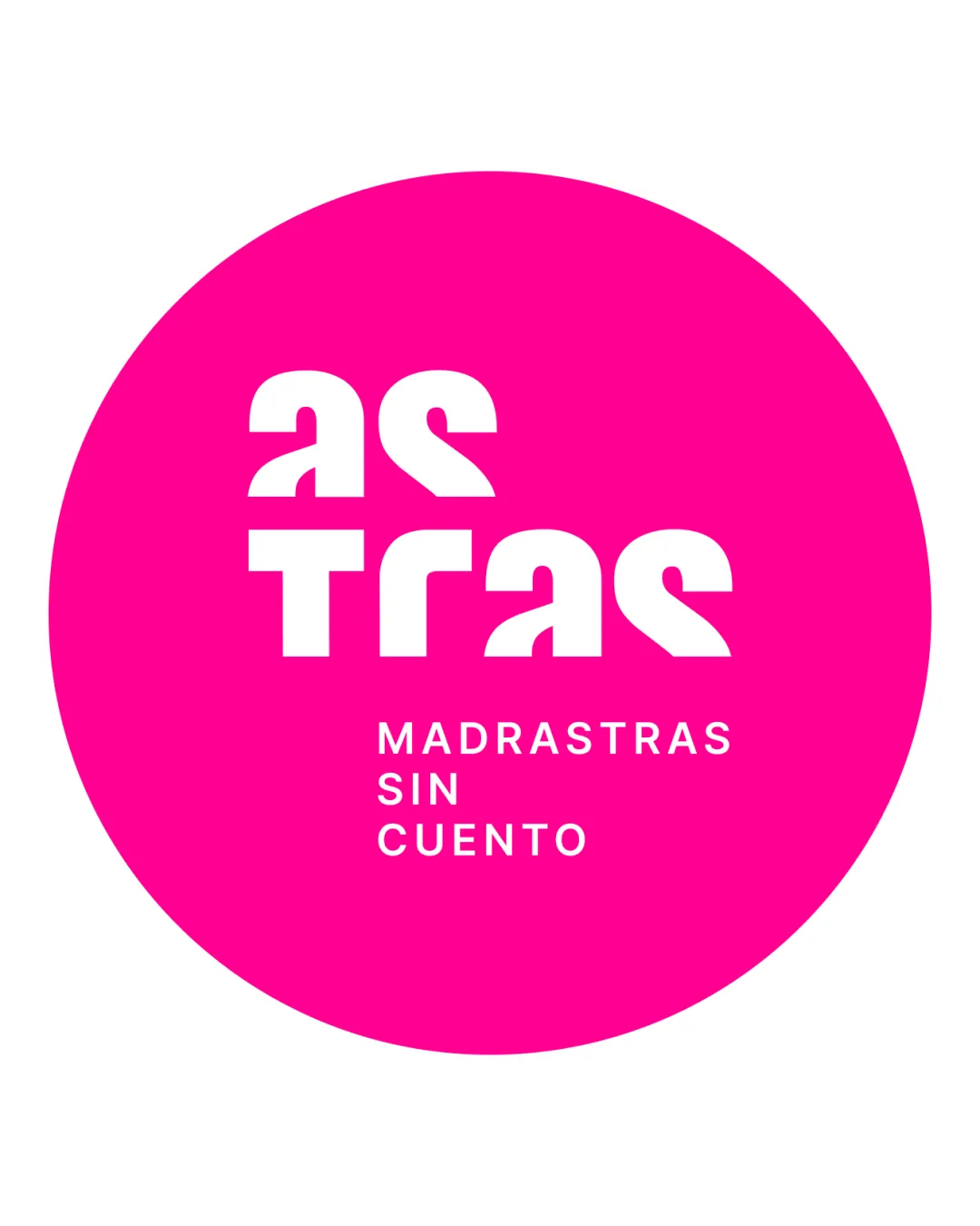
Logo review ofAs Tras Madrastras Sin Cuento
Review the detailed scores below to see what is working and what should be refined first.
Legibility
Originality
Misread
Balance
Scale
Detailed review
Logo performance breakdown
Legibility
![]() The uppercase geometric construction is bold and visually striking.
The uppercase geometric construction is bold and visually striking.![]() Subtext (MADRASTRAS SIN CUENTO) is very clear and readable.
Subtext (MADRASTRAS SIN CUENTO) is very clear and readable.
![]() The primary wordmark 'as TRas' is difficult to decipher at first glance due to abstracted letterforms.
The primary wordmark 'as TRas' is difficult to decipher at first glance due to abstracted letterforms.![]() Letter 'a' and 's' are heavily stylized, making instant recognition problematic.
Letter 'a' and 's' are heavily stylized, making instant recognition problematic.![]() Disjointed alignment between 'as' and 'TRas' further disrupts reading flow.
Disjointed alignment between 'as' and 'TRas' further disrupts reading flow.
Originality
![]() Highly original geometric customization of letterforms.
Highly original geometric customization of letterforms.![]() Unconventional approach grabs attention and establishes unique brand character.
Unconventional approach grabs attention and establishes unique brand character.
![]() Creativity comes at the expense of immediate legibility.
Creativity comes at the expense of immediate legibility.![]() No use of distinctive negative space or hidden meanings.
No use of distinctive negative space or hidden meanings.
Color harmony
![]() Only two strongly contrasting and complementary colors used.
Only two strongly contrasting and complementary colors used.![]() Color pair is energetic yet clear, creating maximum impact.
Color pair is energetic yet clear, creating maximum impact.
Magenta
#FF18A3
White
#FFFFFF
Balance alignment
![]() Centered composition gives a stable feel.
Centered composition gives a stable feel.![]() Circle creates a clear boundary and visual unity.
Circle creates a clear boundary and visual unity.
![]() The visual weight of 'TRas' overpowers 'as', leading to a top-heavy composition.
The visual weight of 'TRas' overpowers 'as', leading to a top-heavy composition.![]() Alignment of abstract wordmark and body text is slightly disjointed.
Alignment of abstract wordmark and body text is slightly disjointed.

Scalability
![]() Simple color palette and bold forms make it visible at large sizes and in digital applications.
Simple color palette and bold forms make it visible at large sizes and in digital applications.![]() Circle container offers a clean and contained shape for social media avatars.
Circle container offers a clean and contained shape for social media avatars.
![]() Small details in the abstract letterforms may get lost at tiny sizes.
Small details in the abstract letterforms may get lost at tiny sizes.![]() Fine text 'MADRASTRAS SIN CUENTO' may become unreadable on small or low-resolution print executions.
Fine text 'MADRASTRAS SIN CUENTO' may become unreadable on small or low-resolution print executions.![]() Logo might not translate well into embroidery due to thin white secondary text.
Logo might not translate well into embroidery due to thin white secondary text.
200x250 px
100×125 px
50×62 px
Misinterpretations
![]() No inappropriate or confusing hidden imagery detected.
No inappropriate or confusing hidden imagery detected.
Try your own review
Review my logo
Wondering how your logo performs?
Get a clear logo score, key risks, and priority fix ideas before your client or audience sees it.
Keep exploring


