Wondering how your logo performs? 🧐
Get professional logo reviews in seconds and catch design issues in time.
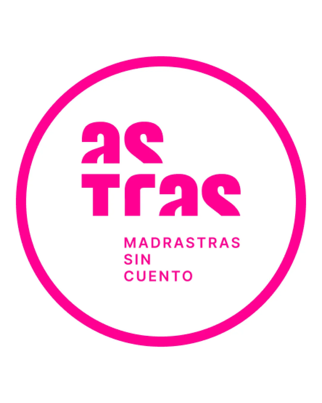
Try it Now!Logo review of as tras MADRASTRAS SIN CUENTO
 Logo analysis by AI
Logo type:
Style:
Detected symbol:
Detected text:
Business industry:
Review requested by Ivan_rf
**If AI can recognize or misinterpret it, so can people.
Structured logo review
Legibility
Clear separation between main word and tagline
Tagline uses a simple, readable sans-serif font
Primary wordmark uses experimental letterforms that are difficult to decipher at first glance
Some characters ('a', 's', 'T', 'r', 'a', 's') are abstracted to the point of confusion
Brand name's readability is significantly compromised due to the unconventional typeface
Scalability versatility
Bold lines and high contrast enhance visibility at large sizes (e.g. posters, billboards)
Single color ensures it is printable on a variety of backgrounds
Excessive abstraction in the main wordmark could become illegible at small sizes (e.g. business cards, social media avatars)
Thin tagline text may get lost in small reproduction

200x250 px

100×125 px

50×62 px
Balance alignment
Circular framing gives visual stability
Vertical and horizontal alignment is precise
Tagline is neatly centered and well proportioned beneath main word
Heavier geometric wordmark creates imbalance against lighter tagline
Upper and lower halves feel slightly disconnected due to differing font weights/styles


Originality
Highly distinctive type design gives the brand a unique, memorable aesthetic
Breaks away from generic wordmark conventions
Abstracted letterforms risk alienating users unfamiliar with the name
Design could be seen as prioritizing style over clarity
Aesthetic look
Vivid, energetic color injects personality, making the logo visually compelling
Modern geometric type aligns with a forward-thinking, contemporary feel
Visual appeal is hampered by difficult legibility in the main brand name
Circular border feels somewhat generic and adds little distinctiveness
Dual meaning and misinterpretations
No inappropriate dual meanings or misinterpretations detected
Typography is abstract but not offensive
Color harmony
Monochromatic palette ensures high contrast and strong visual impact
Color scheme is simple and harmonious
Vivid Pink
#FF0099
White
#FFFFFF

