Wondering how your logo performs? 🧐
Get professional logo reviews in seconds and catch design issues in time.
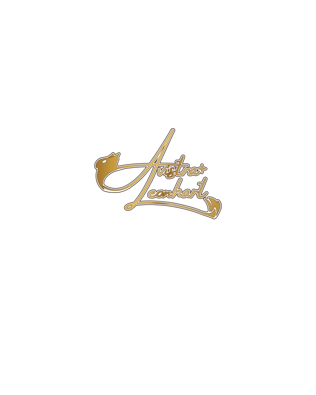
Try it Now!Logo review of Austra Leonhart
 Logo analysis by AI
Logo type:
Style:
Detected symbol:
Detected text:
Business industry:
Review requested by Riku
**If AI can recognize or misinterpret it, so can people.
Structured logo review
Legibility
![]() unique calligraphic style
unique calligraphic style
![]() text may be difficult to read at smaller sizes
text may be difficult to read at smaller sizes![]() intricate script reduces clarity
intricate script reduces clarity
Scalability versatility
![]() distinctive style could stand out on large print formats
distinctive style could stand out on large print formats
![]() complex details might not reproduce well in smaller applications, like business cards
complex details might not reproduce well in smaller applications, like business cards
200x250 px
100×125 px
50×62 px
Balance alignment
![]() well-integrated symbol and text
well-integrated symbol and text![]() good flow between elements
good flow between elements

Originality
![]() unique combination of a calligraphic style with a bird symbol
unique combination of a calligraphic style with a bird symbol
![]() bird symbols are somewhat common in logos
bird symbols are somewhat common in logos
Logomark wordmark fit
![]() harmonious integration with the text
harmonious integration with the text
Aesthetic look
![]() elegant calligraphic appearance
elegant calligraphic appearance
![]() busyness due to complex script
busyness due to complex script
Dual meaning and misinterpretations
Color harmony
![]() simple gold color is elegant and classy
simple gold color is elegant and classy
![]() might be difficult to see on certain backgrounds
might be difficult to see on certain backgrounds


