Wondering how your logo performs? 🧐
Get professional logo reviews in seconds and catch design issues in time.
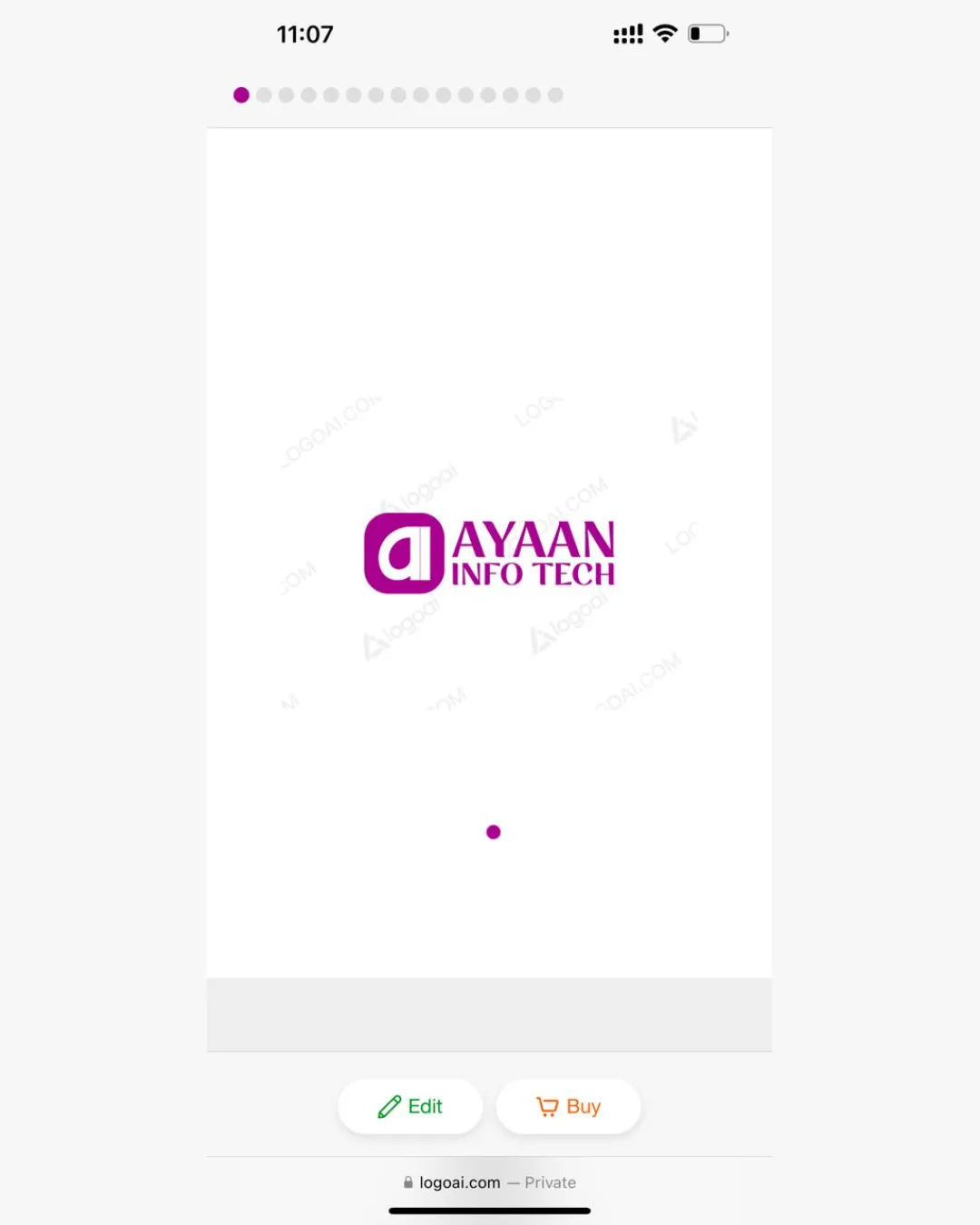
Try it Now!Logo review of AYAAN INFO TECH
 Logo analysis by AI
Recognized style:
Logo type:
Detected symbol:
Detected text:
Business industry:
Review requested by Muhib
**If AI can recognize or misinterpret it, so can people.
Structured logo review
Legibility
![]() The business name AYAAN INFO TECH is clear and readable.
The business name AYAAN INFO TECH is clear and readable.
![]() The tagline font is smaller and might be less legible from a distance.
The tagline font is smaller and might be less legible from a distance.
Scalability versatility
![]() The bold logomark ensures good scalability across different platforms.
The bold logomark ensures good scalability across different platforms.
![]() The fine elements in the text may lose clarity when scaled down.
The fine elements in the text may lose clarity when scaled down.
200x250 px
100×125 px
50×62 px
Balance alignment
![]() The logomark and wordmark have balanced alignment.
The logomark and wordmark have balanced alignment.

Originality
![]() The use of a rounded square with an 'a' adds a unique touch.
The use of a rounded square with an 'a' adds a unique touch.
![]() The symbol itself is not very distinctive for the tech industry.
The symbol itself is not very distinctive for the tech industry.
Logomark wordmark fit
![]() The text and symbol complement each other well.
The text and symbol complement each other well.
![]() The symbol could be slightly more integrated with the brand name for cohesion.
The symbol could be slightly more integrated with the brand name for cohesion.
Aesthetic look
![]() The logo has a clean and professional aesthetic.
The logo has a clean and professional aesthetic.
![]() The spacing between elements could be adjusted for better symmetry.
The spacing between elements could be adjusted for better symmetry.
Cultural sensitivity dual meaning
![]() No cultural sensitivity issues detected.
No cultural sensitivity issues detected.
Color harmony
![]() The purple color is vibrant and energetic, suitable for a tech brand.
The purple color is vibrant and energetic, suitable for a tech brand.
![]() A single color approach might limit versatility in different backgrounds.
A single color approach might limit versatility in different backgrounds.


