Wondering how your logo performs? 🧐
Get professional logo reviews in seconds and catch design issues in time.
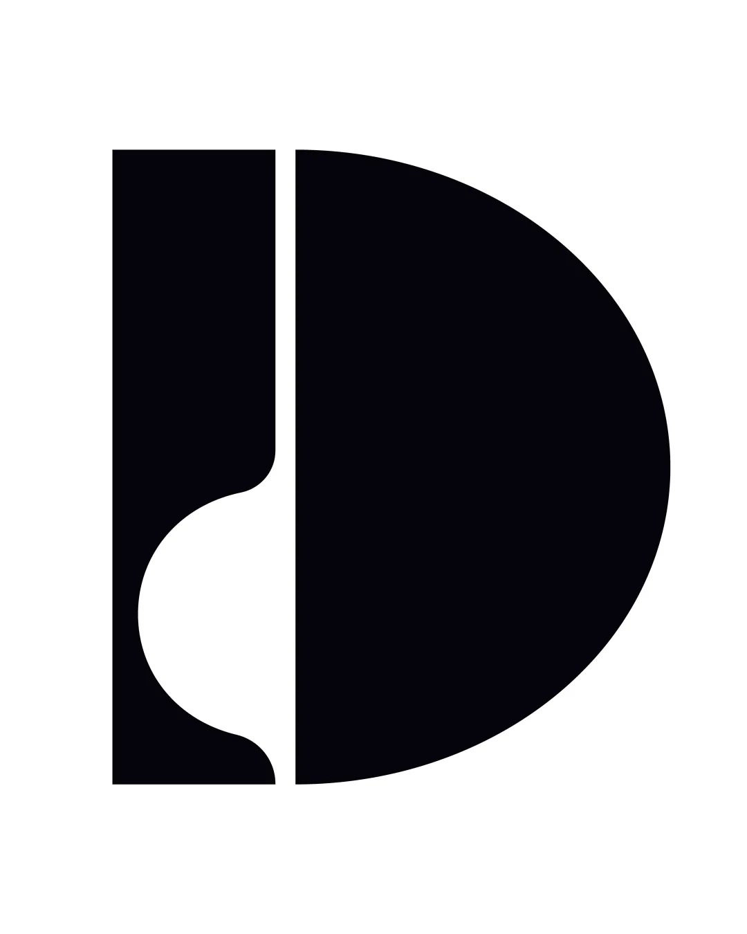
Try it Now!Logo review of B, D
 Logo analysis by AI
Logo type:
Style:
Detected symbol:
Negative space:
Detected text:
Business industry:
Review requested by Ff-fAA123
**If AI can recognize or misinterpret it, so can people.
Structured logo review
Legibility
![]() Distinct and readable letterforms B and D.
Distinct and readable letterforms B and D.![]() Strong contrast enhances clarity.
Strong contrast enhances clarity.
Scalability versatility
![]() Bold geometric shapes ensure clarity at all sizes.
Bold geometric shapes ensure clarity at all sizes.![]() No thin lines or intricate details that could get lost at small scales.
No thin lines or intricate details that could get lost at small scales.![]() Versatile for mockups such as business cards, digital icons, and signage.
Versatile for mockups such as business cards, digital icons, and signage.
200x250 px
100×125 px
50×62 px
Balance alignment
![]() Symmetrical design with visual weight evenly distributed.
Symmetrical design with visual weight evenly distributed.![]() Geometric balance between left and right elements.
Geometric balance between left and right elements.
![]() The division between the B and D creates a strong vertical split, which may feel slightly stiff or static.
The division between the B and D creates a strong vertical split, which may feel slightly stiff or static.

Originality
![]() Creative use of negative space within the geometric form.
Creative use of negative space within the geometric form.![]() The integration of the two letters is visually interesting.
The integration of the two letters is visually interesting.
![]() The approach of combining two letterforms geometrically is increasingly common and may, at a glance, lack distinctiveness without complementary branding.
The approach of combining two letterforms geometrically is increasingly common and may, at a glance, lack distinctiveness without complementary branding.
Aesthetic look
![]() Clean, bold, and contemporary appearance.
Clean, bold, and contemporary appearance.![]() Minimalist approach offers broad appeal.
Minimalist approach offers broad appeal.
![]() The overall shape could be interpreted as a bit generic in the monogram category.
The overall shape could be interpreted as a bit generic in the monogram category.
Dual meaning and misinterpretations
![]() No inappropriate or accidental iconography detected.
No inappropriate or accidental iconography detected.![]() Clear representation of intended letterforms.
Clear representation of intended letterforms.
Color harmony
![]() Restrained black-and-white palette is timeless and effective.
Restrained black-and-white palette is timeless and effective.![]() No color clashes or excess use of color.
No color clashes or excess use of color.
Black
#000000
White
#FFFFFF


