 View review
Logo score
Logo review ofB
Review the detailed scores below to see what is working and what should be refined first.
Legibility
Originality
Misread
Balance
Scale
Detailed review
Logo performance breakdown
Legibility
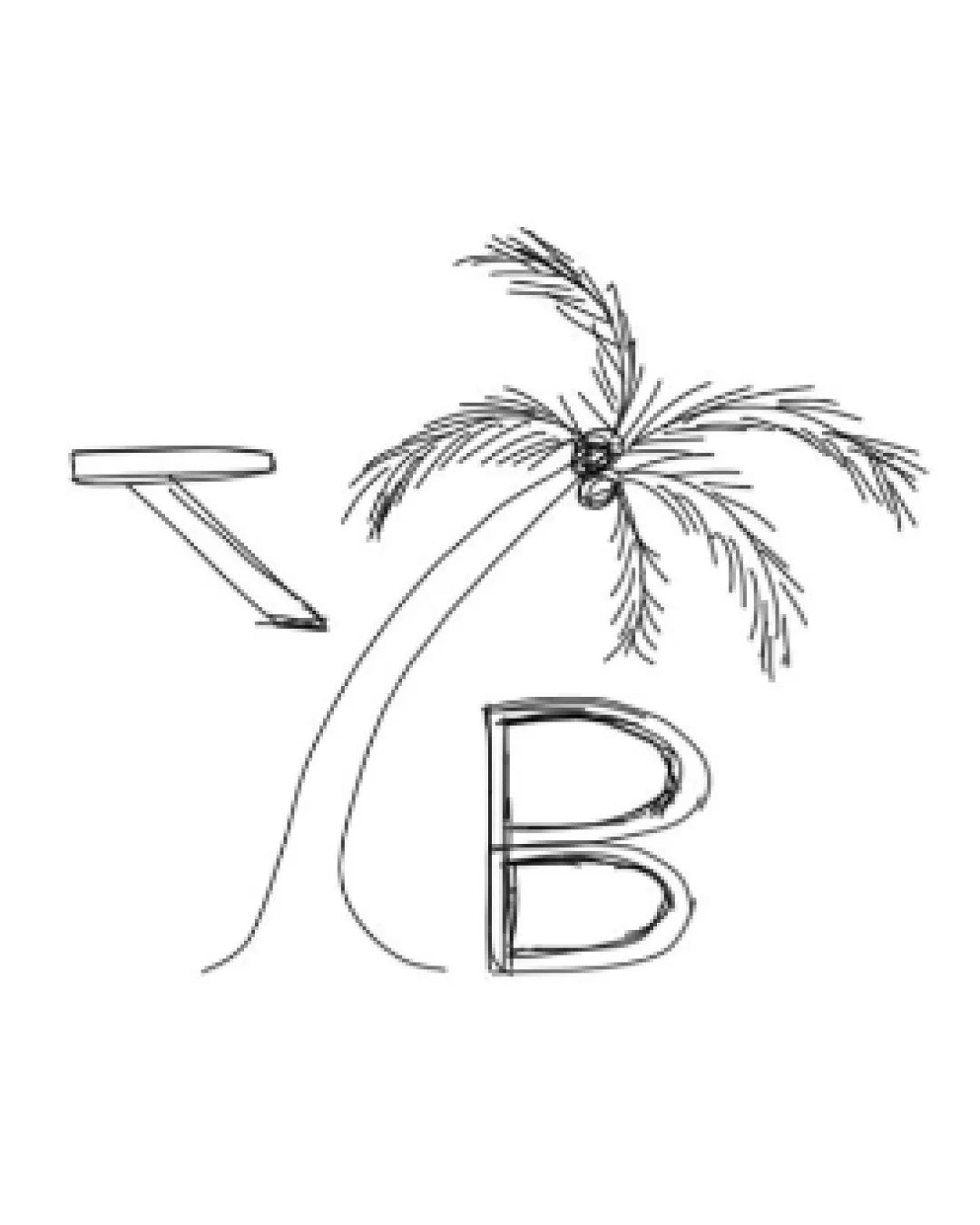
![]() The 'B' is somewhat recognizable as a letter in the design.
The 'B' is somewhat recognizable as a letter in the design.
![]() The hand-drawn style makes the 'B' appear rough and unbalanced.
The hand-drawn style makes the 'B' appear rough and unbalanced.![]() The left element is hard to identify as an airplane on first glance.
The left element is hard to identify as an airplane on first glance.![]() Lack of clear typography reduces the overall legibility, particularly at small sizes.
Lack of clear typography reduces the overall legibility, particularly at small sizes.
Originality
![]() Combines travel and beach tropes in a custom, hand-drawn manner.
Combines travel and beach tropes in a custom, hand-drawn manner.
![]() Use of a palm tree and airplane is highly generic for the travel industry.
Use of a palm tree and airplane is highly generic for the travel industry.![]() No creative twist or clever use of elements; both icons are literal representations.
No creative twist or clever use of elements; both icons are literal representations.![]() Hand-drawn aesthetic does not introduce a memorable or unique form.
Hand-drawn aesthetic does not introduce a memorable or unique form.
Color harmony
![]() Staying black on white keeps it simple and inoffensive.
Staying black on white keeps it simple and inoffensive.
White
#FFFFFF
Black
#000000
Balance alignment
![]() Elements reference an environment (beach/travel theme).
Elements reference an environment (beach/travel theme).
![]() Logo feels very unbalanced: the airplane, palm tree, and 'B' are disproportionate with poor visual alignment.
Logo feels very unbalanced: the airplane, palm tree, and 'B' are disproportionate with poor visual alignment.![]() No established baseline or axis connecting all elements, causing visual disjointedness.
No established baseline or axis connecting all elements, causing visual disjointedness.![]() Negative space between symbols is inconsistently distributed.
Negative space between symbols is inconsistently distributed.

Scalability
![]() Simple black and white design could translate to certain print mediums.
Simple black and white design could translate to certain print mediums.
![]() Thin, sketchy lines are easily lost at small scales, making the logo unsuitable for favicons or embroidery.
Thin, sketchy lines are easily lost at small scales, making the logo unsuitable for favicons or embroidery.![]() Lacks boldness and clarity necessary for signage or digital icons.
Lacks boldness and clarity necessary for signage or digital icons.![]() Would not reproduce well in low-resolution or single-color formats.
Would not reproduce well in low-resolution or single-color formats.
200x250 px
100×125 px
50×62 px
Misinterpretations
![]() No inappropriate shapes or accidentally offensive imagery detected.
No inappropriate shapes or accidentally offensive imagery detected.
Try your own review
Review my logo
Wondering how your logo performs?
Get a clear logo score, key risks, and priority fix ideas before your client or audience sees it.
Keep exploring


