Wondering how your logo performs? 🧐
Get professional logo reviews in seconds and catch design issues in time.
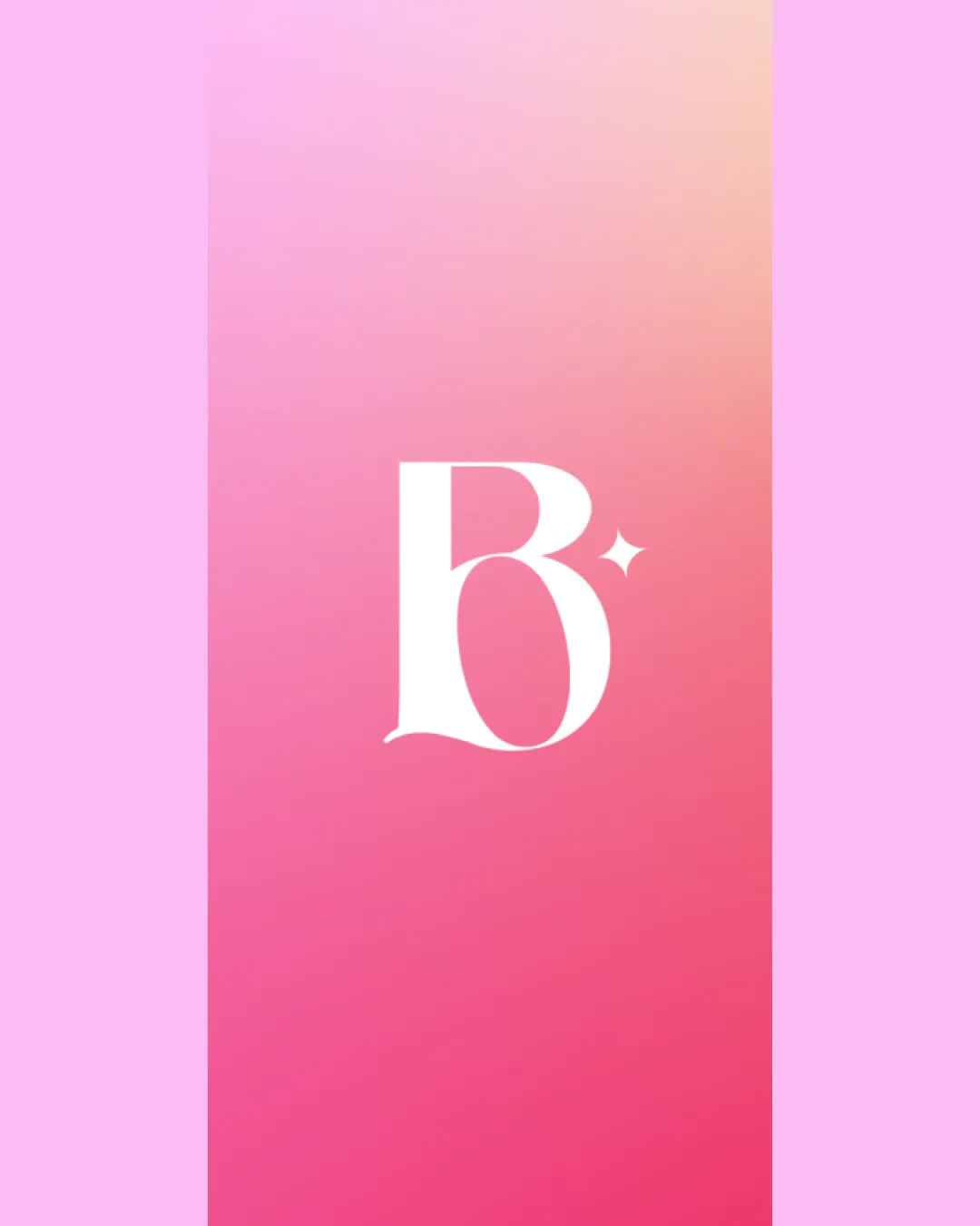
Try it Now!Logo review of B
 Logo analysis by AI
Logo type:
Style:
Detected symbol:
Detected text:
Business industry:
Review requested by Nikita
**If AI can recognize or misinterpret it, so can people.
Structured logo review
Legibility
![]() Clear and readable 'B'
Clear and readable 'B'![]() Good contrast against background
Good contrast against background
Scalability versatility
![]() Can work on business cards and larger formats
Can work on business cards and larger formats![]() Minimal details that scale well
Minimal details that scale well
![]() May lose sparkle detail at extremely small sizes
May lose sparkle detail at extremely small sizes
200x250 px
100×125 px
50×62 px
Balance alignment
![]() Well-centered composition
Well-centered composition![]() Balanced elements
Balanced elements
![]() Slight imbalance due to sparkle might be perceived
Slight imbalance due to sparkle might be perceived

Originality
![]() Incorporates sparkle for uniqueness
Incorporates sparkle for uniqueness
![]() 'B' by itself is common
'B' by itself is common
Aesthetic look
![]() Simple and elegant
Simple and elegant![]() Harmonious color background
Harmonious color background
Dual meaning and misinterpretations
![]() No inappropriate symbols
No inappropriate symbols
Color harmony
![]() Pleasant gradient background
Pleasant gradient background![]() Sufficient contrast with white
Sufficient contrast with white
![]() Background could be overwhelming in some contexts
Background could be overwhelming in some contexts


