Wondering how your logo performs? 🧐
Get professional logo reviews in seconds and catch design issues in time.
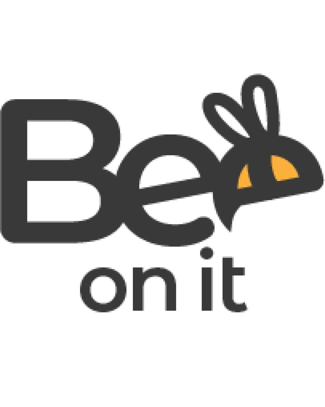
Try it Now!Logo review of Be on it
 Logo analysis by AI
Recognized style:
Logo type:
Detected symbol:
Detected text:
Business industry:
Review requested by Pigi
**If AI can recognize or misinterpret it, so can people.
Structured logo review
Legibility
![]() Text is clear and easy to read.
Text is clear and easy to read.
Scalability versatility
![]() Distinctive symbol and thick lines are versatile.
Distinctive symbol and thick lines are versatile.
![]() Very small uses might slightly obscure detail in the bee shape.
Very small uses might slightly obscure detail in the bee shape.
200x250 px
100×125 px
50×62 px
Balance alignment
![]() Consistent weight and alignment create balance.
Consistent weight and alignment create balance.

Originality
![]() Clever integration of the bee into the letter B.
Clever integration of the bee into the letter B.
![]() Bee symbols are common, slightly affecting originality.
Bee symbols are common, slightly affecting originality.
Aesthetic look
![]() The design is aesthetic and visually appealing.
The design is aesthetic and visually appealing.
Cultural sensitivity dual meaning
![]() No cultural sensitivity issues detected.
No cultural sensitivity issues detected.
Color harmony
![]() Effective use of black and yellow creates high contrast.
Effective use of black and yellow creates high contrast.
![]() Limited color palette might not stand out as much in all contexts.
Limited color palette might not stand out as much in all contexts.


