Wondering how your logo performs? 🧐
Get professional logo reviews in seconds and catch design issues in time.
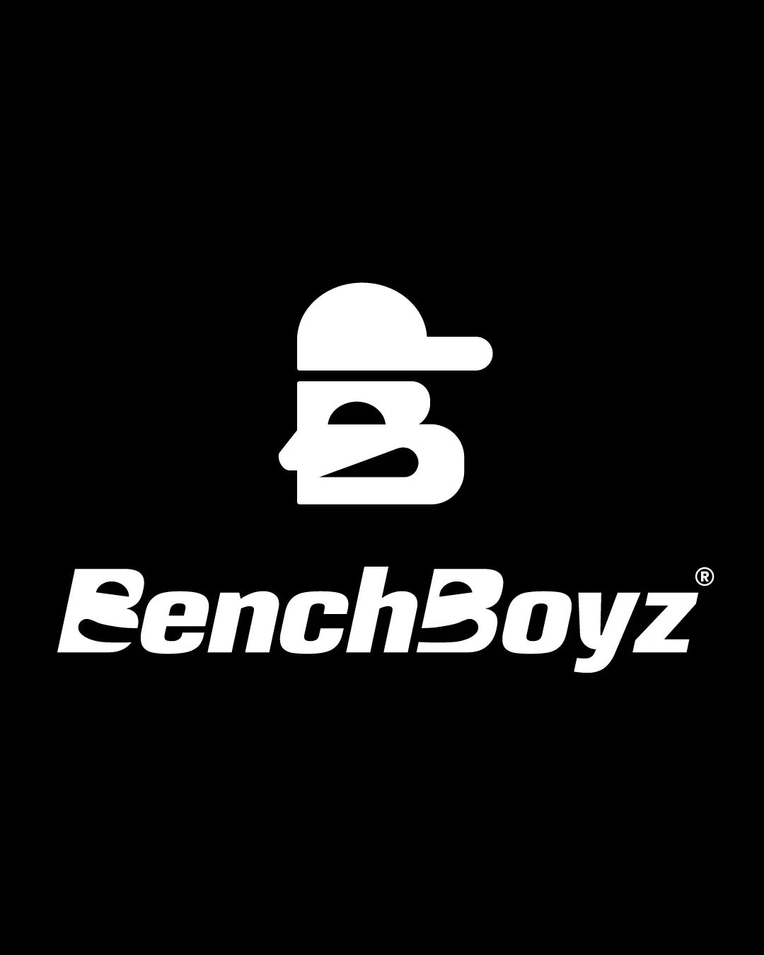
Try it Now!Logo review of BenchBoyz
 Logo analysis by AI
Logo type:
Style:
Detected symbol:
Negative space:
Detected text:
Business industry:
Review requested by Kevinnify
**If AI can recognize or misinterpret it, so can people.
Structured logo review
Legibility
![]() Main text 'BenchBoyz' is generally readable in larger applications.
Main text 'BenchBoyz' is generally readable in larger applications.![]() Typography feels bold and aligns with the playful concept.
Typography feels bold and aligns with the playful concept.
![]() The unique B characters can be confusing at first glance, bordering on illegibility.
The unique B characters can be confusing at first glance, bordering on illegibility.![]() The exaggerated stylization of the 'B's reduces clarity in smaller or quick-view use cases.
The exaggerated stylization of the 'B's reduces clarity in smaller or quick-view use cases.
Scalability versatility
![]() Bold and simple forms will reproduce well in larger formats such as shirts, hats, and posters.
Bold and simple forms will reproduce well in larger formats such as shirts, hats, and posters.![]() Strong contrast ensures clarity on dark backgrounds.
Strong contrast ensures clarity on dark backgrounds.
![]() Thin lines within the icon (facial features) could lose detail or merge at smaller sizes (favicons, embroidery).
Thin lines within the icon (facial features) could lose detail or merge at smaller sizes (favicons, embroidery).![]() Stylized 'B's in the wordmark may blur on small formats or busy backgrounds.
Stylized 'B's in the wordmark may blur on small formats or busy backgrounds.
200x250 px
100×125 px
50×62 px
Balance alignment
![]() Icon and wordmark are aligned centrally, providing visual balance.
Icon and wordmark are aligned centrally, providing visual balance.![]() Cap extends rightward, giving a sense of direction without heavily disrupting symmetry.
Cap extends rightward, giving a sense of direction without heavily disrupting symmetry.
![]() The spacing of the wordmark is tight in areas (particularly around the B's), making the left side look heavier.
The spacing of the wordmark is tight in areas (particularly around the B's), making the left side look heavier.

Originality
![]() Icon creatively uses a single letter to form both a head and a cap, which is visually memorable.
Icon creatively uses a single letter to form both a head and a cap, which is visually memorable.![]() Unique typographic treatment of the B.
Unique typographic treatment of the B.
![]() The hood/cap concept is seen in some urban/apparel logos, though this interpretation is more unique.
The hood/cap concept is seen in some urban/apparel logos, though this interpretation is more unique.![]() Wordmark style feels less distinctive beyond the 'B' characters.
Wordmark style feels less distinctive beyond the 'B' characters.
Logomark wordmark fit
![]() Both icon and wordmark use similar bold, rounded geometry, offering stylistic consistency.
Both icon and wordmark use similar bold, rounded geometry, offering stylistic consistency.![]() The icon directly relates to the brand's initial and visual tone.
The icon directly relates to the brand's initial and visual tone.
![]() Icon is visually heavier than a single wordmark character, making the lockup slightly top-heavy.
Icon is visually heavier than a single wordmark character, making the lockup slightly top-heavy.
Aesthetic look
![]() Striking, high-contrast palette feels modern and urban.
Striking, high-contrast palette feels modern and urban.![]() Distinctive letterform treatment draws attention and stands out from generic styles.
Distinctive letterform treatment draws attention and stands out from generic styles.
![]() The heavy customization of the B's skirts dangerously close to over-stylization, which could grow dated.
The heavy customization of the B's skirts dangerously close to over-stylization, which could grow dated.
Dual meaning and misinterpretations
![]() No inappropriate or problematic visual connotations detected in the icon or wordmark.
No inappropriate or problematic visual connotations detected in the icon or wordmark.
Color harmony
![]() Monochrome palette is versatile and timeless.
Monochrome palette is versatile and timeless.![]() White-on-black provides high contrast and visual punch.
White-on-black provides high contrast and visual punch.
White
#FFFFFF
Black
#000000


