 View review
Logo score
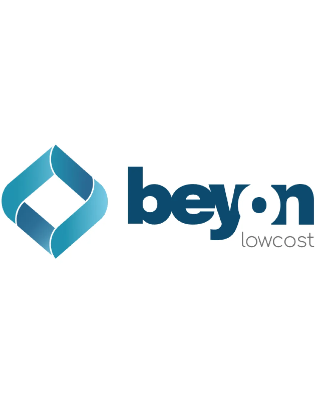
Logo review ofBeyon Lowcost
Review the detailed scores below to see what is working and what should be refined first.
Legibility
Originality
Balance
Scale
Detailed review
Logo performance breakdown
Legibility
![]() The text 'beyon lowcost' is mostly readable.
The text 'beyon lowcost' is mostly readable.
![]() The usage of lowercase 'o' as a dot within 'beyon' might slightly confuse readers at first glance.
The usage of lowercase 'o' as a dot within 'beyon' might slightly confuse readers at first glance.
Originality
![]() The geometric nature of the symbol adds a unique feel.
The geometric nature of the symbol adds a unique feel.
![]() The symbol does resemble common flow or infinity signs, reducing originality slightly.
The symbol does resemble common flow or infinity signs, reducing originality slightly.
Color harmony
![]() The blue gradient is both attractive and appropriate for a cost-conscious brand.
The blue gradient is both attractive and appropriate for a cost-conscious brand.
Balance alignment
![]() The alignment between the symbol and the text is well-executed, providing a sense of balance.
The alignment between the symbol and the text is well-executed, providing a sense of balance.

Scalability
![]() The logo's simple geometric shape and consistent typography ensure good scalability across applications.
The logo's simple geometric shape and consistent typography ensure good scalability across applications.
![]() Thin lines in the symbol may present issues when resized to very small dimensions.
Thin lines in the symbol may present issues when resized to very small dimensions.
200x250 px
100×125 px
50×62 px
Try your own review
Review my logo
Wondering how your logo performs?
Get a clear logo score, key risks, and priority fix ideas before your client or audience sees it.
Keep exploring


