 View review
Logo score
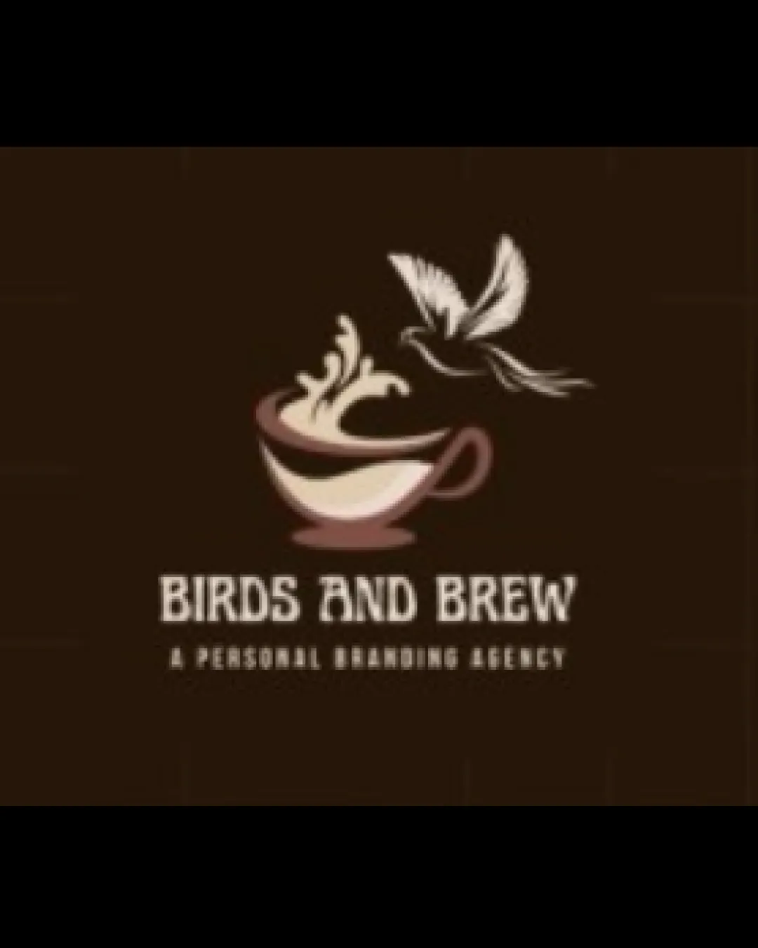
Logo review ofBirds And Brew, A Personal Branding Agency
Review the detailed scores below to see what is working and what should be refined first.
Legibility
Originality
Misread
Balance
Scale
Detailed review
Logo performance breakdown
Legibility
![]() Main text 'BIRDS AND BREW' is clear and distinguishable against the dark background.
Main text 'BIRDS AND BREW' is clear and distinguishable against the dark background.![]() Color contrast between text and background aids readability.
Color contrast between text and background aids readability.
![]() Subtext 'A PERSONAL BRANDING AGENCY' is cramped, small, and hard to read especially at smaller sizes.
Subtext 'A PERSONAL BRANDING AGENCY' is cramped, small, and hard to read especially at smaller sizes.![]() Letter spacing could be improved for enhanced legibility in the tagline.
Letter spacing could be improved for enhanced legibility in the tagline.
Originality
![]() Combining bird and coffee steam is a clever concept that visually ties together the brand name.
Combining bird and coffee steam is a clever concept that visually ties together the brand name.![]() Negative space use in the steam as a bird shows some creativity.
Negative space use in the steam as a bird shows some creativity.
![]() The juxtaposition of birds and coffee is fairly common, bordering on generic in the café and creative industries.
The juxtaposition of birds and coffee is fairly common, bordering on generic in the café and creative industries.![]() Overall illustration lacks a unique stylistic twist that strongly sets it apart from similar logos.
Overall illustration lacks a unique stylistic twist that strongly sets it apart from similar logos.
Color harmony
![]() Earthy, muted colors harmonize well and fit the brand mood.
Earthy, muted colors harmonize well and fit the brand mood.![]() Contrast is sufficient for most applications.
Contrast is sufficient for most applications.
![]() Limited contrast between some elements may reduce clarity on certain backgrounds.
Limited contrast between some elements may reduce clarity on certain backgrounds.
Kabul
#59362A
Albescent White
#EFE0C7
Antique Brass
#A07254
Your palette is close. Explore sharper color combinations with Colorfly.design before updating the logo.
Explore palettesBalance alignment
![]() Visual flow from coffee cup to bird has a pleasing upward movement.
Visual flow from coffee cup to bird has a pleasing upward movement.![]() Text is horizontally centered with the graphic.
Text is horizontally centered with the graphic.
![]() Weight of the upper bird feels detached from the rest of the composition, making the top-heavy.
Weight of the upper bird feels detached from the rest of the composition, making the top-heavy.![]() Disparity in style between illustrative symbol and rigid geometric font impacts cohesion.
Disparity in style between illustrative symbol and rigid geometric font impacts cohesion.

Scalability
![]() Simple color palette enhances adaptability on coffee-themed materials.
Simple color palette enhances adaptability on coffee-themed materials.![]() The bold main logotype works well on signage and digital platforms.
The bold main logotype works well on signage and digital platforms.
![]() Fine illustrative details in the bird and steam will become indistinct at small sizes (e.g., favicons, embroidery).
Fine illustrative details in the bird and steam will become indistinct at small sizes (e.g., favicons, embroidery).![]() Tagline becomes unreadable at small scales.
Tagline becomes unreadable at small scales.![]() Logo complexity may not work well on very small or monochrome formats.
Logo complexity may not work well on very small or monochrome formats.
200x250 px
100×125 px
50×62 px
Misinterpretations
![]() No inappropriate or accidental imagery detected.
No inappropriate or accidental imagery detected.
Symbol & text fit
![]() Logomark references the brand name directly, reinforcing the concept.
Logomark references the brand name directly, reinforcing the concept.
![]() Both elements are visually anchored around the center.
Both elements are visually anchored around the center.
![]() The playful, flowing illustration contrasts sharply with the rigid, blocky font, resulting in stylistic mismatch.
The playful, flowing illustration contrasts sharply with the rigid, blocky font, resulting in stylistic mismatch.
![]() Font style does not feel tailored to the organic nature of the logomark.
Font style does not feel tailored to the organic nature of the logomark.
Try your own review
Review my logo
Wondering how your logo performs?
Get a clear logo score, key risks, and priority fix ideas before your client or audience sees it.
Keep exploring


