Wondering how your logo performs? 🧐
Get professional logo reviews in seconds and catch design issues in time.
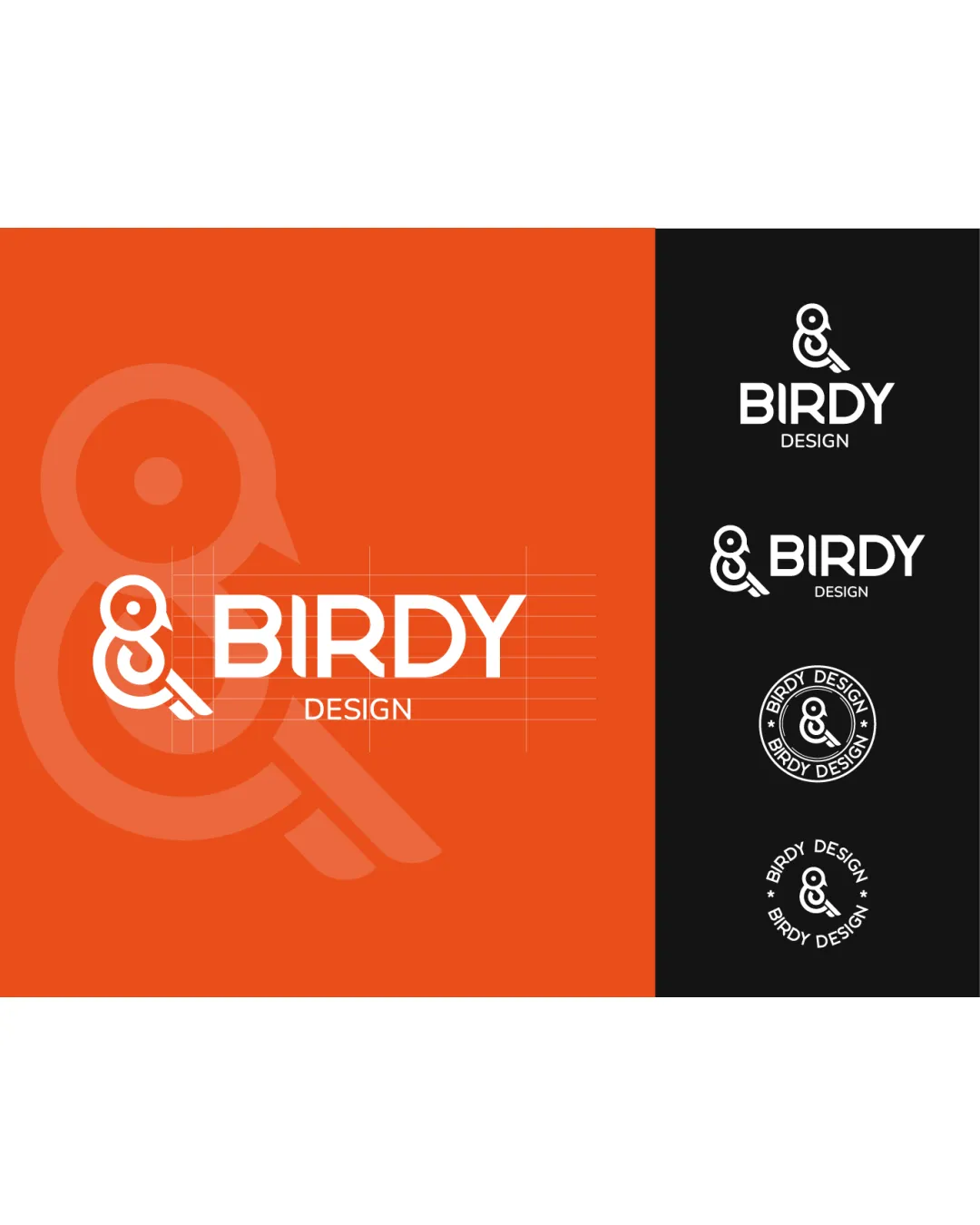
Try it Now!Logo review of BIRDY DESIGN
 Logo analysis by AI
Logo type:
Style:
Detected symbol:
Negative space:
Detected text:
Business industry:
Review requested by Anakarenk
**If AI can recognize or misinterpret it, so can people.
Structured logo review
Legibility
![]() Text 'BIRDY DESIGN' is clear, bold, and readable at various scales.
Text 'BIRDY DESIGN' is clear, bold, and readable at various scales.![]() Good contrast between text and background in all versions, ensuring clarity.
Good contrast between text and background in all versions, ensuring clarity.
Scalability versatility
![]() Symbol is geometric and retains clarity in small sizes, including circular and stacked badge formats.
Symbol is geometric and retains clarity in small sizes, including circular and stacked badge formats.![]() Versatile suite presented: horizontal, stacked, and badge logo variations.
Versatile suite presented: horizontal, stacked, and badge logo variations.![]() Suitable for both screen and print applications, such as business cards and digital headers.
Suitable for both screen and print applications, such as business cards and digital headers.
![]() Thin lines in the bird/ampersand symbol may lose sharpness at very tiny sizes, especially in embroidery or tiny icons.
Thin lines in the bird/ampersand symbol may lose sharpness at very tiny sizes, especially in embroidery or tiny icons.
200x250 px
100×125 px
50×62 px
Balance alignment
![]() Well-aligned elements between symbol and wordmark.
Well-aligned elements between symbol and wordmark.![]() Logo grid demonstrates careful spacing, and both the logomark and wordmark feel visually connected.
Logo grid demonstrates careful spacing, and both the logomark and wordmark feel visually connected.
![]() Slight top-heaviness as the logomark (ampersand bird) sits higher than the wordmark, which could be adjusted for perfect optical balance.
Slight top-heaviness as the logomark (ampersand bird) sits higher than the wordmark, which could be adjusted for perfect optical balance.

Originality
![]() Clever and highly original use of an ampersand to form a bird, relevant to the brand name.
Clever and highly original use of an ampersand to form a bird, relevant to the brand name.![]() Abstract execution distinguishes it from more literal/generic bird marks.
Abstract execution distinguishes it from more literal/generic bird marks.
Logomark wordmark fit
![]() Stylistic consistency between geometric wordmark and symbol.
Stylistic consistency between geometric wordmark and symbol.![]() Matching line thickness and angle echo the wings and letterforms, creating a unified impression.
Matching line thickness and angle echo the wings and letterforms, creating a unified impression.
Aesthetic look
![]() Minimal, contemporary aesthetic appropriate for a design brand.
Minimal, contemporary aesthetic appropriate for a design brand.![]() Balanced use of white space and pleasing geometry.
Balanced use of white space and pleasing geometry.
Dual meaning and misinterpretations
![]() Symbol is abstract but still legibly a bird and ampersand, avoiding any unintended or inappropriate associations.
Symbol is abstract but still legibly a bird and ampersand, avoiding any unintended or inappropriate associations.
Color harmony
![]() Limited, high-contrast color palette: orange, black, and white work harmoniously.
Limited, high-contrast color palette: orange, black, and white work harmoniously.![]() Palette adapts well to monochrome and reversed-logo versions.
Palette adapts well to monochrome and reversed-logo versions.
Red
#E6521F
White
#FFFFFF
Black
#000000


