 View review
Logo score
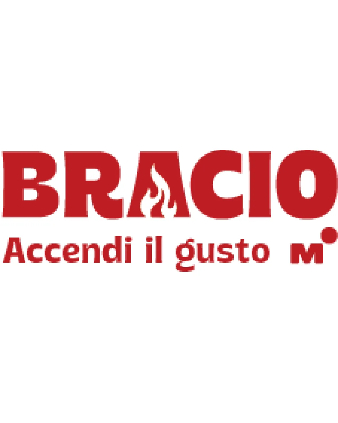
Logo review ofBracio Accendi Il Gusto M.
Review the detailed scores below to see what is working and what should be refined first.
Legibility
Originality
Misread
Balance
Scale
Detailed review
Logo performance breakdown
Legibility
![]() The main 'BRACIO' text is bold and highly readable.
The main 'BRACIO' text is bold and highly readable.![]() Font choice aids strong brand presence.
Font choice aids strong brand presence.
![]() The flame effect in the 'A' reduces its legibility slightly for quick reads.
The flame effect in the 'A' reduces its legibility slightly for quick reads.![]() Tagline and subtext are less prominent and may be hard to read at small sizes.
Tagline and subtext are less prominent and may be hard to read at small sizes.
Originality
![]() Good integration of the flame into the 'A', which directly relates to the food/grill industry.
Good integration of the flame into the 'A', which directly relates to the food/grill industry.![]() Wordmark with graphic touch makes it more recognizable.
Wordmark with graphic touch makes it more recognizable.
![]() Flame-in-letter trick is moderately common in food/grill/barbecue brands.
Flame-in-letter trick is moderately common in food/grill/barbecue brands.![]() Overall aesthetic isn’t entirely unique within the sector.
Overall aesthetic isn’t entirely unique within the sector.
Color harmony
![]() Red and white create effective, high-contrast branding.
Red and white create effective, high-contrast branding.![]() Limited palette fits industry expectations.
Limited palette fits industry expectations.
Flame Red
#D32F2F
White
#FFFFFF
Balance alignment
![]() Strong horizontal alignment; logo feels grounded and substantial.
Strong horizontal alignment; logo feels grounded and substantial.![]() The weight of letters is mostly consistent.
The weight of letters is mostly consistent.
![]() The flame in the 'A' disrupts the uniformity of the top line slightly.
The flame in the 'A' disrupts the uniformity of the top line slightly.![]() Tagline sitting below creates a minor visual imbalance.
Tagline sitting below creates a minor visual imbalance.

Scalability
![]() Simple, bold shapes mean the primary logo will transfer across signage, packaging, and print.
Simple, bold shapes mean the primary logo will transfer across signage, packaging, and print.
![]() Detailed flame element in the 'A' may not print well at very small scales, such as on pens or embroidery.
Detailed flame element in the 'A' may not print well at very small scales, such as on pens or embroidery.![]() The tagline and the small 'M.' risk becoming illegible on smaller applications.
The tagline and the small 'M.' risk becoming illegible on smaller applications.![]() No clear separate icon for app or favicon usage.
No clear separate icon for app or favicon usage.
200x250 px
100×125 px
50×62 px
Misinterpretations
![]() No inappropriate or accidental negative visuals detected.
No inappropriate or accidental negative visuals detected.
Symbol & text fit
![]() Seamless integration of logomark (flame) within the wordmark.
Seamless integration of logomark (flame) within the wordmark.
![]() Unified typographic style.
Unified typographic style.
Try your own review
Review my logo
Wondering how your logo performs?
Get a clear logo score, key risks, and priority fix ideas before your client or audience sees it.
Keep exploring


