Wondering how your logo performs? 🧐
Get professional logo reviews in seconds and catch design issues in time.
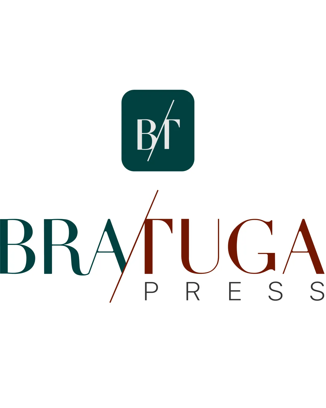
Try it Now!Logo review of BRATUGA PRESS
 Logo analysis by AI
Recognized style:
Logo type:
Detected symbol:
Detected text:
Business industry:
Review requested by Fabiofreire
**If AI can recognize or misinterpret it, so can people.
Structured logo review
Legibility
![]() Text is stylish and legible with distinct word separation.
Text is stylish and legible with distinct word separation.
![]() The slanting line might cause slight confusion initially.
The slanting line might cause slight confusion initially.
Scalability versatility
![]() Bold elements aid in maintaining detail across sizes.
Bold elements aid in maintaining detail across sizes.
![]() Fine elements in the monogram might lose clarity on smaller scales.
Fine elements in the monogram might lose clarity on smaller scales.
200x250 px
100×125 px
50×62 px
Balance alignment
![]() Balanced composition between monogram and text.
Balanced composition between monogram and text.
![]() The angled line could cause a slight perceived imbalance.
The angled line could cause a slight perceived imbalance.

Originality
![]() Clever integration of letters in the monogram.
Clever integration of letters in the monogram.
![]() Might draw on some common design styles, but remains distinctive.
Might draw on some common design styles, but remains distinctive.
Logomark wordmark fit
![]() Monogram and wordmark styles complement each other well.
Monogram and wordmark styles complement each other well.
Aesthetic look
![]() Clean, professional appearance with modern aesthetics.
Clean, professional appearance with modern aesthetics.
Cultural sensitivity dual meaning
![]() No dual meanings or cultural insensitivities detected.
No dual meanings or cultural insensitivities detected.
Color harmony
![]() Effective use of complementary colors for a sophisticated look.
Effective use of complementary colors for a sophisticated look.


