 View review
Logo score
Logo review ofBreakthrough
Review the detailed scores below to see what is working and what should be refined first.
Legibility
Originality
Balance
Scale
Detailed review
Logo performance breakdown
Legibility
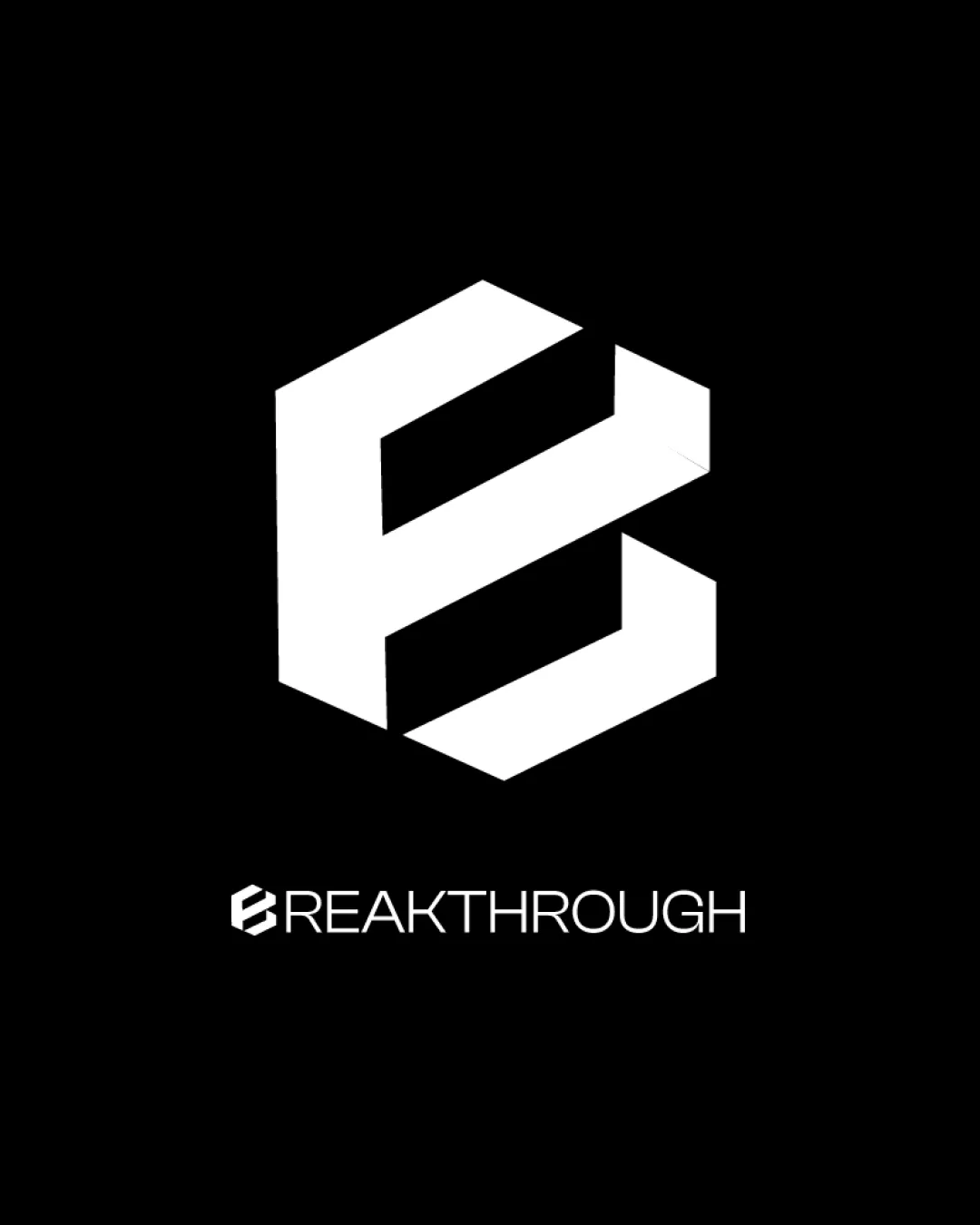
![]() I assume the business name is Breakthrough.
I assume the business name is Breakthrough.
![]() The geometric design of the 'E' could cause slight legibility issues for some viewers.
The geometric design of the 'E' could cause slight legibility issues for some viewers.
Originality
![]() Unique geometric design of the 'E' adds a creative touch.
Unique geometric design of the 'E' adds a creative touch.
![]() Geometric shapes are common in logo designs, slightly affecting originality.
Geometric shapes are common in logo designs, slightly affecting originality.
Color harmony
![]() The black and white color scheme provides strong contrast and clarity.
The black and white color scheme provides strong contrast and clarity.
Balance alignment
![]() The logomark and wordmark have balanced alignment.
The logomark and wordmark have balanced alignment.

Scalability
![]() The bold logomark ensures good visibility and scalability across different sizes.
The bold logomark ensures good visibility and scalability across different sizes.
200x250 px
100×125 px
50×62 px
Symbol & text fit
![]() The text and symbol complement each other, creating a cohesive unit.
The text and symbol complement each other, creating a cohesive unit.
Try your own review
Review my logo
Wondering how your logo performs?
Get a clear logo score, key risks, and priority fix ideas before your client or audience sees it.
Keep exploring


