 View review
Logo score
Logo review ofBubess
Review the detailed scores below to see what is working and what should be refined first.
Legibility
Originality
Balance
Scale
Detailed review
Logo performance breakdown
Legibility
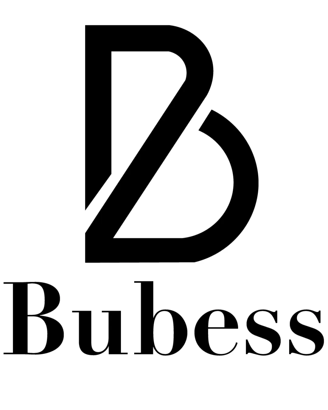
![]() The text 'Bubess' is bold and clear.
The text 'Bubess' is bold and clear.
Originality
![]() The integration of the 'B' in a creative way adds uniqueness.
The integration of the 'B' in a creative way adds uniqueness.
![]() The 'B' symbol could be seen as somewhat common.
The 'B' symbol could be seen as somewhat common.
Color harmony
![]() The black and white color scheme is classic and professional.
The black and white color scheme is classic and professional.
Balance alignment
![]() The monogram and wordmark are well-aligned and balanced.
The monogram and wordmark are well-aligned and balanced.

Scalability
![]() The bold design ensures versatility across different media.
The bold design ensures versatility across different media.
200x250 px
100×125 px
50×62 px
Symbol & text fit
![]() The text and monogram fit well together as a cohesive unit.
The text and monogram fit well together as a cohesive unit.
Try your own review
Review my logo
Wondering how your logo performs?
Get a clear logo score, key risks, and priority fix ideas before your client or audience sees it.
Keep exploring


