Wondering how your logo performs? 🧐
Get professional logo reviews in seconds and catch design issues in time.
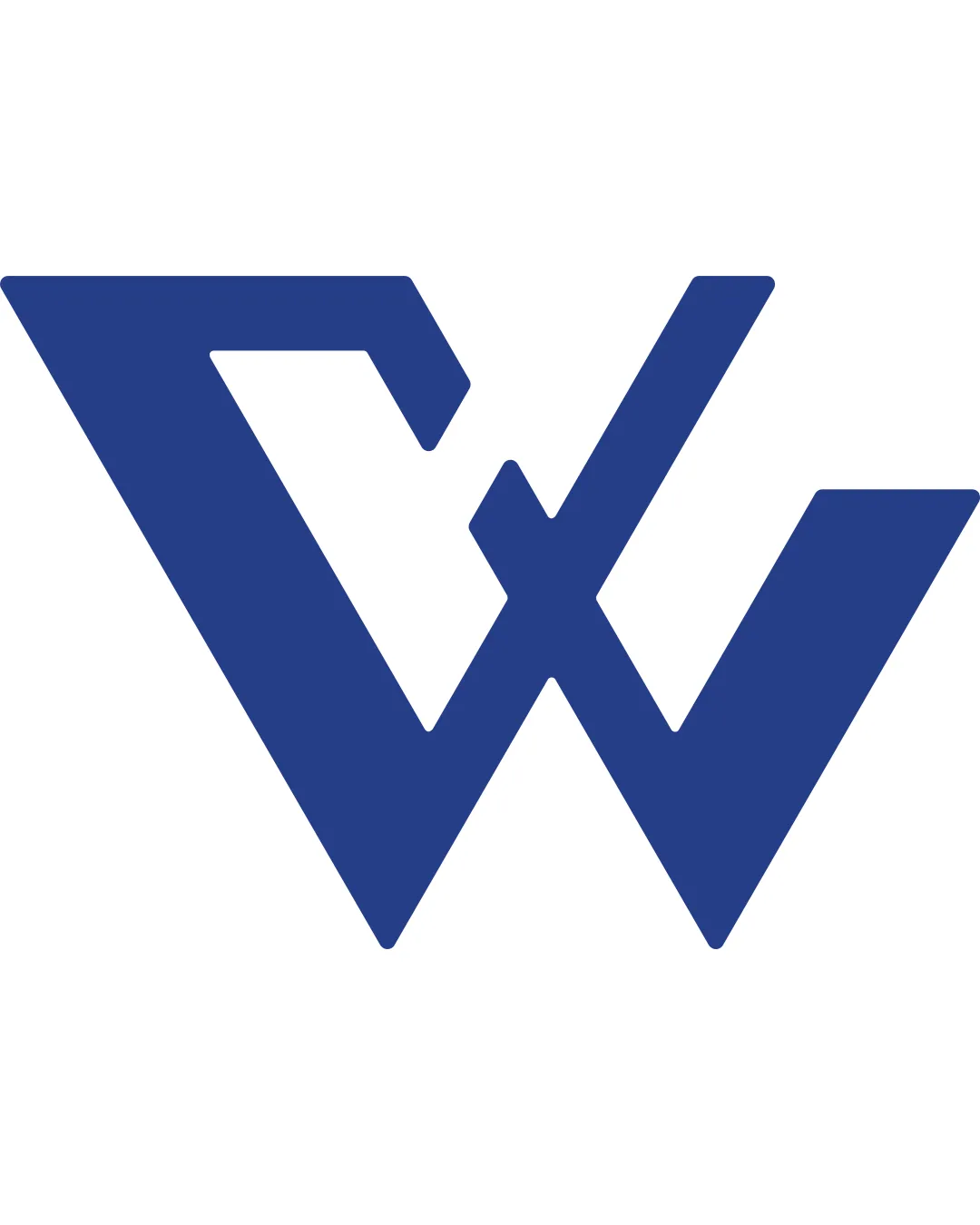
Try it Now!Logo review of C W letters
 Logo analysis by AI
Logo type:
Style:
Detected symbol:
Negative space:
Detected text:
Business industry:
Review requested by Mrwasimmohammad
**If AI can recognize or misinterpret it, so can people.
Structured logo review
Scalability versatility
![]() Highly geometric and bold mark ensures excellent scalability across small and large formats.
Highly geometric and bold mark ensures excellent scalability across small and large formats.![]() Simple forms and solid fills make it suitable for business cards, signage, and digital favicons.
Simple forms and solid fills make it suitable for business cards, signage, and digital favicons.![]() There are no thin lines or intricate details that would be lost at smaller sizes.
There are no thin lines or intricate details that would be lost at smaller sizes.
200x250 px
100×125 px
50×62 px
Balance alignment
![]() Symmetrical overall composition with a strong central axis.
Symmetrical overall composition with a strong central axis.![]() Clever integration of both letters without major visual imbalance.
Clever integration of both letters without major visual imbalance.
![]() The top left of the C feels heavier due to the wide triangular form, creating a slight leftward weight.
The top left of the C feels heavier due to the wide triangular form, creating a slight leftward weight.

Originality
![]() Distinctive merging of the C and W within one geometric shape.
Distinctive merging of the C and W within one geometric shape.![]() Modern and abstract execution, avoids cliches from the industry.
Modern and abstract execution, avoids cliches from the industry.
![]() Monogram marks using initials are common, so while the execution is good, the concept feels only moderately unique.
Monogram marks using initials are common, so while the execution is good, the concept feels only moderately unique.
Aesthetic look
![]() Bold, minimalist, and contemporary look.
Bold, minimalist, and contemporary look.![]() Color choice provides authority and professionalism.
Color choice provides authority and professionalism.
![]() Angular cutouts might be too harsh for brands needing a softer touch.
Angular cutouts might be too harsh for brands needing a softer touch.![]() Large white negative spaces may be visually distracting in some contexts.
Large white negative spaces may be visually distracting in some contexts.
Dual meaning and misinterpretations
![]() No inappropriate or ambiguous symbols detected.
No inappropriate or ambiguous symbols detected.![]() Abstract form remains professional and uncontroversial.
Abstract form remains professional and uncontroversial.
Color harmony
![]() Uses a single blue color paired with white, ensuring simplicity and sophistication.
Uses a single blue color paired with white, ensuring simplicity and sophistication.![]() Strong color contrast aids in clarity.
Strong color contrast aids in clarity.
Blue
#263C84
White
#FFFFFF


