Wondering how your logo performs? 🧐
Get professional logo reviews in seconds and catch design issues in time.
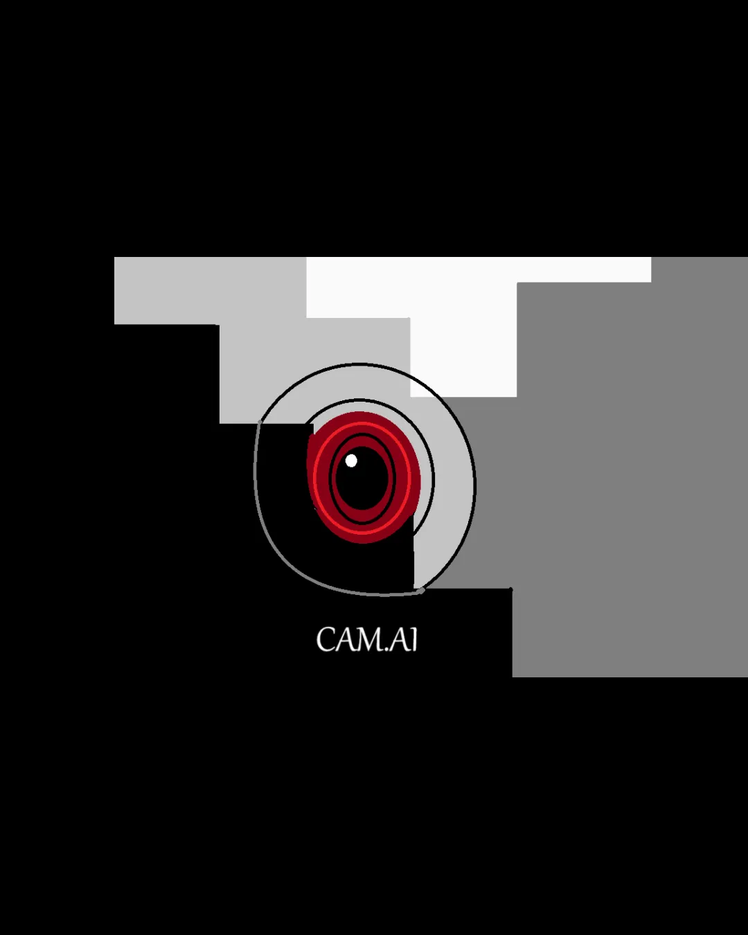
Try it Now!Logo review of CAM.AI
 Logo analysis by AI
Logo type:
Style:
Detected symbol:
Detected text:
Business industry:
Review requested by Ashes
**If AI can recognize or misinterpret it, so can people.
Structured logo review
Legibility
![]() Text is clear and easily readable
Text is clear and easily readable![]() Letter spacing is generously set and supports legibility
Letter spacing is generously set and supports legibility
![]() The dot in 'CAM.AI' could be mistaken for a speck, as it doesn’t strongly distinguish the domain aspect
The dot in 'CAM.AI' could be mistaken for a speck, as it doesn’t strongly distinguish the domain aspect
Scalability versatility
![]() Bold elements of the symbol will still be visible on medium-larger applications such as web banners or T-shirts
Bold elements of the symbol will still be visible on medium-larger applications such as web banners or T-shirts
![]() Multiple thin outlines and fine details in the camera icon will likely blur or get lost at small sizes (e.g., favicons or business cards)
Multiple thin outlines and fine details in the camera icon will likely blur or get lost at small sizes (e.g., favicons or business cards)![]() Color gradients and overlapping geometric shapes reduce versatility on single-color or simplified formats
Color gradients and overlapping geometric shapes reduce versatility on single-color or simplified formats![]() Would struggle with embroidery or small-format printing
Would struggle with embroidery or small-format printing
200x250 px
100×125 px
50×62 px
Balance alignment
![]() The lens is centered horizontally over the logotype
The lens is centered horizontally over the logotype
![]() The blocky background geometry creates a feeling of left-heavy imbalance
The blocky background geometry creates a feeling of left-heavy imbalance![]() Outer rings and square forms compete visually, leading to disjointed negative space
Outer rings and square forms compete visually, leading to disjointed negative space

Originality
![]() Modern abstraction of a camera with unique concentric circle lens and blocky background
Modern abstraction of a camera with unique concentric circle lens and blocky background
![]() The use of a lens motif is very common in camera/AI imagery and lacks a truly inventive twist
The use of a lens motif is very common in camera/AI imagery and lacks a truly inventive twist![]() Rectangle and circle combination is a familiar motif in tech logos
Rectangle and circle combination is a familiar motif in tech logos
Logomark wordmark fit
![]() Wordmark and logomark are visually distinct but well-aligned overall
Wordmark and logomark are visually distinct but well-aligned overall![]() Font style has a tech aesthetic matching the theme
Font style has a tech aesthetic matching the theme
![]() The geometric style of the mark is more dynamic than the minimalist wordmark; could benefit from shared visual details (e.g., matching roundness in letters to the lens)
The geometric style of the mark is more dynamic than the minimalist wordmark; could benefit from shared visual details (e.g., matching roundness in letters to the lens)
Aesthetic look
![]() Color palette is striking and fitting for tech/AI
Color palette is striking and fitting for tech/AI
![]() Busy background rectangles add unnecessary complexity and visual noise
Busy background rectangles add unnecessary complexity and visual noise![]() The design feels cluttered and lacks clean minimalism seen in leading technology brands
The design feels cluttered and lacks clean minimalism seen in leading technology brands
Dual meaning and misinterpretations
![]() No inappropriate or unintended visual associations
No inappropriate or unintended visual associations
Color harmony
![]() Strong and cohesive tech-oriented palette
Strong and cohesive tech-oriented palette![]() Color contrast between red, black, and gray provides clear separation of elements
Color contrast between red, black, and gray provides clear separation of elements
![]() The number of color areas and gradients adds visual busyness rather than clarity
The number of color areas and gradients adds visual busyness rather than clarity
Red
#B10811
Light Gray
#E1E1E1
Dark Gray
#444444
Black
#000000
White
#FFFFFF


