 View review
Logo score
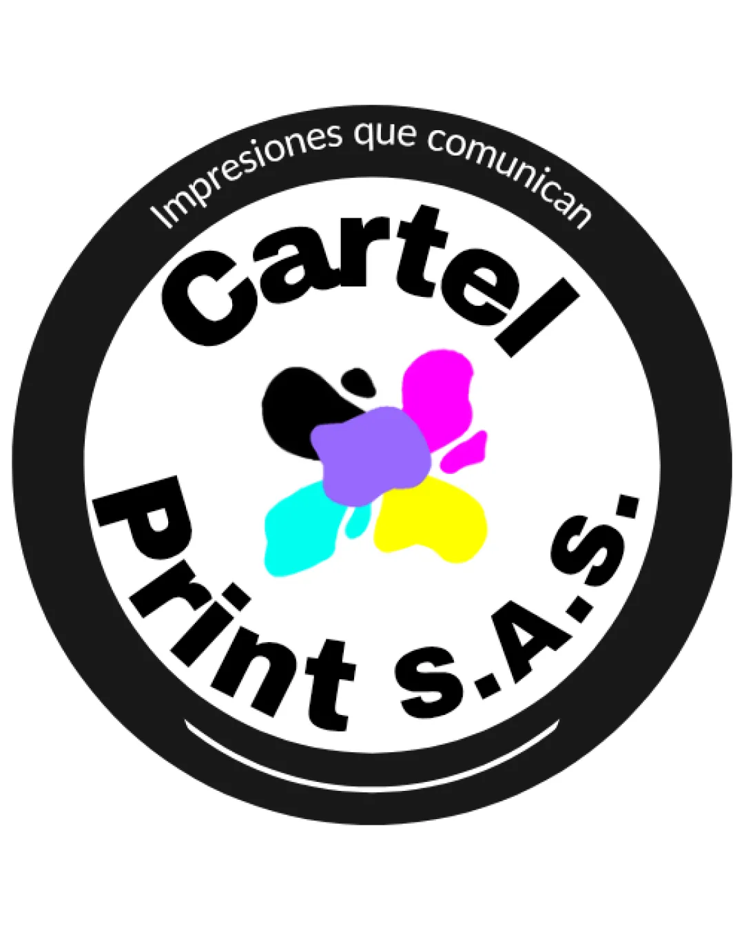
Logo review ofCartel Print S.a.s.
Review the detailed scores below to see what is working and what should be refined first.
Legibility
Originality
Misread
Balance
Scale
Detailed review
Logo performance breakdown
Legibility
![]() Bold font enhances readability.
Bold font enhances readability.![]() Good contrast between text and background.
Good contrast between text and background.
![]() Text curve may slightly affect readability.
Text curve may slightly affect readability.
Originality
![]() Unique color splash reflects industry.
Unique color splash reflects industry.
![]() Circular emblem shape is commonly used in the industry.
Circular emblem shape is commonly used in the industry.
Color harmony
![]() CMYK palette is relevant to printing.
CMYK palette is relevant to printing.
![]() Four distinct colors can be overwhelming.
Four distinct colors can be overwhelming.![]() Black border might clash with other colors.
Black border might clash with other colors.
Color may be holding this logo back. Explore stronger palette options with Colorfly.design before updating the logo.
Explore palettesBalance alignment
![]() Well-centered text and symbol.
Well-centered text and symbol.![]() Symmetrical circular design creates balance.
Symmetrical circular design creates balance.
![]() Text alignment around the circle can feel slightly off.
Text alignment around the circle can feel slightly off.

Scalability
![]() Simple layout is versatile.
Simple layout is versatile.
![]() Color splash detail might get lost at smaller sizes.
Color splash detail might get lost at smaller sizes.![]() Circular emblem may not fit certain rectangular spaces well.
Circular emblem may not fit certain rectangular spaces well.
200x250 px
100×125 px
50×62 px
Misinterpretations
![]() No inappropriate symbols or meanings detected.
No inappropriate symbols or meanings detected.
Try your own review
Review my logo
Wondering how your logo performs?
Get a clear logo score, key risks, and priority fix ideas before your client or audience sees it.
Keep exploring


