Wondering how your logo performs? 🧐
Get professional logo reviews in seconds and catch design issues in time.
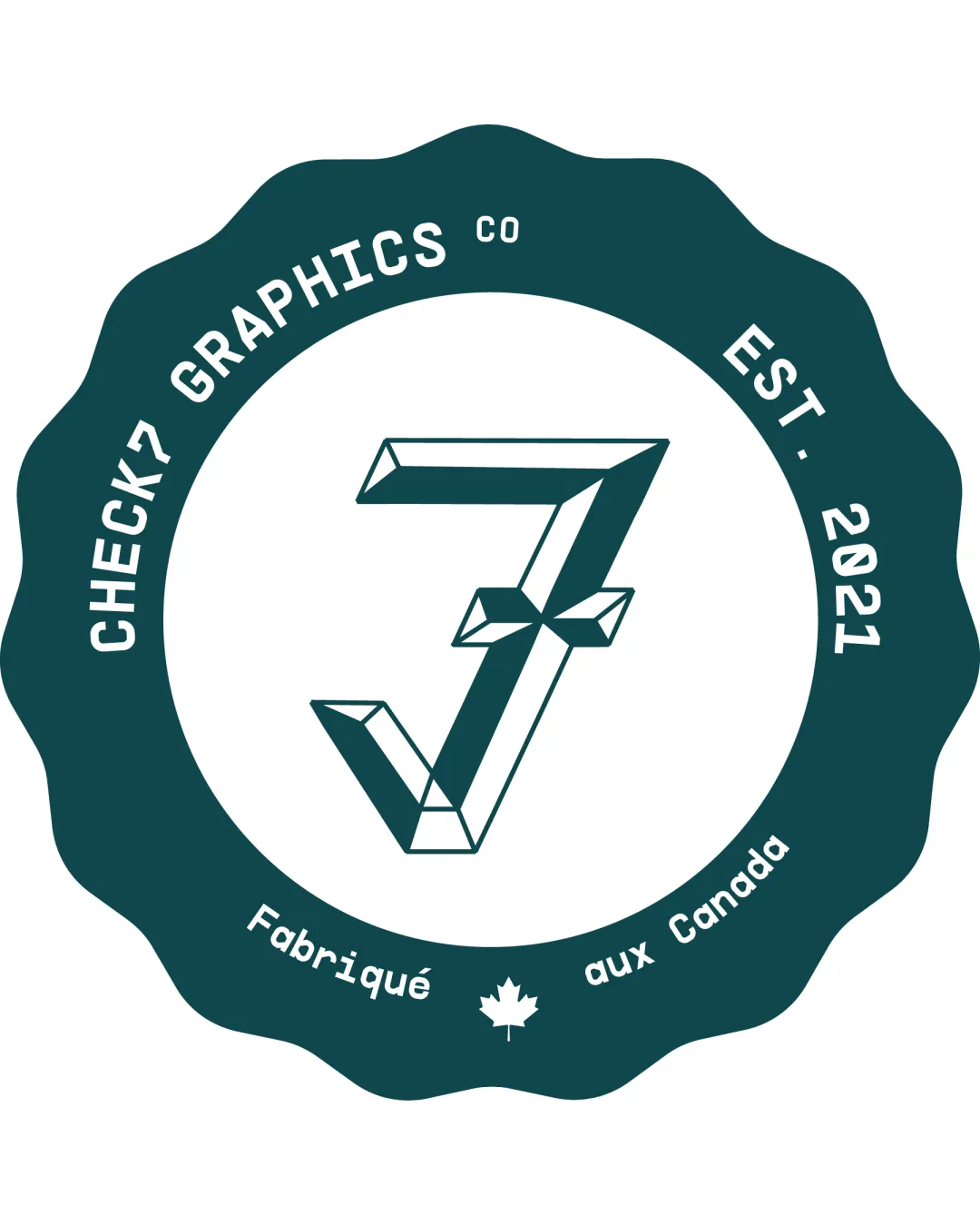
Try it Now!Logo review of CHECK7 GRAPHICS CO EST. 2021 Fabriqué aux Canada
 Logo analysis by AI
Logo type:
Style:
Detected symbol:
Detected text:
Business industry:
Review requested by StephenZ
**If AI can recognize or misinterpret it, so can people.
Structured logo review
Legibility
![]() Main text is generally clear and easy to read.
Main text is generally clear and easy to read.![]() Distinct contrast between text and background aids readability.
Distinct contrast between text and background aids readability.
![]() Curved text around the badge perimeter may reduce legibility at smaller sizes.
Curved text around the badge perimeter may reduce legibility at smaller sizes.![]() Small subtext like 'CO' and 'Fabriqué aux Canada' can become hard to read in compact formats.
Small subtext like 'CO' and 'Fabriqué aux Canada' can become hard to read in compact formats.
Scalability versatility
![]() Bold symbol and high contrast color scheme help with recognition at larger sizes.
Bold symbol and high contrast color scheme help with recognition at larger sizes.![]() The emblem/badge format is suitable for print, stickers, and signage.
The emblem/badge format is suitable for print, stickers, and signage.
![]() Excessive detail and long text limit scalability—smaller formats like favicons or embroidery will lose crucial elements.
Excessive detail and long text limit scalability—smaller formats like favicons or embroidery will lose crucial elements.![]() Small elements (maple leaf, 'CO', fine details in the geometric symbol) are unlikely to reproduce well at small sizes.
Small elements (maple leaf, 'CO', fine details in the geometric symbol) are unlikely to reproduce well at small sizes.
200x250 px
100×125 px
50×62 px
Balance alignment
![]() Central placement of the 7/checkmark symbol balances the logo.
Central placement of the 7/checkmark symbol balances the logo.![]() Text is generally well-aligned in the circular badge design.
Text is generally well-aligned in the circular badge design.
![]() Slight crowding with small elements and the number of text segments makes the layout feel cramped.
Slight crowding with small elements and the number of text segments makes the layout feel cramped.![]() The geometric symbol's visual weight slightly overpowers the small peripheral text.
The geometric symbol's visual weight slightly overpowers the small peripheral text.

Originality
![]() Creative integration of checkmark and number 7 is visually distinctive.
Creative integration of checkmark and number 7 is visually distinctive.![]() Badge style adds a level of personality relevant for a graphics company.
Badge style adds a level of personality relevant for a graphics company.
![]() Emblem/badge format is commonly used and not highly unique in isolation.
Emblem/badge format is commonly used and not highly unique in isolation.![]() Symbol could be further stylized to cement brand uniqueness.
Symbol could be further stylized to cement brand uniqueness.
Logomark wordmark fit
![]() Wordmark and logomark are stylistically cohesive and unified within the badge.
Wordmark and logomark are stylistically cohesive and unified within the badge.![]() Typefaces and geometric symbol complement each other well.
Typefaces and geometric symbol complement each other well.
Aesthetic look
![]() Modern and professional aesthetic with good use of negative space.
Modern and professional aesthetic with good use of negative space.![]() Limited color palette creates visual harmony.
Limited color palette creates visual harmony.
![]() Badge edge shape can appear dated compared to more minimal branding trends.
Badge edge shape can appear dated compared to more minimal branding trends.![]() Multiple text segments and details slightly disrupt the visual simplicity.
Multiple text segments and details slightly disrupt the visual simplicity.
Dual meaning and misinterpretations
![]() No inappropriate or unintended imagery detected.
No inappropriate or unintended imagery detected.
Color harmony
![]() Monochromatic color scheme is harmonious and professional.
Monochromatic color scheme is harmonious and professional.![]() Good contrast between background and foreground.
Good contrast between background and foreground.
Cetacean Blue
#1D5454
White
#FFFFFF


