Wondering how your logo performs? 🧐
Get professional logo reviews in seconds and catch design issues in time.
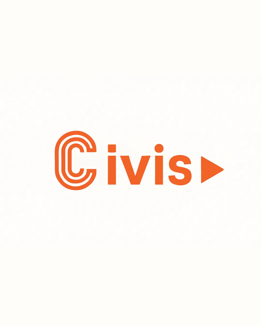
Try it Now!Logo review of Civis
 Logo analysis by AI
Logo type:
Style:
Detected symbol:
Detected text:
Business industry:
Review requested by Ferrgomez
**If AI can recognize or misinterpret it, so can people.
Structured logo review
Legibility
![]() The 'Civis' text is clear and easy to read in a clean, bold font.
The 'Civis' text is clear and easy to read in a clean, bold font.![]() Color contrast between the orange type and white background enhances visibility.
Color contrast between the orange type and white background enhances visibility.
![]() The multiline 'C' could create slight confusion at small sizes due to its complexity.
The multiline 'C' could create slight confusion at small sizes due to its complexity.![]() The triangle shape as a substitute for a period or part of a letter could cause brief interpretation delay.
The triangle shape as a substitute for a period or part of a letter could cause brief interpretation delay.
Scalability versatility
![]() Strong, bold lines and minimal color palette support confident scaling.
Strong, bold lines and minimal color palette support confident scaling.![]() Would translate decently for web headers, posters, or large signage.
Would translate decently for web headers, posters, or large signage.
![]() Multiline 'C' and triangle could lose clarity and impact at favicon or small print sizes.
Multiline 'C' and triangle could lose clarity and impact at favicon or small print sizes.![]() Fine spacing in the 'C' might fill in when embroidered or printed small, damaging legibility.
Fine spacing in the 'C' might fill in when embroidered or printed small, damaging legibility.
200x250 px
100×125 px
50×62 px
Balance alignment
![]() Text is visually aligned with the multiline 'C', overall a harmonious left-to-right flow.
Text is visually aligned with the multiline 'C', overall a harmonious left-to-right flow.![]() The triangle at the end helps balance the heavier 'C' symbol at the start.
The triangle at the end helps balance the heavier 'C' symbol at the start.
![]() Triangle's weight and placement creates a visual 'full stop', which might be jarring for some applications.
Triangle's weight and placement creates a visual 'full stop', which might be jarring for some applications.![]() Minimal white space between the 's' and triangle could use refinement to avoid crowding.
Minimal white space between the 's' and triangle could use refinement to avoid crowding.

Originality
![]() Multiline 'C' is a fresh take that adds character and distinctiveness.
Multiline 'C' is a fresh take that adds character and distinctiveness.![]() Incorporation of a triangle as a symbol or punctuation is an uncommon touch.
Incorporation of a triangle as a symbol or punctuation is an uncommon touch.
![]() Triangle is reminiscent of common play/forward media buttons, undermining uniqueness.
Triangle is reminiscent of common play/forward media buttons, undermining uniqueness.
Logomark wordmark fit
![]() Multiline 'C' integrates seamlessly into the wordmark as the initial letter.
Multiline 'C' integrates seamlessly into the wordmark as the initial letter.![]() Visual style and line weights are cohesive throughout the mark.
Visual style and line weights are cohesive throughout the mark.
Aesthetic look
![]() Modern and clean visual with energetic orange.
Modern and clean visual with energetic orange.![]() Balanced combination of curves and straight lines; pleasant to the eye.
Balanced combination of curves and straight lines; pleasant to the eye.
![]() Slightly generic execution due to the simple geometric triangle symbol.
Slightly generic execution due to the simple geometric triangle symbol.
Dual meaning and misinterpretations
![]() No inappropriate or ambiguous imagery detected in the composition.
No inappropriate or ambiguous imagery detected in the composition.
Color harmony
![]() Consistent single orange hue maintains brand cohesiveness.
Consistent single orange hue maintains brand cohesiveness.![]() Excellent contrast with white for superior visibility.
Excellent contrast with white for superior visibility.
Orange
#F76920
White
#FFFFFF


