Wondering how your logo performs? 🧐
Get professional logo reviews in seconds and catch design issues in time.
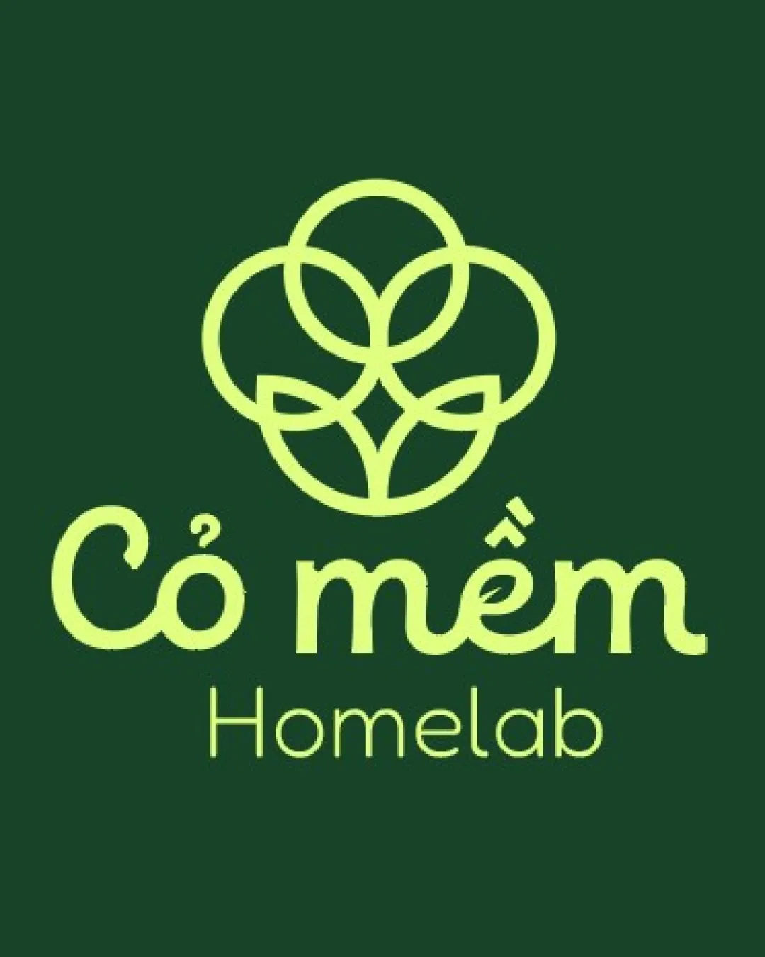
Try it Now!Logo review of Cỏ mềm Homelab
 Logo analysis by AI
Logo type:
Style:
Detected symbol:
Negative space:
Detected text:
Business industry:
Review requested by Okhssaff
**If AI can recognize or misinterpret it, so can people.
Structured logo review
Legibility
![]() The text 'Cỏ mềm' is highly readable with a friendly, distinct typeface.
The text 'Cỏ mềm' is highly readable with a friendly, distinct typeface.![]() The word 'Homelab' is clear and spaced well in a clean sans-serif font.
The word 'Homelab' is clear and spaced well in a clean sans-serif font.
![]() The smaller size of 'Homelab' reduces readability at a distance or small scale.
The smaller size of 'Homelab' reduces readability at a distance or small scale.![]() Accent marks may get lost on very small applications.
Accent marks may get lost on very small applications.
Scalability versatility
![]() Simple geometric symbol allows for relatively good scalability.
Simple geometric symbol allows for relatively good scalability.![]() Works on print materials and digital formats with sufficient clarity.
Works on print materials and digital formats with sufficient clarity.
![]() Thin linework in the symbol could disappear in embroidery, small favicons, or stamps.
Thin linework in the symbol could disappear in embroidery, small favicons, or stamps.![]() Text below the symbol is too fine for very tiny uses, such as labelling or tiny social profile displays.
Text below the symbol is too fine for very tiny uses, such as labelling or tiny social profile displays.
200x250 px
100×125 px
50×62 px
Balance alignment
![]() Excellent vertical stacking between symbol and wordmark for a cohesive look.
Excellent vertical stacking between symbol and wordmark for a cohesive look.![]() Visual weight is well distributed between the logomark and text.
Visual weight is well distributed between the logomark and text.

Originality
![]() Overlapping circle concept with negative space leaf/petal effect is moderately unique.
Overlapping circle concept with negative space leaf/petal effect is moderately unique.![]() Logo avoids clichés by abstracting the floral theme in a geometric manner.
Logo avoids clichés by abstracting the floral theme in a geometric manner.
![]() Abstract flower motifs using overlapping circles are somewhat common in nature-based logos.
Abstract flower motifs using overlapping circles are somewhat common in nature-based logos.
Logomark wordmark fit
![]() Both logomark and wordmark share soft, round lines, making for a harmonious pairing.
Both logomark and wordmark share soft, round lines, making for a harmonious pairing.![]() Color and thickness are consistent, creating a unified brand appearance.
Color and thickness are consistent, creating a unified brand appearance.
Aesthetic look
![]() Clean, modern, and inviting look with a calm color palette.
Clean, modern, and inviting look with a calm color palette.![]() Geometric simplicity keeps the design elegant while being approachable.
Geometric simplicity keeps the design elegant while being approachable.
![]() Doesn't push boundaries aesthetically—leans heavily on minimalism, so may not stand out boldly in crowded markets.
Doesn't push boundaries aesthetically—leans heavily on minimalism, so may not stand out boldly in crowded markets.
Dual meaning and misinterpretations
![]() No inappropriate or ambiguous symbols are detected.
No inappropriate or ambiguous symbols are detected.
Color harmony
![]() Pleasant, harmonious combination of light green and deep green delivers natural, eco-friendly vibes.
Pleasant, harmonious combination of light green and deep green delivers natural, eco-friendly vibes.![]() Colors have enough contrast for visibility while maintaining on-brand calmness.
Colors have enough contrast for visibility while maintaining on-brand calmness.
Tea Green
#D5E68D
Green Kelp
#153A28


