Wondering how your logo performs? 🧐
Get professional logo reviews in seconds and catch design issues in time.
Try it Now!Logo review of Comunione e Cooperazione
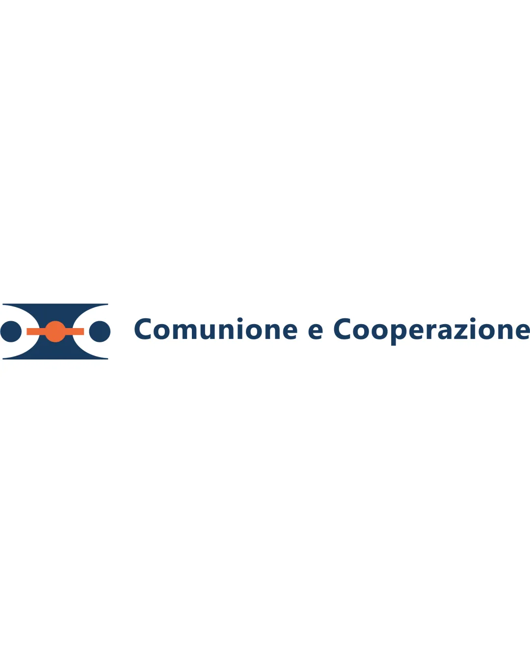
 Logo analysis by AI
Logo type:
Style:
Detected symbol:
Detected text:
Business industry:
Review requested by V.concas3
**If AI can recognize or misinterpret it, so can people.
Structured logo review
Legibility
Text is highly readable due to simple sans-serif typeface
Good contrast between text and background
Scalability versatility
Logo mark remains recognizable at smaller sizes
Trademark can be used independently from the wordmark in some contexts
Thin line elements and smaller dots may begin to merge or appear less clear at favicon or embroidery scale

200x250 px

100×125 px

50×62 px
Balance alignment
Logo symbol is horizontally aligned with text
Visual weight of the mark and wordmark is almost balanced
Symbol may feel slightly heavier on the left side, marginally disrupting total balance


Originality
Abstract mark attempts a unique geometric concept
Efforts made to avoid overtly literal shapes
Use of dots and connecting lines to represent cooperation is somewhat generic and appears in many nonprofit/association logos
Logomark wordmark fit
Both elements share a minimalist, modern style
Color palette and geometric motif are consistently applied between symbol and text
Aesthetic look
Clean, minimalist aesthetic
Color palette is simple and professional
Abstract symbol might not be immediately legible or meaningful to some audiences
Dual meaning and misinterpretations
No inappropriate imagery detected
Abstract nature could potentially be misinterpreted as unrelated symbols (e.g., stylized eyes, mask, or abstract animal face)
Color harmony
Excellent color contrast and minimal palette usage
Colors work harmoniously in both symbol and type
Dark Blue
#193651
Orange
#E05426
White
#FFFFFF

