 View review
Logo score
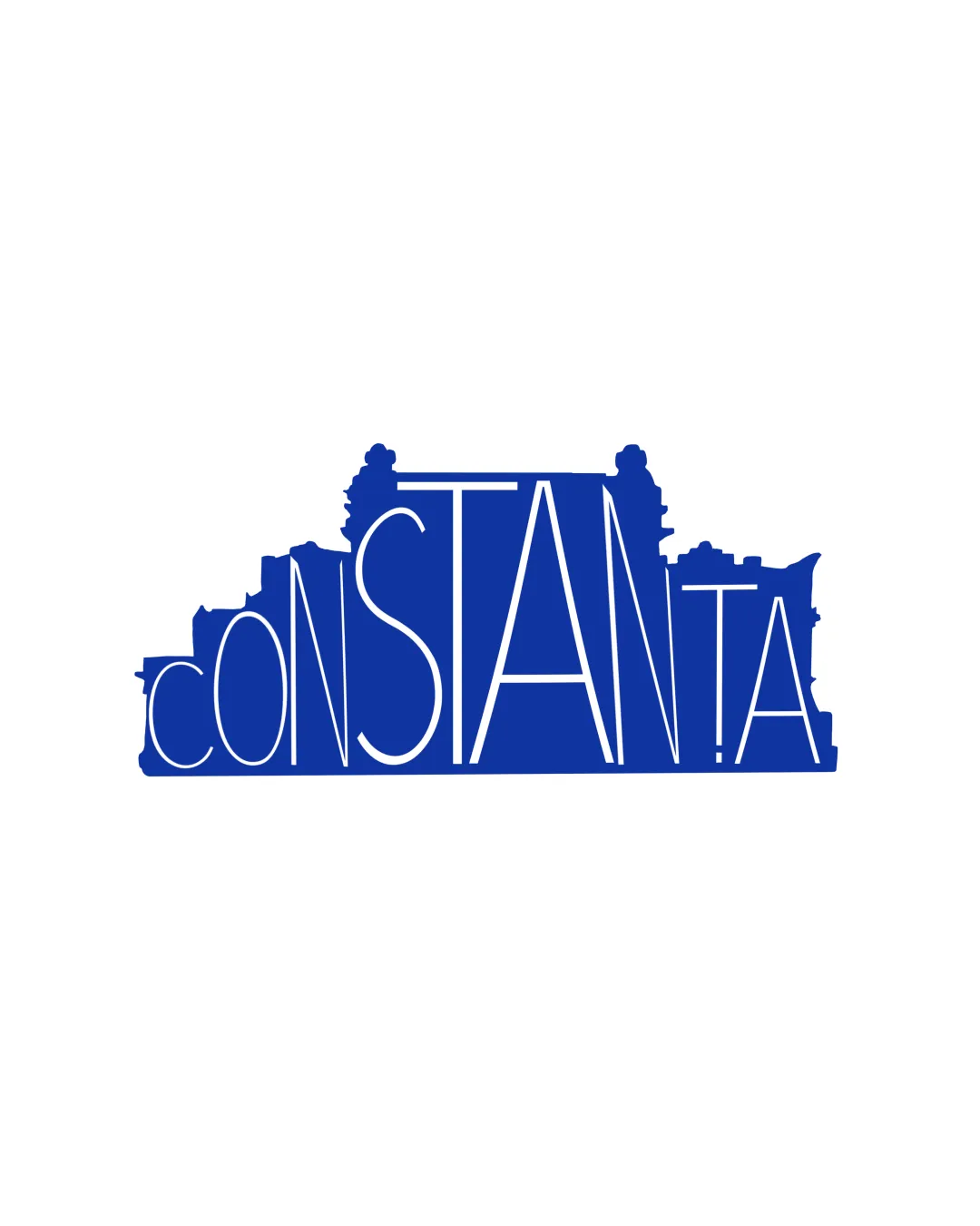
Logo review ofConstanta
Review the detailed scores below to see what is working and what should be refined first.
Legibility
Originality
Balance
Scale
Detailed review
Logo performance breakdown
Legibility
![]() The text is prominent and central within the design.
The text is prominent and central within the design.
![]() The varying letter sizes and integration with a skyline reduce legibility.
The varying letter sizes and integration with a skyline reduce legibility.
Originality
![]() The integration of a skyline is original and contextually relevant.
The integration of a skyline is original and contextually relevant.
![]() The concept could be more distinctive with unique skyline features.
The concept could be more distinctive with unique skyline features.
Color harmony
![]() The single color creates unity.
The single color creates unity.
![]() Lack of contrast might reduce emphasis.
Lack of contrast might reduce emphasis.
Your palette is close. Explore sharper color combinations with Colorfly.design before updating the logo.
Explore palettesBalance alignment
![]() The skyline provides a balanced top element.
The skyline provides a balanced top element.
![]() The varied letters create a slight imbalance.
The varied letters create a slight imbalance.

Scalability
![]() The simplicity allows for some scalability.
The simplicity allows for some scalability.
![]() The details in the skyline may be lost at smaller sizes.
The details in the skyline may be lost at smaller sizes.
200x250 px
100×125 px
50×62 px
Try your own review
Review my logo
Wondering how your logo performs?
Get a clear logo score, key risks, and priority fix ideas before your client or audience sees it.
Keep exploring


