 View review
Logo score
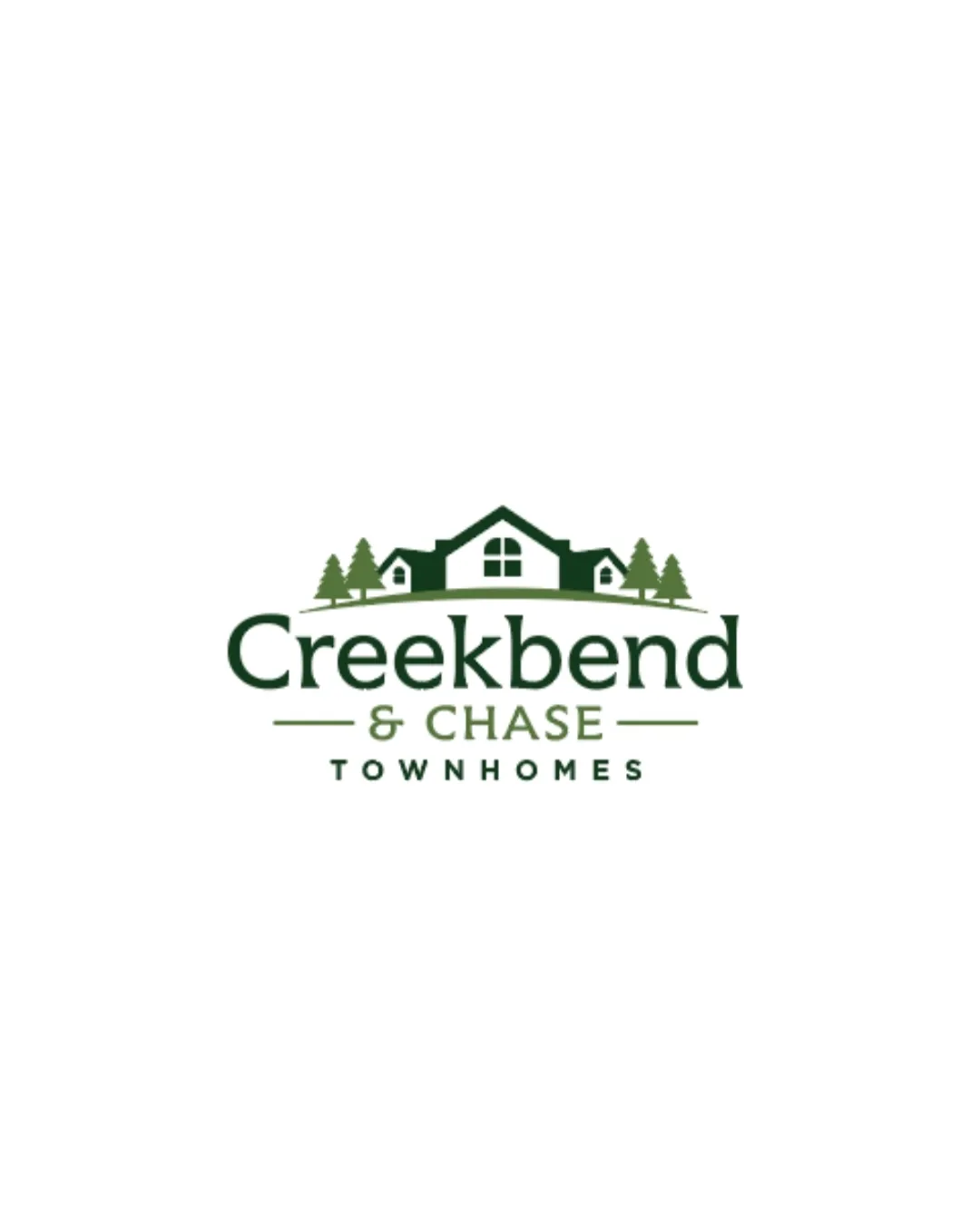
Logo review ofCreekbend & Chase Townhomes
Review the detailed scores below to see what is working and what should be refined first.
Legibility
Originality
Misread
Balance
Scale
Detailed review
Logo performance breakdown
Legibility
![]() Primary text 'Creekbend' is clear, bold, and easily readable.
Primary text 'Creekbend' is clear, bold, and easily readable.![]() '& CHASE' and 'TOWNHOMES' are both legible at most sizes due to font weight and spacing.
'& CHASE' and 'TOWNHOMES' are both legible at most sizes due to font weight and spacing.
![]() '& CHASE' has a lighter color and thinner weight, slightly reducing legibility at very small sizes.
'& CHASE' has a lighter color and thinner weight, slightly reducing legibility at very small sizes.
Originality
![]() Combination of house and trees is industry-appropriate.
Combination of house and trees is industry-appropriate.
![]() The house-with-trees motif is a common trope in real estate branding.
The house-with-trees motif is a common trope in real estate branding.![]() No unique or clever twist on the symbols or the text design.
No unique or clever twist on the symbols or the text design.
Color harmony
![]() Color limitation enhances harmony and brand recognition.
Color limitation enhances harmony and brand recognition.![]() Green tones are appropriate for real estate and evoke nature.
Green tones are appropriate for real estate and evoke nature.
Green
#415B37
White
#FFFFFF
Balance alignment
![]() Visual symmetry with the house and trees gives a balanced composition.
Visual symmetry with the house and trees gives a balanced composition.![]() Text and symbol are well-centered relative to each other.
Text and symbol are well-centered relative to each other.
![]() Tree placements, while balanced, make the logo feel slightly heavier on the top.
Tree placements, while balanced, make the logo feel slightly heavier on the top.

Scalability
![]() Simple elements allow for reproduction in print and digital formats.
Simple elements allow for reproduction in print and digital formats.![]() Solid color palette enhances potential printing flexibility for signage and stationery.
Solid color palette enhances potential printing flexibility for signage and stationery.
![]() Fine details in the house symbol and small window shapes may be lost at small scales, such as business cards or favicons.
Fine details in the house symbol and small window shapes may be lost at small scales, such as business cards or favicons.![]() Multi-level text arrangement may compromise legibility in compact applications like app icons.
Multi-level text arrangement may compromise legibility in compact applications like app icons.
200x250 px
100×125 px
50×62 px
Misinterpretations
![]() No inappropriate or ambiguous shapes detected.
No inappropriate or ambiguous shapes detected.
Symbol & text fit
![]() Classic style of house symbol complements the font and overall aesthetic.
Classic style of house symbol complements the font and overall aesthetic.
![]() Wordmark's modern sans-serif and symbol's illustrative details are stylistically close, but a more unified approach could increase overall cohesion.
Wordmark's modern sans-serif and symbol's illustrative details are stylistically close, but a more unified approach could increase overall cohesion.
Try your own review
Review my logo
Wondering how your logo performs?
Get a clear logo score, key risks, and priority fix ideas before your client or audience sees it.
Keep exploring


