 View review
Logo score
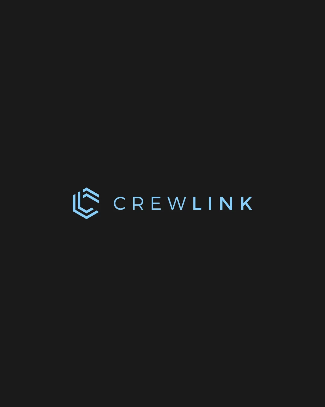
Logo review ofCrewlink
Review the detailed scores below to see what is working and what should be refined first.
Legibility
Originality
Misread
Balance
Scale
Detailed review
Logo performance breakdown
Legibility
![]() Sans-serif font is highly legible and well-spaced
Sans-serif font is highly legible and well-spaced![]() Single color on text ensures excellent contrast and clarity
Single color on text ensures excellent contrast and clarity
Originality
![]() Monogram design is clean and modern, slightly abstract for a unique approach
Monogram design is clean and modern, slightly abstract for a unique approach
![]() Hexagonal/angled line motifs are common in technology/startup branding, so the core idea isn’t groundbreaking
Hexagonal/angled line motifs are common in technology/startup branding, so the core idea isn’t groundbreaking
Color harmony
![]() Consistent use of one highlight color against a dark background creates a memorable and harmonious palette
Consistent use of one highlight color against a dark background creates a memorable and harmonious palette
Light Blue
#7EC9F6
Dark Charcoal
#232323
Balance alignment
![]() The weight of the symbol matches the wordmark perfectly
The weight of the symbol matches the wordmark perfectly![]() Excellent horizontal alignment; feels centered and intentional
Excellent horizontal alignment; feels centered and intentional

Scalability
![]() Minimal detailing ensures logo remains clear at small sizes
Minimal detailing ensures logo remains clear at small sizes![]() Works well on screens, business cards, and digital platforms
Works well on screens, business cards, and digital platforms
![]() Thin lines in the monogram may lose impact or become hard to see on physical products like embroidery or very small-scale applications
Thin lines in the monogram may lose impact or become hard to see on physical products like embroidery or very small-scale applications
200x250 px
100×125 px
50×62 px
Misinterpretations
![]() No inappropriate or unintended imagery detected; visual language is straightforward
No inappropriate or unintended imagery detected; visual language is straightforward
Symbol & text fit
![]() Monogram and text use matching line weights and geometry
Monogram and text use matching line weights and geometry
![]() Shared color unifies the mark and wordmark seamlessly
Shared color unifies the mark and wordmark seamlessly
Try your own review
Review my logo
Wondering how your logo performs?
Get a clear logo score, key risks, and priority fix ideas before your client or audience sees it.
Keep exploring


